Last September I went looking for tools that turn handwriting into fonts, half expecting a graveyard of abandoned side projects and sketchy landing pages. Instead I found a bench of documented attempts, and a Hacker News thread to prove the urge is mainstream: “Making a font of my handwriting,” linking to chameth.com, submitted by user kickofline on September 5, 2025, sat at 337 points with 80 comments whose visible timestamps run from September 5 through September 8, 2025, the latest from user huksley on September 8. That’s not a niche. That’s a crowd.
Here’s what an AI font generator from handwriting actually gives you: a downloadable, installable TTF file of your own pen strokes. Your handwriting, in your presentation titles, your notes, your screenshot posts, no retyping involved.
The honest version of this story involves two documented builds with opposite outcomes. One came out polished enough that people loved it on social media. The other came out, in the builder’s own words, cursed. Both are worth your time, because together they teach the real lesson: this pipeline runs as a loop, not a line. The build is the middle of the process, not the end.
Key Takeaways
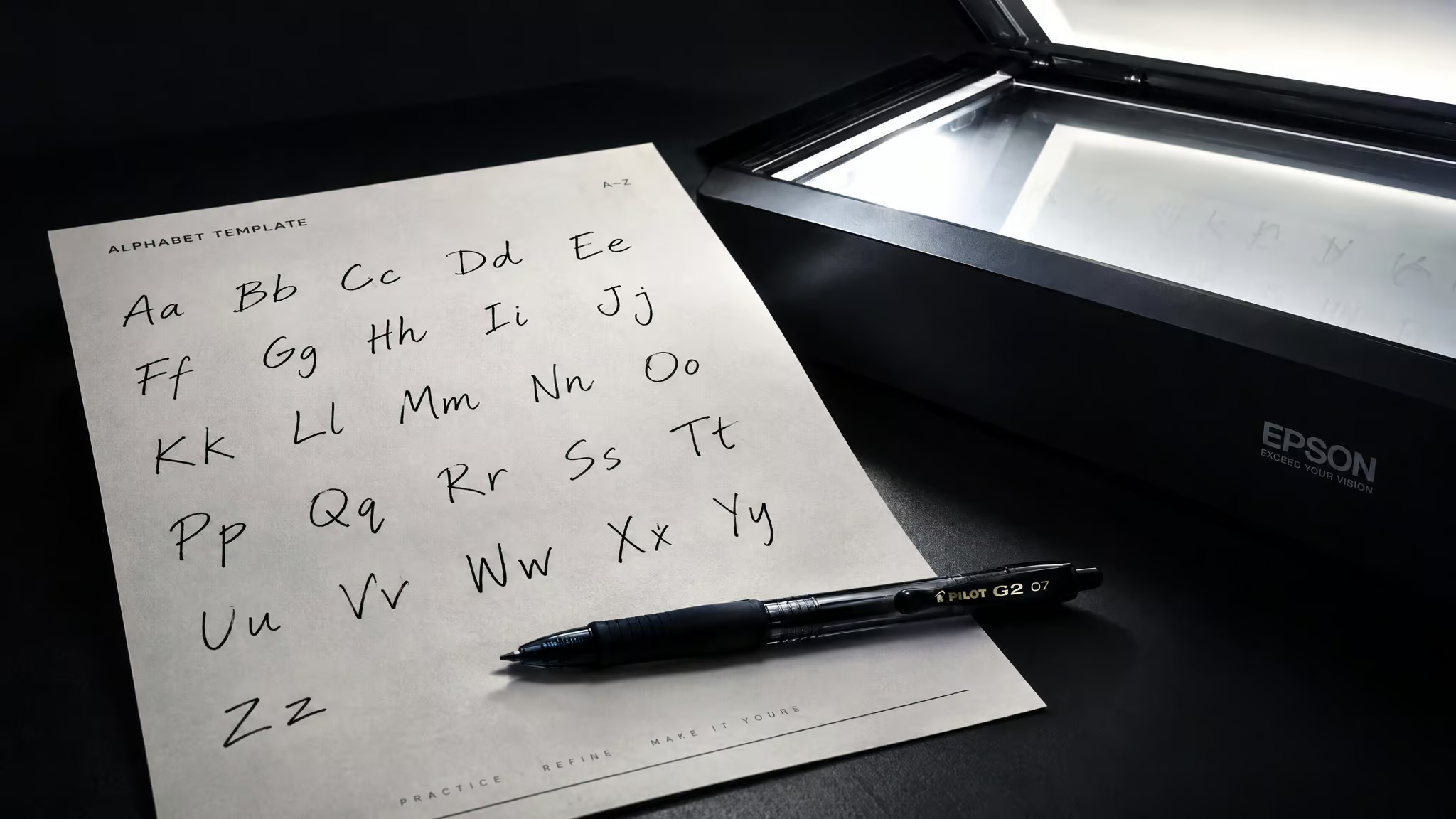
The pipeline: print (or digitize) a template, fill it with a mid-tip pen like a Pilot G2 1.0, scan or photograph it, upload, review glyphs, build, install, and almost certainly rebuild.
Calligrapher’s free tier caps at 75 characters against a 76-character template, so you must choose up front which glyph your font will never contain.
Matt Ragland’s font got loved on social media; PC Gamer’s came out “cursed” because a felt-tip pen died mid-template and the printer clipped the crosshairs. Either way, quality gets decided in the glyph-review loop.
Table of Contents
What an AI font generator from handwriting actually does
Handwriting-to-font tools like Calligrapher and FontCrafter produce an installable typeface, while AI OCR tools like Fintelite’s converter turn handwriting into editable text, and those are different jobs entirely. A third category, style simulation, generates brand-new text that looks like your handwriting. Three different artifacts, three different tool categories:
- Glyph-capture font generation: template in, installable TTF out.
- Handwriting-to-text OCR: image in, editable text out. OCR, short for optical character recognition, is the technology that converts text captured in images or documents into data a machine can read.
- Style simulation: prompt in, fresh text in your handwriting style out.
Mechanically, the font tools are refreshingly dumb. They trace raster images of the characters you supply on a template and assemble them into a TTF. There’s no deep understanding of your penmanship happening, just careful capture. The confusion exists because Google lumps all of this under one keyword, so transcription questions surface right beside font queries. Knowing which output you want picks the tool category for you. (And if what you actually want is fancy-looking text to paste into a bio, that’s a different gadget altogether; most “copy and paste” generators are Unicode character stylizers, not real font creation.)
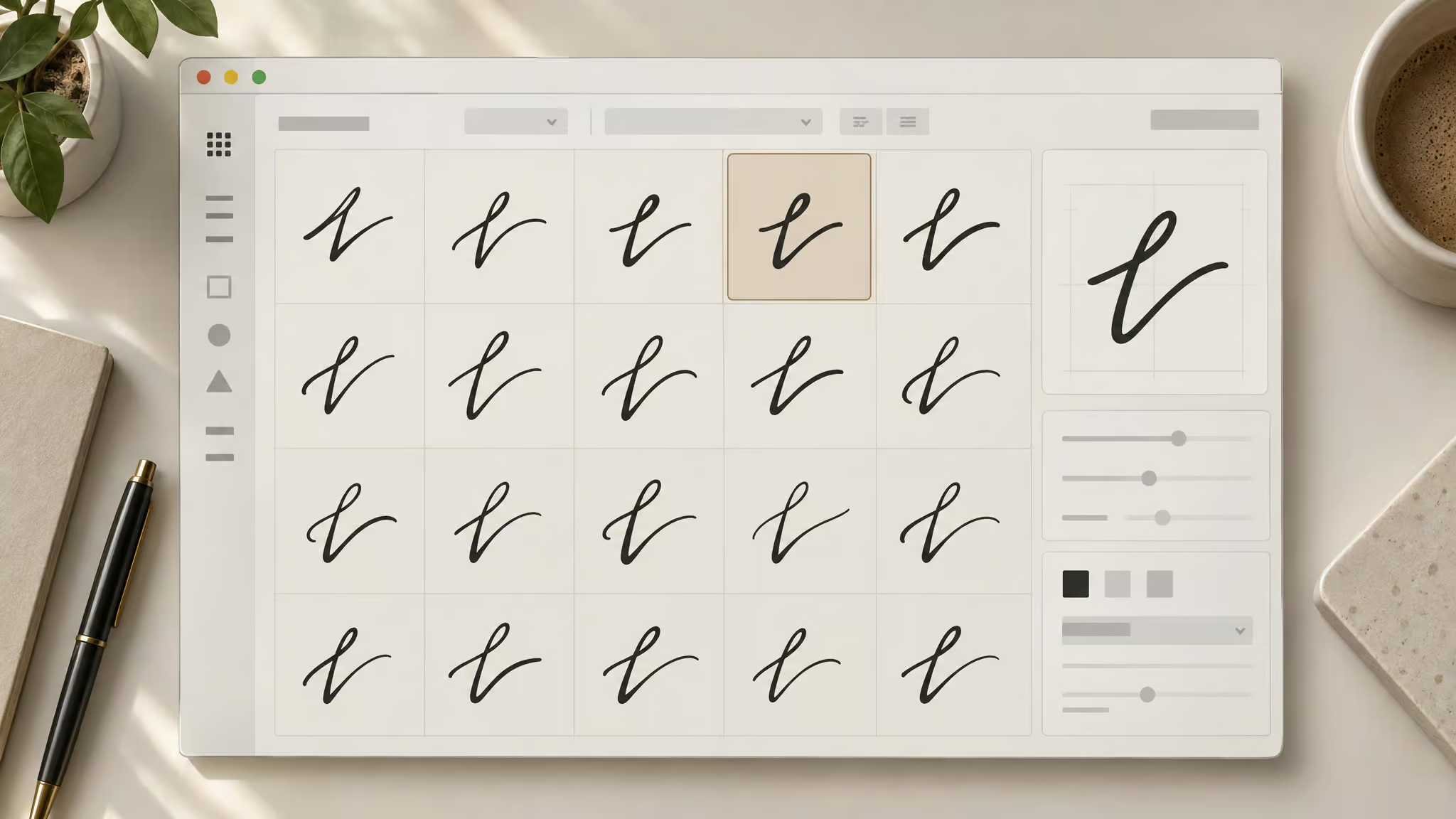
The template-to-TTF pipeline, step by step
The full workflow is: print or digitize a character template, fill it with a suitable pen, scan or photograph it, upload it, review the glyphs, build the font, and install the TTF. Both Calligrapher and FontCrafter run some version of this loop, every documented build I found follows it. The proof it works end to end: Matt Ragland’s finished file, literally named “Matt handwriting regular ttf,” landed in his Downloads folder and ended up installed and in use. Here’s the shape of it:
- Get the template and fill it in.
- Scan or photograph the completed sheets.
- Upload and review the glyphs the tool extracted.
- Build the font file and install it.
- Almost certainly: fix something, rebuild, reinstall.
The H3s below walk the loop with the details that actually matter.
Fill the template
FontCrafter’s flow starts with printing its supplied template and filling it out with a felt-tip pen, then scanning the result and uploading it. The tool scrapes your handwritten characters and fashions a personal font, with “should” doing honest work in that sentence, since success isn’t guaranteed. One spec detail turns out to matter: FontCrafter’s template asks for three rows of characters. That’s deliberate, sensible overengineering, the good kind. Handwriting isn’t uniform, so the font shouldn’t be either, and the extra rows give the tool spare samples to draw from just in case one row scans badly.
Calligrapher’s template comes as a PDF or PNG (grab the PNG if you’re headed for a tablet) and spans two sheets because there are a lot of characters, zoned for uppercase, lowercase, symbols, and numbers. Don’t be surprised when the printer spits out two pages.
Upload and review glyphs
Calligrapher’s review layer is the step every landing page skips. You head to My Fonts and upload the completed template, and it accepts a photo or image, so a phone picture works, which lowers the barrier nicely. The tool generates variant glyphs per character to add variance, and you click through and set whichever default you like. Ragland disliked his defaults and fixed them, which is reassuring proof that the defaults aren’t sacred.
Then there’s the fine-tuning layer. Individual glyphs adjust for baseline position and size, and this is where a decent font becomes a good one. Ragland’s lowercase “e” rendered too small on his first build; he fixed it by dropping the baseline and resizing. The satisfying part is the eyeball pass: click through each glyph and check it against the other lowercase characters. It’s inspection, but the fun kind, because you’re reading your own handwriting in a grid.
Build the font file
The payoff is three actions: go to Build Font, type the font name, hit build. A TTF lands in Downloads, which is exactly what a Mac wants. Ragland’s was named “Matt handwriting regular ttf,” and that mundane filename is the whole point: the end state is just a font file, the same species as any font you’ve ever downloaded, the same file type, for instance, that AI font generation tools produce.
Then the loop closes. Ragland rebuilt a couple of times, and it’s not uncommon to come back and redo the build after installing. The trigger might be an unwanted variant, glyphs rendering tiny, or line height and spacing sitting wrong. Plan on it. If you’d rather start from an image of lettering instead of your own hand, there’s a whole separate workflow for turning lettering into a working TTF/OTF for that too.
Pen choice and scan settings that decide your font
A mid-tip pen like the Pilot G2 1.0 is the documented sweet spot, and two independent walkthroughs converge on it from opposite directions. The calibration, from Ragland’s tutorial and PC Gamer’s hands-on test respectively:
- Pen picks: Pilot G2 1.0 recommended; a Sharpie or permanent marker is too fat; a 0.5 tip is too thin; ballpoints are too faint; thick felt-tip markers bleed. This is practitioner guidance from two documented builds, not lab-tested universal law.
- Scan settings: if strokes come out faint, rescan as black-and-white with contrast boosted to force stroke opacity before uploading.
The failure case is documented too. PC Gamer’s only felt-tip pen ran out of ink mid-template, and the printer cut the template’s alignment crosshairs in half. Two mundane hardware gremlins, one doomed first attempt.
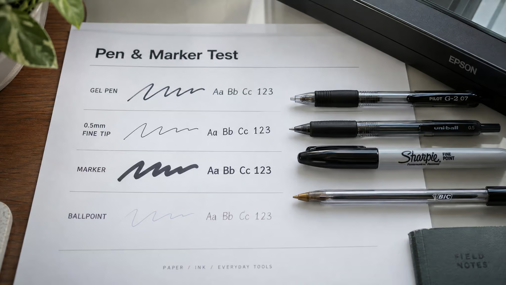
One principle worth carrying over: tool-page copy says “neater writing yields better results,” a rare falsifiable claim in a genre full of vibes, and it transfers reasonably to template tracing. PC Gamer’s author had recognition trouble that backs it up. It’s a sensible cross-tool inference, not a universal law, more friendly nudge than handwriting coaching.
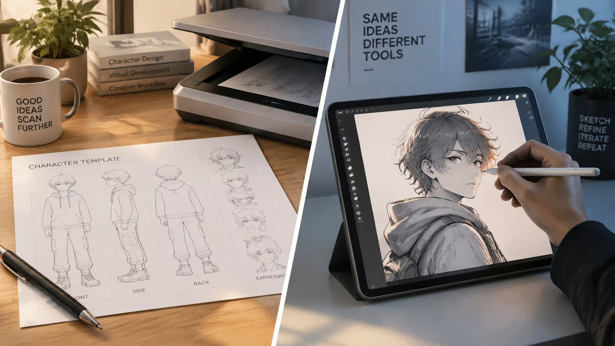
Skip the scanner: build your font on an iPad
Yes, the template can be filled digitally in Procreate, which removes the scanner from the pipeline entirely. Ragland filled the Calligrapher template in Procreate on an iPad with an Apple Pencil instead of printing it, then uploaded the finished image through the same My Fonts flow and built the TTF like anyone else.
The logistics are simple: download the template as PDF or PNG, take the PNG for tablet use, and draw the characters directly onto the image. It works because the drawing is dialed in and already digitized; there are no printer margins or scanner contrast to fight, which, given the PC Gamer printer gremlins, is honestly appealing. The scanner is the pipeline’s biggest single point of failure, and this route deletes it.
Tradeoffs, stated plainly: you need tablet hardware, and you lose paper-and-ink texture in the strokes. And for the pen-and-paper crowd, that path remains fully sufficient. Procreate is a refinement, not a requirement.
Which handwriting-to-font tool should you use?
Calligrapher fits readers who want the documented end-to-end path with glyph editing; FontCrafter fits readers who want free, account-free, in-browser processing. Neither is a copy and paste font generator, most tools under that label are Unicode character stylizers, not real AI font creation, so know which you need. Both are free and both output real fonts; the choice comes down to polish versus friction:
- Calligrapher: two-sheet template, photo upload via My Fonts, clickable variant glyphs with settable defaults, per-glyph baseline and size fixes, TTF output. Free tier caps at 75 characters per font.
- FontCrafter: printed template filled with a felt-tip pen, three rows of samples, processing that happens in your browser with no account, and a privacy claim that belongs to its creator. It’s also vibe-coded with AI assistance, which makes any bug that much harder to isolate and fix.
- What “free” constrains everywhere: character count, variant cleanup, rebuild effort, and no support guarantees. Limits change, so check current terms before you commit an afternoon.
Calligrapher: the documented end-to-end walkthrough
Calligrapher is the tool with the complete paper trail: Matt Ragland’s 8-minute screen-share tutorial, How To Turn Your Handwriting into a Custom Font! [Easy 8 Minute Tutorial], covers upload, glyph review, build, install, and use in one sitting, a hands-on contrast with how AI font generation works, which tries to design typefaces from scratch. The free version caps at 75 characters per font against a 76-character template, so one glyph gets dropped; Ragland swapped the semicolon for the plus symbol to fit. Two sheets, photo upload, TTF out, and his resulting font got a lot of love on social media.
One naming flag: the tutorial says “Calligrapher,” while related searches show “Calligraphr,” spelled with one fewer e. Check the site’s actual spelling before you go hunting for it.
FontCrafter: free, browser-based, and vibe-coded
FontCrafter is Chris Pirillo’s tool, and its architecture is the clever bit: most of the heavy lifting happens in the browser with no server round-trip, and no account is needed. Just open the page and go. Pirillo touts it as “100% private,” and the browser-only design is what backs that up, though the phrase stays his characterization, not an independent audit. PC Gamer writer Jess put it through a hands-on test, which is more than most tools in this space can claim.
It’s also vibe-coded, built with AI assistance, stated plainly with no pearl-clutching. The real cost is that bugs are that much harder to isolate and fix, which is exactly why comments from human coders still matter enormously in any codebase. It’s a fair tradeoff observation, not a scandal.
The chatbot frontier: Claude and friends
Fast Company published a piece headlined Claude can turn your handwriting into a font, and that headline is genuinely all we have; the article body wasn’t accessible in the capture, so the claim holds at exactly headline strength. The demand is real, though: “claude font” pulls roughly 590 monthly searches, with “claude ai font” adding about 70. General-purpose chatbots are edging into this category, and whether they can actually run a template workflow is something to verify live before describing any steps. Microsoft Font Maker shows up in related searches too, but with zero source-backed evaluation behind it, it stays unverified here. If you want the deeper question of whether AI can design typefaces at all, that’s its own rabbit hole.
What the 75-character free limit actually costs
Calligrapher’s free tier gives you a 75-character budget against a 76-character template, which means one glyph gets sacrificed before anything gets written. The off-by-one is almost rude. Ragland’s fix was swapping the semicolon for the plus symbol, a tiny triage decision that somebody had to make.
The sting is smaller than it sounds. The budget still covers every numeral, all upper- and lowercase letters, and core punctuation, leaving roughly a dozen discretionary slots. Ragland spent his on quotation marks, hashtag, money sign, percentage, apostrophe, and the at symbol. Brackets or a plus can go in instead; the slots are yours to spend.
The trade-off no landing page spells out: choose up front which punctuation, symbols, or accented characters your font will never include. “Free” is the dominant qualifier in this keyword space, three of eight related searches carry it, but it buys constraints: character limits, variant cleanup, no support guarantees.
Buyer rule: Decide which glyph gets cut before you fill the template — the 75-character budget forces one sacrifice, so spend it on purpose.
How well AI captures your handwriting quirks
The font reads fine as a specimen and wrong as a sentence, because tracing preserves your character shapes and their variation but loses pen pressure, writing rhythm, and baseline drift. Quality gets decided in the glyph-review loop after the build, and the first build is never the final one:
- Preserved: character variation, selectable variants you can set as defaults.
- Lost: pen pressure, writing rhythm, baseline drift.
The documented outcome spectrum runs wide. Ragland’s polished font was loved on social media. PC Gamer’s compromised-scan attempt produced something the headline called “Cthulu’s own cursed Wingdings,” with jokes about kerning only cephalopodic gods could appreciate. The author’s fair caveats: cursive attempts look cursed anyway, and machines misread her handwriting long before this project.
There’s also a numerals wrinkle: a live typing demo produced 1, 2, 3, 4, 5, “six,” and 78, prompting the “can’t even type numbers” joke. Hold that at medium confidence, since the template nominally includes every numeral, so it may be a demo quirk rather than a real limit.
What’s certain is the loop: Ragland rebuilt at least twice to fix unwanted variants, spacing, and that small “e.” Expect the same, and treat the iteration as part of the fun.
Install your TTF and troubleshoot where it shows up
Build Font outputs a TTF to Downloads, which installs on the Mac by dragging the file into Font Book, after which it appears in the system font list. A little green plus shows up during the drag, a tiny UI detail that never stops being satisfying. Then comes the geek-reward moment: open the font and admire your own handwriting, inspectable glyph by glyph, working anywhere Font Book is installed.
Compatibility is a field report from one documented run on one Mac, caveats included:
- Works: Pages, Keynote, and TextEdit (when shared).
- Doesn’t: Notes. Say it casually, like a friend’s heads-up.
- Untested: Google Docs and Canva. Nobody checked, so nobody’s guessing.
Standard effects still apply, which is the real proof it behaves like a font and not a novelty import: the Keynote demo showed a title text box set in the “Matt handwriting” font, signed “by Matt Raglin,” with a drop shadow on it. Use cases write themselves: presentation titles, screenshot note posts in your own hand. One hygiene rule for the rebuild loop: drag the old TTF to the trash before installing a rebuilt version, so duplicates never appear.
Why did my handwriting font come out distorted?
The two documented causes are a compromised scan and strokes too faint to survive it, and the recovery is a high-contrast black-and-white rescan, a careful glyph review, and a rebuild. The pattern, framed as a pattern: in print-and-scan font workflows, printer margins clip the alignment crosshairs, and the pen either runs dry or lays down strokes too faint to separate from paper texture. The tell is thin strokes dropping out or glyphs landing misaligned. PC Gamer’s attempt is the documented instance of exactly this.
The recovery, in order: resize, render the characters as opaquely as possible, and upload a black-and-white scan with contrast boosted. If the output is still distorted after that, the loop is improve the scan, review glyphs, rebuild. And remember that vibe-coded tools are harder to debug when they misbehave. Your handwriting isn’t the villain here; the scanner probably is.
Read the marketing before you upload your handwriting
Compare a tool’s headline claims against its own fine print before uploading anything, because handwriting samples are biometric-adjacent personal data. The worked example, from the adjacent OCR space: one page headlined “accurate handwriting recognition for any language” while its own support list named English, Spanish, French, German, and other Latin-script languages, with “high accuracy” and no benchmark anywhere, plus generic placeholder strings left in the page, the kind that read like unfinished design templates. Privacy claims need attribution too: FontCrafter’s “100% private” is its creator’s assertion, not an audit. And the vibe-coded debuggability tax is a real argument for purpose-built, human-maintained tools.
Where to start: pick your tool, fill the template, expect a rebuild
Start with Calligrapher, budget your 75 characters before filling a single box, and grab a Pilot G2 1.0 or take the Procreate route. FontCrafter if account-free, in-browser processing matters more to you than polish. And plan the loop into your first session: even the best-documented build needed two-plus rebuilds before it was done.
Frequently Asked Questions
What app can I use to convert my handwriting into a font?
Calligrapher is the documented end-to-end option, with a two-sheet template, photo upload, clickable variant glyphs, and per-glyph baseline and size fixes. FontCrafter is the free, account-free alternative that processes everything in your browser. Both output real installable TTF fonts.
Does a custom handwriting font work in Google Docs, Canva, and Notes?
In one documented run on a Mac, the font worked in Pages, Keynote, and TextEdit (when shared), but not in Notes. Google Docs and Canva went untested, so nobody’s guessing. Since the output is a standard TTF installed via Font Book, it behaves like any other font wherever the system fonts are available.