
Every time you save a desk photo to a board, some part of you knows it doesn’t look like that. The laptop is open at exactly the right angle, the coffee has never known a spill, the screen is a luminous void. And then there’s the suspiciously photogenic sprig of eucalyptus that no real desk has ever earned. So I went looking. Started with a “desk flatlay” search, ended up falling through four stock platforms, a chaptered 2022 YouTube desk tour, and a pile of filter menus, and came out the other side able to tell you exactly why every pinned laptop snaps aesthetic photo looks the way it does.
Two payoffs ahead: the formula is fully constructible with a phone and a window, plus a complete screenshot toolkit for getting that luminous-void screen right on your own machine, and once you can spot what’s manufactured about the reference images, the gap between your desk and the pinned ideal mostly stops mattering. The scale alone should reframe it: Pexels reports 96.3K photos under “flat lay desk,” while Magnific’s desk-flatlay page serves about 50 results. That’s not a vibe. That’s a genre, and genres can be reverse-engineered.
Key Takeaways
The catalog flatlay formula is one hero laptop, roughly 4 to 6 set-dressing props, deliberate copy space, and one consistent light direction, shot either straight overhead or from a 3/4 elevated angle.
Free wins (window light, one plant, cable discipline) tier above any gear purchase; Kai Notebook’s 339K-view budget desk tour drew a top comment celebrating no $300 monitor light and $2500 bookshelf speakers.
Much of your inspiration feed is manufactured: labeled AI stock, blank-screen mockups, affiliate-routed links (Shutterstock via 7eer.net), and sponsored iStock placements inside Pexels’ free results.
Table of Contents
What the laptop snaps aesthetic actually looks like: the flatlay formula
The laptop snaps aesthetic is a repeatable flatlay formula: one hero laptop, roughly 4 to 6 supporting objects, deliberate empty copy space, and a single consistent light direction, almost always shot from overhead. That’s the whole machine. Once you see it, you can’t unsee it, and it explains why the photo of your actual desk, buried under a water bottle and two charging cables, never matches.

The catalogs make the anatomy obvious because they’re a dataset. Magnific (formerly Freepik), the AI-plus-stock platform where my rabbit hole started, serves about 50 desk-flatlay results on its first page, and they’re dominated by mockup, copy space, and top-view framings. Vecteezy’s laptop flatlay gallery runs the same way. The sponsored iStock image inside Pexels’ free results, number 1411178215, is literally titled “top view with copy space.” Nobody’s hiding the blueprint.
The motifs are so consistent you’ll recognize them instantly. The wooden-table flat lay with laptop, cup, notepad, and calculator is the genre’s default template, the free photo equivalent of a baseline font. Then there’s the white-background variant with laptop, notepad, coffee, and glasses; the gadgets-and-coffee shot on a pink background; the plain top view of laptop plus coffee, which is the genre’s classic loadout; the black-background overhead flatlay with everything arranged around a blank center; and the minimalist home-office shot with an empty copy-space zone ready for someone’s headline. Same skeleton every time, different wallpaper.
Here’s the failure pattern, and it’s a pattern rather than a statistic: first attempts overfill. People cram seven or more props into frame, thinking more objects means more aesthetic, and the image turns into clutter. The catalogs work in the opposite direction. The look comes from editing down.
If you take one thing from this section, take this: remove two objects from your next shot before you shoot it. The negative space isn’t wasted frame; it is the style.
One convention deserves an honest origin story: the blank screens. In this context, a “mockup” is an image built so a designer can drop their own artwork onto the laptop screen and hand it to a client, which is why mockups command premium pricing. The screens stay blank because they’re placeholders. The side benefit for the rest of us: an unlit screen is also the safest exposure choice, since a bright display is the easiest thing to blow out in an otherwise well-balanced shot.
The catalogs didn’t choose blank screens for beauty. They chose it for commerce, and beauty came along for the ride.
Angles and light: why your photo stays flat
Light direction and camera height decide whether a laptop photo pops; quantity of light and price of gear barely register. Two camera positions carry this entire genre. The first is the strict overhead flatlay, camera dead parallel to the desk. The second is the 3/4 elevated view, and yes, the catalogs distinguish these.

One of Magnific’s free photos is described as an elevated view of flowers with stationeries and a laptop, and it’s genuinely elevated rather than top-down. That distinction sounds pedantic until you try it, and then it’s the difference between a flat snapshot and something with depth.
On light: what separates a flat snap from a pop is the direction the light comes from, not how much of it you have. The catalog imagery leans on natural window light with soft shadows falling consistently in one direction. You can see it in the way the sourced examples are described: single mood, single shadow side. The claim about technique is inference from the conventions, since stock galleries show you the result rather than the behind-the-scenes, but the pattern holds across every platform I dug through.
One window, camera raised, shadows falling the same way across every object. That’s the recipe.
The reason this works is refreshingly unromantic: catalogs standardize on top-view and copy-space framings because designers need reusable ad space. A designer buys a flatlay to put a headline in the empty zone, so the shot has to be clean, evenly lit, and geometrically simple. Borrowing that constraint for your own photos is basically getting professional art direction for free.
And here’s the tell I keep seeing: someone upgrades a lamp or buys a new keyboard, posts the photo, and it barely changes. Gear was never the variable. Raise the camera and clear two objects off the desk, and the same photo transforms. If your shot stays flat despite good equipment, the problem is above the desk, not on it.
Quick test: If a flat shot won’t improve, raise the camera and remove two objects before touching any gear.
Do you need expensive gear? The hype-free tier ranking
No, expensive gear isn’t required for aesthetic desk photos, light direction and composition change the image more than any purchase, and a few simple DIY projects for better laptop snaps prove it. The desk-photo community itself will back that up. The top comment on Kai Notebook’s 2022 desk tour, from @bhxlegend, says it outright: at last, a desk video with neither a $300 monitor light nor $2500 bookshelf speakers. That comment has the energy of an entire audience exhaling. The viewers of a 339K-view desk video on a 470K-subscriber channel are actively celebrating the absence of a flex.
So here’s the qualitative tier list, no invented prices. Tier one, free and unbeatable: window light from one direction, a single plant for organic contrast (the eyeglasses-clipboard-keyboard-and-leaves catalog entries prove the botanical-plus-tech look is a whole bucket), and cable discipline, because nothing screams “real desk” like a charging cable staging a daring escape across the frame. These three move the needle more than anything money buys. Gear cost and photo quality simply aren’t proportional in this genre.
Tier one-and-a-half is the counterexample: Kai Notebook’s actual build. The tour (video 5usF6w7YoqQ, from 2022) is chaptered by zone like a tiny technical document, which I love: main workspace at 0:38, mini bookshelf at 2:14, peg board at 4:51, left side at 5:33. The keyboard is a GamaKay LK67 with Akko Black & Pink keycaps and Gateron Yellow switches, which is a properly respectable budget-tier custom board, and the rest of the setup mixes IKEA and Shopee items. If you’ve been adjacent to the custom-keyboard hobby at all, you know this crossover is real: half the desk-aesthetic content online is secretly keyboard-culture content wearing a different skin. The people building a 65% board with cherry-profile caps are the same people composing flatlays.
The honest answer to how much an aesthetic setup costs, then, is: mostly nothing, and the ceiling is whatever you decide a hobby is worth. Everything that makes the photo work in the catalogs is staging, not spending.
Theme templates: one composition, many re-skins
The strongest laptop flatlay ideas are one stable composition re-skinned with different props and palettes, and the clearest way to use inspiration is to strip a pinned photo down to its skeleton, then re-dress it deliberately, the same way a solid grounding in laptop snaps makes the aesthetic choices feel intentional rather than accidental:
- The classic: laptop, coffee, notebook, glasses, wooden table, overhead, copy space
- Cozy autumn: laptop, cocoa, plaid blanket, maple leaves, pine cone on a grey backdrop
- Winter/festive: keyboard, notebook, coffee, decorations, top view
- Back-to-school: colorful school supplies on a white wooden desk (an AI-labeled stock entry, per the catalog)
- Valentine’s: notebook, flower, laptop, glasses on a wooden table
- Travel planning: laptop, passport, and luggage on a jute rug, with a hands-in-frame variant
- Peach pastel: macaroons, spiral notepad, lipstick, glasses on a laptop
- Marble luxe: hot coffee and violet irises, copy space, premium tier
- Beige neutrals: tea cup, glasses, stationery on a beige backdrop
- Dark mode: eyewear, keyboard, phone, and notepad around a blank center on black
- Color-block: a keyboard, paperclips, and leaves against a vibrant yellow background
The logic underneath every entry is the same: swap the prop set and the palette, keep the composition. Learn one good overhead arrangement and you haven’t learned one photo; you’ve learned a re-skinning engine.
The proof that the formula tolerates anything is Vecteezy ID 8017108, a laptop mockup planted on the beach amid coconuts, a camera, a hat, and slippers, framed as a top view flat lay composition. It is completely absurd and I respect it enormously. Someone looked at the flatlay template and thought, “what if the desk were sand.” The genre’s seasonal calendar isn’t a coordinated industry conspiracy, to be clear; it’s just recurring catalog patterns.
Theme buckets exist because buyers come looking for them around the same times each year, so the catalogs pre-package them. Shutterstock’s travel-planning flatlay (ID 2693586329) even ships with a human-hands variant, because sometimes the story needs a person in it.
The scale numbers back up how many distinct styling sub-worlds live under this one formula. Pexels’ related-tag counts read like a map of the genre: study table at 246K photos, office table at 283K, messy desk at 51K, plus the cozy variants. Pastel, marble, beige, dark, bold: each palette is its own searchable country, all sharing one border and one camera angle.
If you’re styling a setup with a specific look in mind, say a softer, cute pastel desk for study content, the catalogs already stock the palette. The peach-backdrop flatlay runs pencil, macaroons, spiral notepad, coffee cup, lipstick, and eyeglasses on a laptop; there’s a white-notebook calming workspace variant, and a marble background with coffee and violet irises if pastel isn’t your speed, plus AI-labeled options for copy space. Pick the palette, keep the flat lay formula, and you’re done.
Where your inspiration actually comes from: stock, AI, and sponsorship
The decisive facts about sourcing: Pexels is the deep end for free stock (96.3K photos for “flat lay desk” versus only 5K for the “flatlay” tag itself, plus a hand-curated 79-item Desks collection), Magnific blends free stock, premium stock, vectors, and labeled AI images in one result set, Vecteezy gives you an explicit AI-exclusion filter, and Shutterstock runs the premium incumbent with affiliate-routed links. Where you source decides how much of what you’re seeing is real.
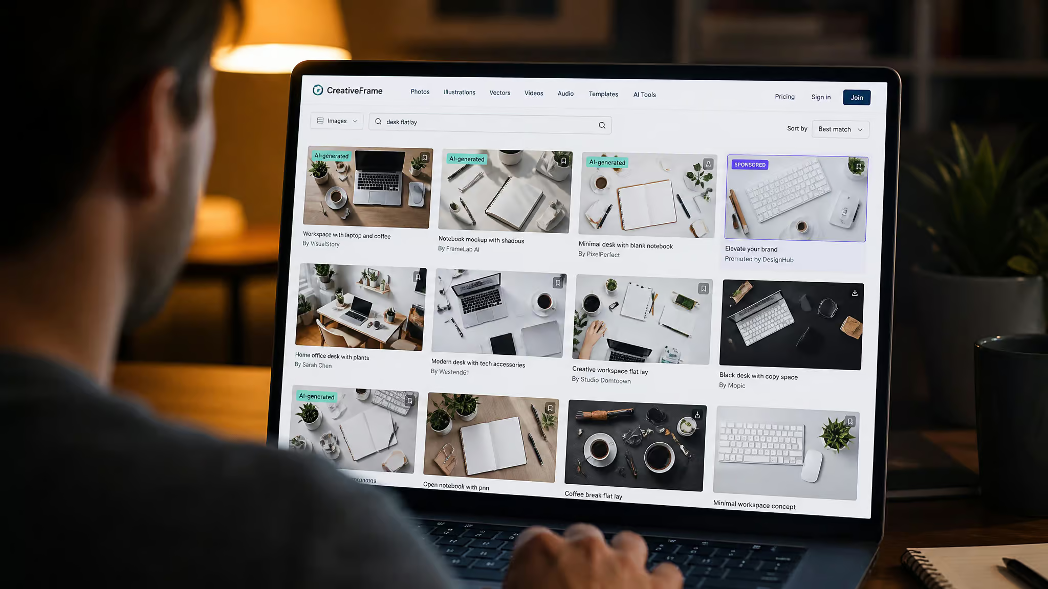
Let me dwell on that Pexels spread for a second, because the gap between 96.3K and 5K is the observation: nobody searches the purist term. Why fan out so wide, from 5K up to 642K for “table”? Because the genre just lives under adjacent, natural-language tags instead.
The AI layer is a labeled, filterable practicality rather than a moral crisis. Magnific marks its premium AI images, and the tell is sometimes delightful: the marble-desk flatlay with puzzle pieces is a classic “hmm, generated” moment, because puzzle pieces are exactly the kind of object an image model arranges with unsettling confidence. Vecteezy hosts AI flatlays too, asset 42402847, a pink feminine home-office flat lay, is both AI-generated and labeled as such, and its explicit AI Generated exclusion filter is a feature I will cheer for unironically. You can literally opt out of synthetic imagery with one checkbox. That’s the tooling working as intended.
Then there’s the monetization plumbing, visible if you know where to look, and it’s genuinely funny. Shutterstock routes result links through 7eer.net affiliate redirects; the tracking campaign string is right there in the URL. Pexels, a free site, interleaves sponsored iStock/Getty placements inside its own free results, one of which links to a competing iStock search. The free site is running ads for the paid competitor inside its grid, and the sponsorship parameters announce themselves in the URL if you view source. Vecteezy upsells its Pro/Plus tier (60M+ assets, unlimited royalty-free and 4K downloads) and pushes four preset/font/story bundles directly on its laptop-flatlay page.
Everyone is getting paid somewhere. You can watch it happen.
One provenance aside: both Magnific and Vecteezy credit Freepik Company S.L.U. in their footers, copyright span 2010 to 2026, but they still operate as distinct storefronts. Same parent, separate channels, no conspiracy.
Here’s the recalibration payoff, and it’s the reason this whole article exists: some of the most striking pinned “setups” never existed as physical desks. They’re generated composites or mockup templates. I’m describing a pattern across the platforms I dug through, not a statistic about Pinterest’s overall makeup, but the implication holds: if your reference image was never a real room, no amount of shopping was ever going to reproduce it. For free sourcing specifically, start with Pexels’ free tier and curated collection.
Magnific and Vecteezy both offer free downloads too. And check the license filter, Free / Pro / Editorial Use Only, every single time. That last one is the difference between a photo you can use and a surprise.
Red flag: A pinned “setup” that was generated or mocked up can’t be bought into existence — check the source before shopping.
The moving version: desk-culture video and who profits from it
Cozy desk setup tours are popular on YouTube because they’re relatable, cheap-looking in the best way, and endlessly chainable: Kai Notebook’s 2022 tour pulled 339K views on a 470K-subscriber channel, the Mix sidebar around it spans a whole desk-culture ecosystem, and the top comment is literally relief that nobody flexed a $300 monitor light. The video itself is a delight, chaptered by zone like a proper document, with comments citing the calming voice, the witty commentary, and the Animal Crossing background music, which is exactly the soundtrack choice you’d expect and it works.
The recommendation graph is where the genre reveals its size. Sean Study’s 6-hour Shanghai study-with-me on a Pomodoro 50-10 cycle sits at 2.4M views. Chill Crossing Hour jazz: 3.8M. Desk makeovers: 1.4M and 911K. Morley Kert’s I Hate Modern Desks… So I Built This. has 3.4M views, and it’s the genre’s rebellious maker cousin, the guy who looked at the whole aesthetic and built his way out of it. Upgrade-list videos pull 382K. Runtimes? Anywhere from 6:17 to a genuinely unhinged 6:01:01.
Six hours and one minute. Someone put six hours of desk ambiance on the internet and 2.4 million people said yes.
The pattern underneath is the same one from the comment section: relatability out-performs luxury. The videos that win aren’t the ones with the most expensive gear; they’re the ones that feel like a desk you could actually have, plus a vibe.
And the economics are honest, mostly. The genre is affiliate-monetized end to end. Kai Notebook discloses Banggood links, which is the transparent version of the plumbing; the undisclosed version is everywhere else. That’s also why gear-heavy advice dominates the space: follow the links and you find the business model. When a setup video tells you the aesthetic requires a purchase, check whose checkout page the description links to.
The untaught half: night-mode and on-screen laptop snaps
The cozy low-light and screen-first snaps people actually post at midnight are the half of the genre the stock catalogs erase, and if you’ve been calibrating your night shots against daylight mockup rules, you’ve been graded on the wrong rubric. The stock pipeline structurally can’t represent this sub-genre: blank screens and even daylight are merchandising constraints, not social conventions.
The social-native night shots have names you’ll recognize on sight: the late-night Netflix or movie glow in a dark room, warm lamp or lit keyboard doing all the work; the late-night study shot with an open laptop, scattered notes, and a coffee going cold; the Spotify player screen captured as a mood; dark-mode code editors with ambient lighting behind the monitor. My evidence here is search-signal based, honestly stated: the stock catalogs barely cover these, which is precisely the point. This aesthetic lives where the catalogs don’t.
The other half is the screen itself as the aesthetic. Wallpapers, visible app UI, the laptop screen as a deliberate prop. Here the catalogs are doing the exact opposite of the audience: stock mockups blank the screens on purpose, while real users keep asking what to put on them. Two conventions, pointed in opposite directions, sharing one keyword.
The good news is the free-wins logic from the gear section carries over intact. For a night setup, lamp placement and screen content cost nothing, and they’re the variables that actually change the image. A rare catalog datapoint proves even the stock world knows this: a cozy workplace photo with keyboard and notebook exists in the free tier, but it’s the exception that proves the daylight constraint.
So, the compressed version. The look is fully constructible: two camera heights, one light direction, 4 to 6 props around a single hero laptop, deliberate copy space, and one decision about the screen (blank or styled). That’s the entire formula, and you now have it for free from a website that sells it by the image.
The second half is the payoff that actually changes how you feel about your desk: once you can spot a mockup, a labeled AI image, and a sponsored placement, the pinned ideal stops being a standard and becomes a product. Some of those reference photos were never real rooms. The gap you felt between your desk and the board was partly marketing the whole time, which, if you’ve spent any time cutting through spec-sheet hype, should feel familiar. Same trick, visual layer. Your actual desk, one window, and two things removed from frame will get you further than any of it.
People Also ask
Where can I find free aesthetic laptop flat lay stock photos?
Pexels is the deep end for free stock, with 96.3K photos under ‘flat lay desk’ plus a hand-curated 79-item Desks collection — note that the ‘flatlay’ tag itself only has 5K, so search natural-language terms. Magnific and Vecteezy also offer free downloads. Always check the license filter (Free / Pro / Editorial Use Only) every single time, and watch for sponsored iStock placements interleaved inside Pexels’ free results.
How much does it cost to build an aesthetic desk setup for photos?
Mostly nothing. Everything that makes catalog flatlays work is staging, not spending: window light from one direction, a single plant, and cable discipline are free and unbeatable. The ceiling is whatever you decide a hobby is worth — a budget custom keyboard like a GamaKay LK67 with budget keycaps is a respectable tier-one-and-a-half addition — but gear cost and photo quality aren’t proportional.
What lighting and angles make laptop photos look good on social media?
Two camera positions carry the entire genre: the strict overhead flatlay and the 3/4 elevated view, which adds depth a top-down shot lacks. For light, direction matters far more than quantity — natural window light with soft shadows falling consistently in one direction is the catalog standard. If a flat shot won’t improve, the problem is above the desk (camera height and composition), not on it.
How can I tell if a desk setup photo on Pinterest is AI-generated or a mockup?
Check the source platform and its labels: Magnific marks its premium AI images, and Vecteezy labels AI entries and even offers an explicit AI Generated exclusion filter. Tells include unsettlingly arranged objects (like puzzle pieces in a marble-desk flatlay) and mockup conventions such as blank screens and copy space. If a pinned ‘setup’ was generated or mocked up, it can’t be bought into existence — which is why no amount of shopping ever reproduces it.