A product video opens with a sleek device, a glowing interface and a series of confident claims. It looks impressive, but by the end you still cannot answer a basic question: what does the feature actually do when someone uses it? Dreamina’s motion studio can help creators arrange text and graphics into a moving explanation. Check the current options available in your account. The value of the demo, however, depends on the decisions behind the visuals: which interaction to show, what information to verify and how to distinguish a concept animation from the behaviour of a real product.
Start with the user’s task
A feature name is not the same as a use case. “Smart workspace mode” may sound interesting, but a viewer needs to know what action it supports and what changes when it is used.
Imagine a fictional app with a focus timer. A user chooses a work period, starts the timer and sees the remaining time. That simple sequence is the feature’s job in this example. A useful demo could show those steps before discussing optional settings or design details.
The example app is invented; it is not a claim about a particular product. For a real demo, start with the current product specification and confirm what the feature actually supports. If the timer can be paused but cannot silence notifications, the visual should not suggest that it does both.
Write the task in one sentence: “A user starts a timed work period and checks how much time remains.” That sentence gives the demo a clear purpose and helps the team decide which screens and actions belong in it.
Choose the moment the feature becomes understandable
A demo does not need to reproduce every step in an app. It does need enough context for the viewer to understand the interaction.
For the focus timer, an opening screen might show the user choosing a duration. The next moment shows the start action; the final view shows the countdown. If the viewer sees only an attractive countdown, they may not know whether it is a timer, a video or a status indicator.
Think about what a first-time user would ask: where does the action begin, what choice is available and what happens after the selection? Those answers should be visible in the sequence or explained in accompanying text.
If setup, permissions or a compatible device are required, do not hide them simply to make the demo look seamless. You can keep a short visual focused while providing the necessary conditions in a caption or linked guide.
Decide what should be real and what can be illustrative
A product demonstration and a concept animation can look similar, but they make different promises. A screen recording shows what happened in a particular test environment. A recreated or generated interface can illustrate an idea, but it may contain labels, states or transitions that do not exist in the product.
For a released feature, an approved screen recording or verified screenshot is often the most direct source for interface details. A designer can add callouts, zooms or text around it to explain the interaction. If the interface changes by platform or version, identify the relevant version and avoid implying that every user will see the same screen.
A concept visual can be useful before a feature is built or when a team is exploring a possible interaction. Label it clearly as a concept or illustrative mock-up. Do not present an invented screen as footage of the live product.
Generated imagery may alter icons, text and timing. Compare every important element with the approved source, and use a conventional editor or design tool for details that need precise control.
Use motion to explain a relationship
Motion is most useful when it shows what changed or where the viewer should look next. In the timer example, the selected duration can be highlighted, the start control can be indicated and the resulting countdown can appear.
The animation should make the sequence easier to follow, not make the interface appear more capable than it is. If the real app requires a confirmation step, the demo should not silently skip it when that omission changes the viewer’s understanding.
Keep the previous state visible long enough to understand the change. A quick cut from a menu to a finished screen may be visually polished but leave the audience unsure which action connected them.
A simple pointer, highlight or label can be more informative than a moving camera. Choose one visual cue for each point and give viewers time to read. If several interface elements animate at once, test whether someone unfamiliar with the product can still identify the important action.
Build a motion brief from approved information
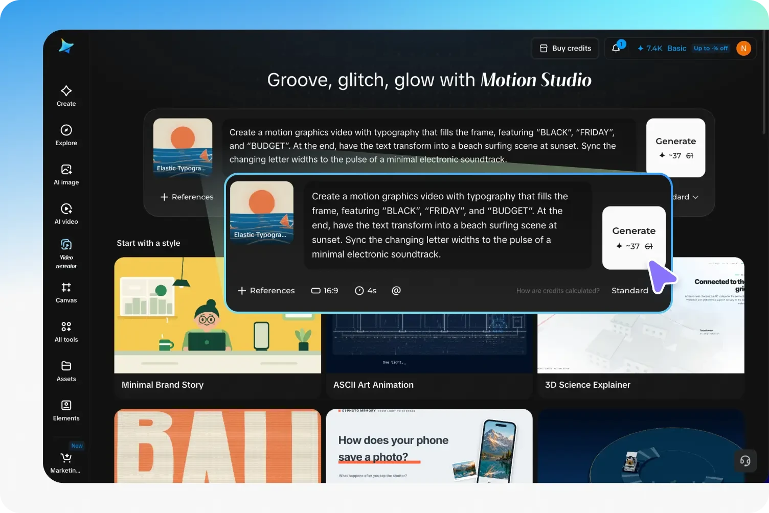
A useful brief includes the audience, the task, the source assets, the sequence and the statements that must remain accurate. It should also say whether the result is a product demonstration or a concept.
For the fictional timer, the brief might read: “Create an illustrative explainer showing a user selecting a work period, pressing Start and viewing a countdown. Use the supplied approved interface reference. Highlight one control at a time. Keep all labels readable and finish with a still frame identifying this as a concept.”
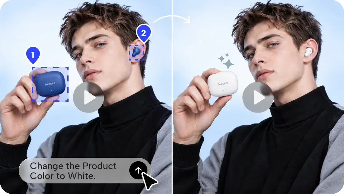
Use an authorised interface reference to guide the layout. After the first draft, request a longer pause on the Start control or a clearer label if the sequence moves too quickly. Compare the finished visual with the current product; for a claim about actual behaviour, use verified footage or approved screens rather than assuming the generated sequence is proof.
The workspace can develop a motion-graphics draft from a natural-language brief and refine text, layout and timing through follow-up instructions. Available controls may vary by account. Review the draft as an illustration; it does not verify that a recreated interface matches the actual software.
Replace the fictional example with approved details for the real product. Check the tool’s current terms before uploading screenshots, especially if they contain customer data or unreleased information.
Storyboard a feature in three moments
Imagine a fictional scheduling app with a confirmed feature that lets a user select an available meeting time and send an invitation. Instead of opening with a list of features, make the demo follow one task: “Choose a time that works and send an invite.”
First, show the starting point: the relevant scheduling screen and an unobtrusive label such as “Choose a time.” Next, focus attention on the actual selection, using a highlight or a slow zoom to make the action visible. Finally, show the real confirmation state and explain the result: “Invitation sent.” Use approved recordings or screenshots for the interface itself.
A practical motion brief could say: “Create a clean 15-second technology explainer around the supplied approved screen captures. Begin with the scheduling screen, highlight the available time selected, then transition to the supplied confirmation screen. Use a restrained blue-and-white palette, slow transitions and space for three short captions. Do not invent interface controls or product claims.” Adjust duration and presentation to the real footage rather than forcing the interface into an invented sequence.
Use motion to guide attention
Choose one visual emphasis for each moment. A highlight can point to the relevant control, a crop can remove unrelated interface elements and a transition can connect an action to its result. If all three move at once, the viewer has to decide where to look instead of following the feature.
Write captions that explain the action rather than repeat a vague benefit. “Select an available time” helps a viewer understand the screen; “Work smarter” does not explain the interaction. Add captions as editable text and check that they remain readable on a phone.
Check the claims that appear around the interface
A demo’s wording can imply more than its visual sequence shows. “Start a focus timer” describes an action. “Eliminate distractions” is a broader outcome that may not follow from the feature.
Ask what each claim requires. If the demo says the app blocks notifications, confirm the supported platforms, permissions and behaviour. If it says a device connects automatically, check the setup conditions. If it shows a result in a particular time, do not imply that timing is guaranteed unless it is supported and qualified.
A fictional interface must not display invented measurements, reviews or customer results as if they were real. If a number is used only to illustrate a design, label it as an example.
The viewer should be able to distinguish the product’s verified behaviour from a creative suggestion about how it might be used.
Make the sequence readable on the intended screen
A feature demo may be watched in a vertical social post, on a product page or during a presentation. The same interface capture may need a different crop in each placement.
Preview the final version at the size viewers will actually see. Are the controls and labels readable? Does a crop remove the button that explains the next action? Is there enough contrast between the callout and the screen?
Avoid shrinking a full desktop interface into a phone-sized frame if the key text becomes illegible. Consider a carefully labelled close-up, a separate card for the important instruction or a longer explanation alongside the video.
If narration contains essential information, provide accurate captions. A written summary or transcript can help viewers who cannot watch or prefer to read the steps at their own pace.
Test comprehension before testing performance
Before comparing views or clicks, ask someone unfamiliar with the feature to watch the demo once. Then ask: “What does this feature let you do?” “What step starts it?” and “Is this a real product screen or a concept?”
Their answer may reveal that a transition looked impressive but concealed a necessary step. They may also assume a capability the team did not intend to claim. Both findings are useful before the asset is published.
This is a comprehension check, not proof that the feature is easy to use or that the demo will improve conversions. A few viewers can reveal obvious confusion, but product usability and campaign performance need appropriate testing of their own.
If the answer is unclear, revise the sequence or wording. Adding more motion is not necessarily the solution; a pause, a clear label or an accurate screen capture may do more work.
Review the full asset and its destination
Before sharing, compare the final export with the current product and the approved brief. Check interface labels, sequence, claims, version information and any necessary conditions. Watch every transition, not only the opening and final frames.
Use screenshots, music, fonts, logos and other materials only with the necessary permissions. If the demo contains a customer’s information, remove or replace it with authorised example data. Keep a record of which product version and source assets were used so the video can be updated when the interface changes.
Make the destination useful too. If the video promises setup instructions, the linked page should provide them. If it introduces a concept, the page should not imply that the feature is already available.
A good tech demo gives the viewer a clear answer to a practical question. Motion can guide attention, but accurate product information and a sequence that makes sense are what turn an impressive-looking visual into a useful explanation.