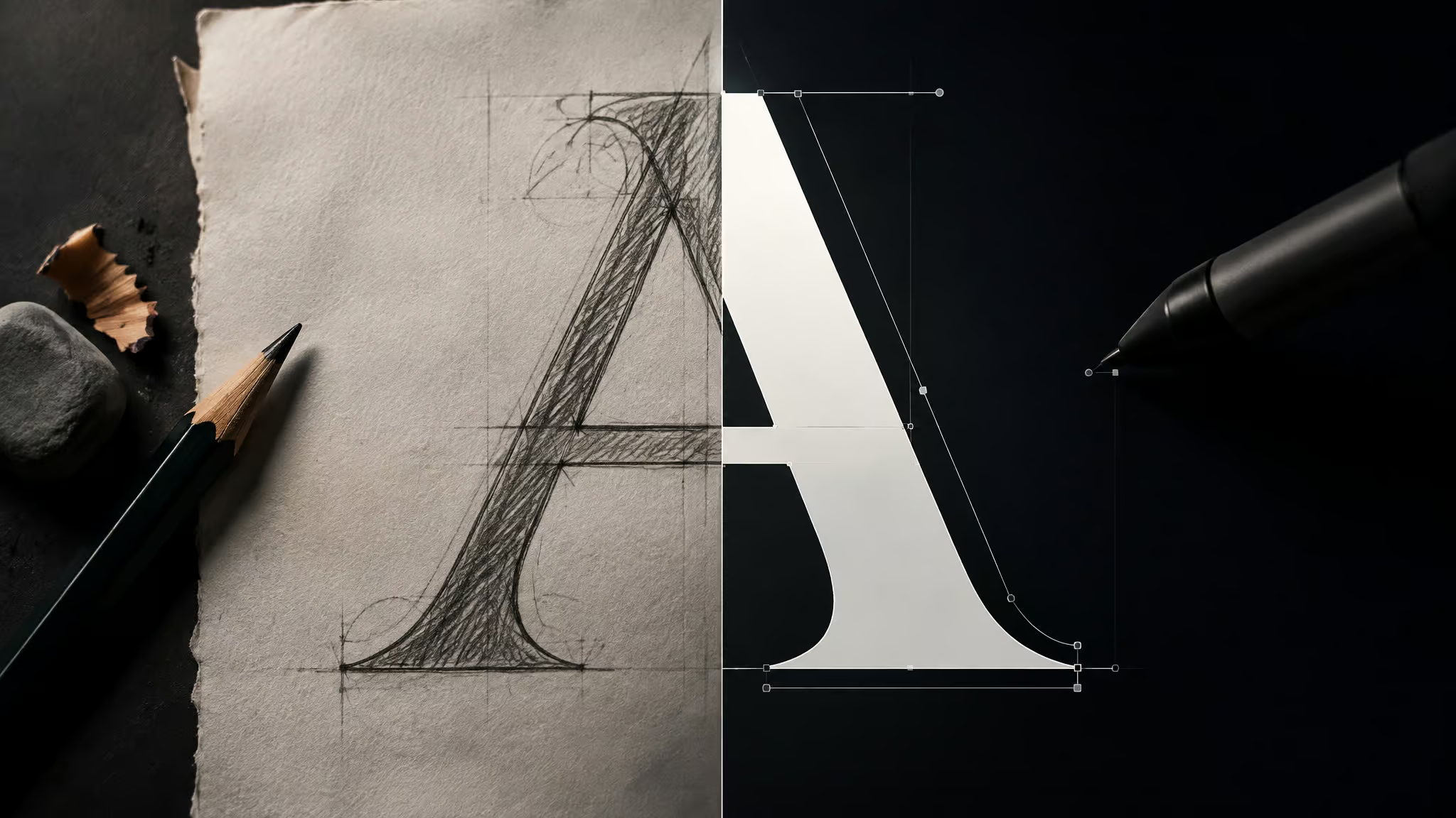
You’ve got letterform ideas, Illustrator is open, and you’re assuming there’s an “Export as .ttf” button hiding somewhere in the menus. There isn’t. Illustrator is a vector drawing tool, not font-creation software, so the real pipeline is: draw your glyphs in Illustrator, then hand them off to a plugin or external compiler that actually builds the font file. And before the keyword confusion bites: “AI” here means Adobe Illustrator, the classic designer workflow, not generative AI, though these days the question can AI generate font files has a real answer, with neural networks now producing complete typefaces from a single letter sample.
Illustrator has been the industry standard since 1985, and it’s the right drawing environment precisely because vectors are math, not pixels, so they scale losslessly. It just can’t finish the job alone.
Key Takeaways
A realistic first font is about 89 glyphs, exported as 89 individual SVG files, then compiled with Fontself Maker, IcoMoon, or FontForge.
Image Trace turns your sketches into editable vectors, but the cleanup sequence matters: Object > Expand, ungroup, then Magic Wand (W) to delete white fills.
The free routes are real: IcoMoon (web) and FontForge (desktop) cost nothing, while Fontself Maker is a one-time-purchase plugin that lives inside Illustrator.
Table of Contents
| # | Step | Key detail |
|---|---|---|
| 1 | Plan and sketch your letter set | Sketch letters by hand, then clean scans via Photoshop Threshold; reuse a lowercase ‘b’ as ‘d’, ‘p’, and ‘q’ for consistency. |
| 2 | Vectorize sketches with Image Trace | Use Image Trace to turn sketches into editable vectors, then Object > Expand and delete white fills with the Magic Wand Tool (W). |
| 3 | Set up artboards and alignment guides | Font artboards should use three horizontal guides, baseline (bottom), height (middle, top of lowercase), and cap (top, top of uppercase), placed by dragging from rulers, with |
| 4 | Draw and refine your letterforms | Organize glyphs by category into layers; use Blob or Calligraphic Brush with a tablet, or the Pen Tool if drawing with a mouse. |
| 5 | Export each glyph as an SVG | Save every glyph as its own SVG with default settings, organized by character name, ready for a font-making program. |
| 6 | Install, test, and put your font to work | Open zip, open fonts folder, double-click .ttf, click Install Font; test in Microsoft Word by typing font name in dropdown |
| 7 | From first font to sellable product | Fontself Maker: In-app font creation via purchased plugin accessed through Windows > Extensions; auto-assigns dragged letters, automatic kerning, style labeling |
| 8 | Adjacent Illustrator font workflows: file exchange and text-to-object | Use AIX with Maps for Adobe Creative Cloud to preserve layers in *.AI files, and check OFF Embed Fonts to avoid import issues. |
Plan and sketch your letter set
The step-by-step answer is a five-beat sequence: draw your letters, import and vectorize them, tweak them, save them as SVGs, then use the compiled font. Everything starts at the draw step, and it starts with planning shared letter structure, not drawing every character in isolation. Sketch by hand on paper, or digitally in Photoshop or Procreate on an iPad. Freehand drawing directly in Illustrator is also completely valid. If you’re sketching in a drawing program, turn on grid lines so you can informally track letterform height and width as you go.
Here’s the hack that made me grin when I first read about it: one good lowercase ‘b’ becomes ‘d’, ‘p’, and ‘q’ with flips and reshapes. The wikiHow author behind the numbers in this article got four characters out of one. Honestly kind of elegant.
Optional cleanup before any of this hits Illustrator: if your scan is muddy, run Image > Adjustments > Threshold in Photoshop to force clean black-and-white. Your trace will thank you, but it’s a nice-to-have, not a gate.
Vectorize sketches with Image Trace
Image Trace is the button that turns your imported sketch into an editable vector graphic, and with Preview enabled it’s essentially automatic. Hit Trace and watch your pencil lines become math. That scan-to-vector hop is the whole reason this works: it captures line length, ascenders, and descenders, not just a pretty picture.
Then comes the inseparable cleanup sequence: Object > Expand turns the trace into real vector objects, ungroup them, then grab the Magic Wand Tool (W) and select and delete the white-filled objects.
For handwriting-style lettering, enable ‘ignore white’ and set smoothing to around 5%. Save those trace settings as a reusable preset and apply them across every character, because retuning the panel 89 times is nobody’s idea of fun.
A common first-attempt mistake: traces at default settings come out muddy, with stray white shapes littering the artboard. The ‘ignore white’ plus 5% smoothing combo, followed by the Expand-and-delete cleanup, is what fixes it.
Quick test: Muddy trace with stray white shapes? Enable ignore white, set smoothing near 5%, then Expand and delete the white fills.
Set up artboards and alignment guides
Consistency across a whole alphabet comes from two things: artboards plus guides, and there are two legitimate ways to set the guides.
Artboard specs
Set each artboard to 350 px × 350 px, in pixels, not points. That parenthetical is the real gotcha; the pixels-versus-points slip is the mistake people actually make. A font with uppercase and lowercase needs 52 artboards, and the count scales with your character set, so add more for numbers and punctuation. One Envato tutorial author took a different route and sized the whole document to their largest letterforms at 0.55 in × 1.26 in.
That’s one person’s choice, not a spec. Pick your own.
Two ways to set your guides
The wikiHow method is three horizontal guides per artboard: baseline at the bottom where letters rest, height in the middle at the top of lowercase, and cap at the top for uppercase. Drag them from the rulers (View > Rulers > Show Rulers), with height and cap slightly closer together than even spacing. It’s a 30-second setup that saves hours.
Max Jung’s method is the one I’d call tiny wizardry: use real letters as your rulers. The letter H gives you top and bottom alignment lines, and X gives you the middle. No ruler-dragging, just typography calibrating itself.
Placement conventions, all optional design decisions rather than standards: letters without descenders sit on the baseline, descenders like p, g, j, and y all hit a shared line below it, asterisks sit highest, plus signs land near the midpoint, and lowercase letters other than l, h, t, k stay under the lowercase top line.
Draw and refine your letterforms
The right drawing tool depends on your input device and target style, not on any flat ranking.
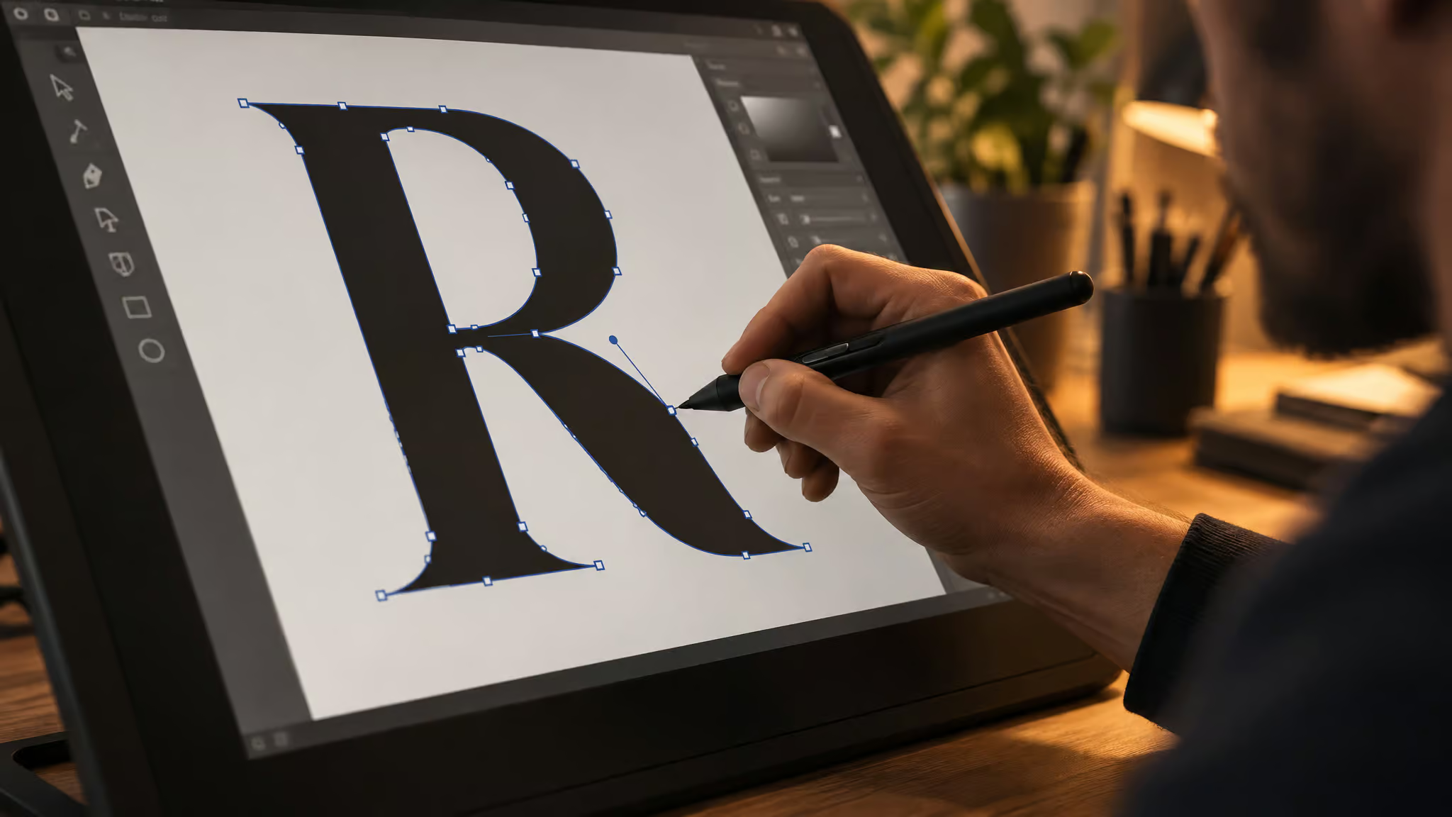
Which drawing tool fits your setup
- Calligraphic Brush (Window > Brush Libraries): the pick for hand-drawn, chiseled-marker styles, and it shines with a pressure-sensitive tablet. The wikiHow author drew all 89 glyphs this way.
- Pen Tool: the mouse user’s lane, no stylus required. Click points for straight lines, click-hold-drag for curves, Enter ends the path. Great for letters like L and R.
- Blob Brush vs Brush Tool: this is the object-model fork that changes how you refine later. Blob Brush creates each letterform as a single filled object; Brush Tool creates editable paths you can restyle with different brushes. Pick based on how you want to edit.
Redraw and refine
This is where the font actually gets good. It’s still hand work, even though can AI generate fonts is a fair question these days. Work on a layer above each letter, show one letter at a time, hide the rest, and draw over your own work to clean it up. Let like characters influence each other as you go. Refine punctuation too: the wikiHow author redrew an oversized hashtag smaller and chubbier, and that detail is exactly the kind of obsessing this stage deserves.
Organize into category layers
Sort everything in the Layers panel into lowercase, uppercase, punctuation, and numbers. Size numbers near uppercase; punctuation placement is experimental, so play. Yes, it’s tedious. It’s also the boring-but-smart move that makes an 89-character project manageable instead of maddening.
Export each glyph as an SVG
Every glyph must become its own SVG file, and the export happens through File > Export for screens with ‘All’ selected, then Export Artboard. The ‘All versus Range versus Full Document’ selection is the trap. Pick Range and you get a subset. Pick Full Document and you get one giant file, which is exactly what you don’t want. ‘All’ is what turns every artboard into its own SVG in one pass, so you’re not hand-exporting 52 files.
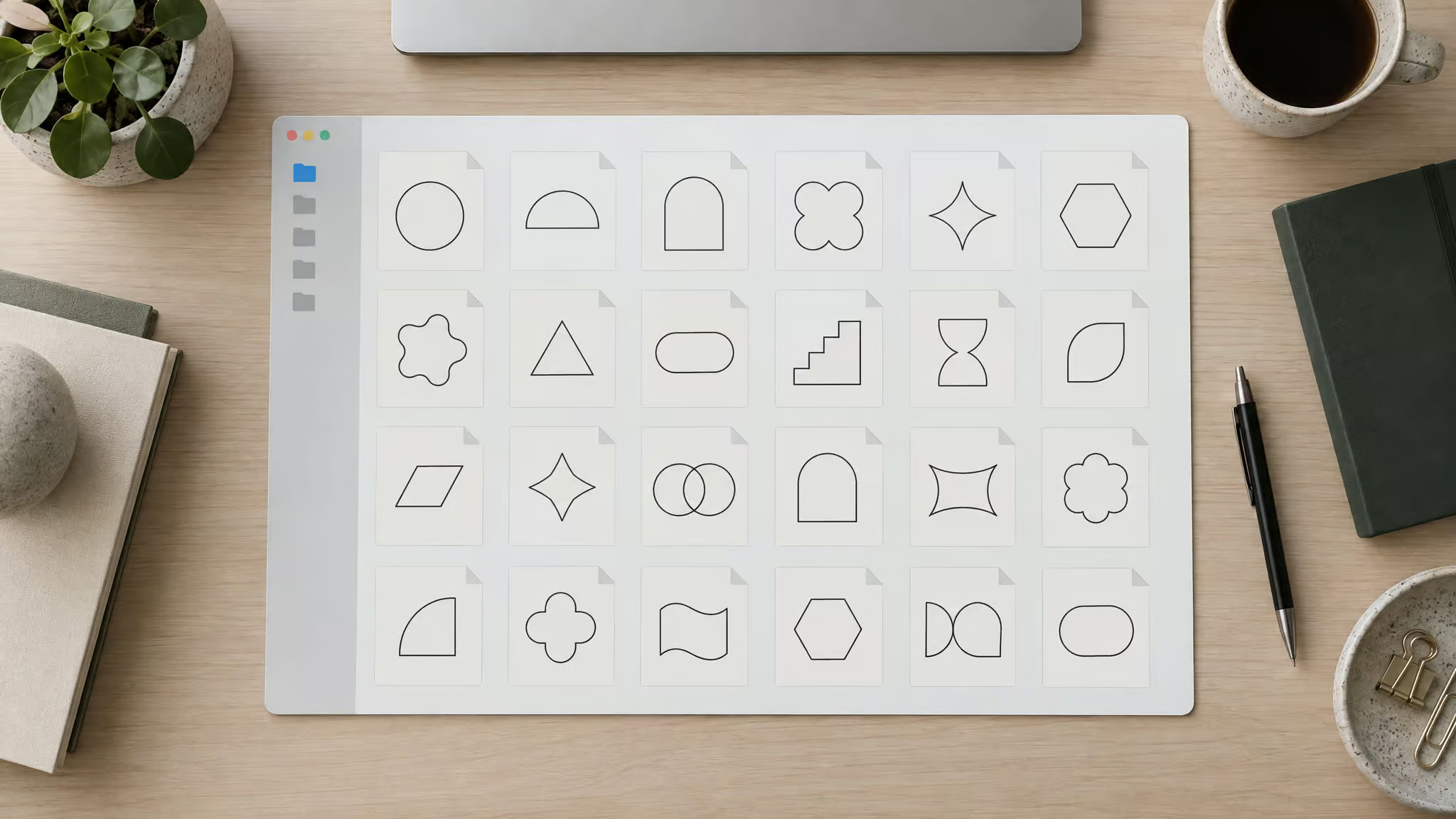
The routine is simple enough to pin above your desk:
- One glyph per artboard
- One SVG per glyph
- Named by character
- Organized in a folder
- Default SVG settings
Red flag: Range exports a subset; Full Document exports one giant file; All gives every artboard its own SVG.
The wikiHow author’s font was 89 characters, exported as 89 SVG files, and after optimization each file shrank from around 800kb to 1kb or less. Eight hundred kilobytes down to one. That’s the most quotable stat in this entire pipeline.
The common export mistake looks like this: you export one massive file, or your SVGs come out bloated, and then the font tool either chokes on the import or stacks every glyph onto a single slot. The fix is the discipline above: per-glyph artboards, per-character filenames, and lean files. If your exported font “won’t work” later, bloated SVGs and single-file exports are the documented culprits, and they’re both fixed at this stage, not in the compiler.
Compile your glyphs into a font: Fontself vs IcoMoon vs FontForge
Three tools compile Illustrator glyphs into a font file, and the choice is cost-tiered. If you were wondering whether there’s a free font maker plugin for Illustrator: yes, two of these three routes cost nothing.
Fontself Maker (paid, in-app)
Fontself Maker is a one-time-purchase extension that lives under Windows > Extensions, right inside Illustrator. You drag letters in and it auto-assigns them to the right slots, which still feels like a small magic trick every time. It handles automatic kerning, labels styles like regular, bold, and decoration, assigns special characters to keys, and installs the font within Illustrator while you’re still adjusting it. The low-friction route, and the only one of the three that costs money.
IcoMoon (free, web)
You can do this without buying anything. IcoMoon runs in the browser: Import Icons loads your SVGs, then rename the set via Properties > Edit Metadata. You get four editing tools, Rotate/Mirror, Move, Scale, and Canvas/Alignment, which is genuinely capable for a free tool. Then Select all, Generate Font, and assign Unicode per file by typing the actual character.
Unicode, in one line, is what maps your keystrokes to glyphs. Name the font under Preferences, hit Download, and you get a zip with an installable .ttf inside.
FontForge (free, desktop)
FontForge is the external desktop app option for importing your character set, covered as the part-two route in the wikiHow tutorial. Keep it in your back pocket as the third lane, not a rivalry.
The pattern to know about: many first-time font makers finish their glyphs and then stall right here, because they assumed Illustrator could output a font directly. It can’t, and this section is the handoff. The choice hinges on budget and whether you need hands-on kerning control. Fontself automates kerning; the free tools don’t claim to match that, so weigh what your font needs.
Install, test, and put your font to work
Installing the finished font is a five-second finale: open the downloaded zip, open the fonts folder, double-click the.ttf, click Install Font. Your font is now a real font, and yes, it’s delightful.
Then verify it somewhere that isn’t the artboard. Type the font name into Microsoft Word‘s font dropdown; Word as the test bench is a charmingly low-tech final boss. If it shows up and renders, you’re done.
Custom fonts work across Creative Cloud, so the same font shows up in Photoshop, XD, and Premiere. For context on why you’d bother: Adobe Fonts offers 17,000+ activatable fonts across those apps, plus third-party plug-ins to help finalize and manage your own. Even with a library that huge, people still make their own fonts, usually because existing ones are too expensive to license or just lack the details they want. The font you want doesn’t exist yet, so you made it.
From first font to sellable product
Yes, you can make a handwriting font from iPad drawings, and the documented pipeline is Procreate ? Illustrator ? Fontself Maker. It has already produced a sold product. Max Jung turned his handwriting into Offcut, a multi-style font family, by drawing characters in Procreate on the iPad, exporting JPEGs, tracing them in Illustrator with ‘ignore white’ enabled and around 5% smoothing, then building the font with Fontself Maker. His demo dragged 26 uppercase letters straight into Fontself, and he sells Offcut on Gumroad. Receipts matter, and that’s a real one.
Envato Elements is another channel for selling fonts. On cost: the pipeline’s tools are either a one-time Fontself purchase or free, via IcoMoon and FontForge. That’s the whole budget conversation. The Offcut case proves the pipeline is replicable, not that income is guaranteed, but replicable is the part you control.
Adjacent Illustrator font workflows: file exchange and text-to-object
Two other Illustrator font-adjacent things, clearly not font-making. Object > Expand converts text into vector outlines, and if you inherit outlined text, Illustrator’s Retype (Firefly-powered) can identify the font and convert it back to editable text, searching Adobe Fonts and local fonts for matches. Separately, AIX (Illustrator Exchange), used with the ArcGIS Maps for Adobe Creative Cloud plugin, produces native *.AI files. Illustrator’s own file format, that preserve layers and symbology, replacing problematic PDF exports. One caveat: certain fonts cause Illustrator to misinterpret text properties on import, so check Embed Fonts off or use a basic font and change it later.
Frequently Asked Questions
How do I create my own font in Illustrator step by step?
The pipeline is five beats: draw your letters (on paper, in Procreate or Photoshop, or freehand in Illustrator), import and vectorize them with Image Trace, refine them on artboards with alignment guides, export each glyph as its own SVG via File > Export for screens with ‘All’ selected, then compile the SVGs into a font with Fontself Maker, IcoMoon, or FontForge. Illustrator can’t output a .ttf itself — the compiler step is mandatory.
What’s the difference between Fontself Maker, IcoMoon, and FontForge?
The choice is cost-tiered. Fontself Maker is a one-time-purchase extension inside Illustrator that auto-assigns dragged-in letters to the right slots and handles automatic kerning. IcoMoon is a free web tool with Rotate/Mirror, Move, Scale, and Canvas/Alignment editing tools, plus manual Unicode assignment. FontForge is a free external desktop app for importing your character set. The trade-off: Fontself automates kerning; the free tools don’t claim to match that.