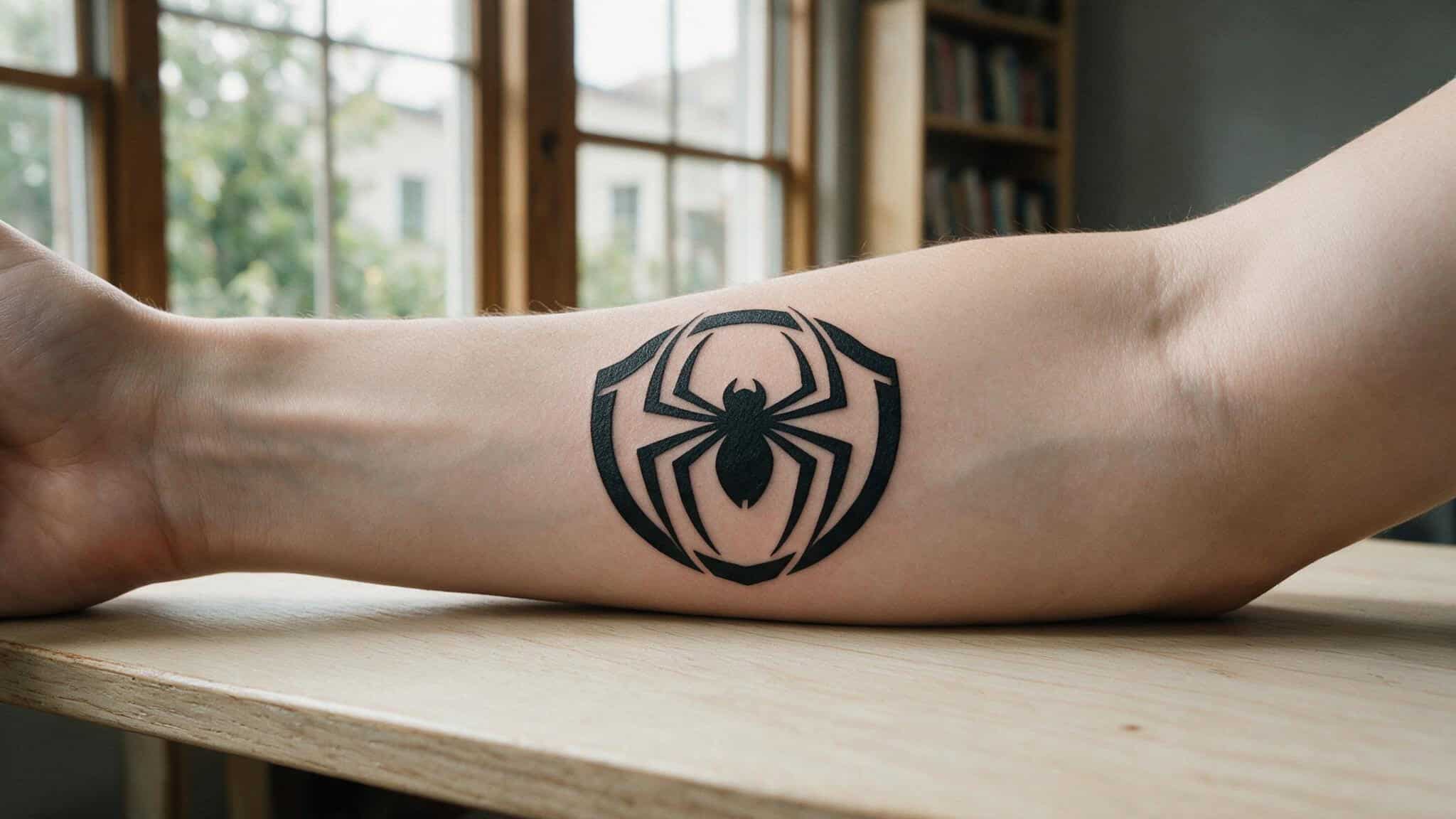
Spider-Man’s visual identity was built to work at its most distilled. When Stan Lee and Steve Ditko dropped Amazing Fantasy #15 in 1962, they weren’t chasing photorealism. They were chasing readability. Bold outlines, clean shapes, a color palette that pops from a newsstand rack.
The character turned 59 in 2021, and that same stripped-back design language is why some of the best Spider-Man tattoos aren’t elaborate sleeves or hyper-detailed portraits. They’re the ones that look like they stepped right out of a Ditko panel.
I’ve been digging through tattoo galleries, and there’s a pattern that keeps surfacing: the most effective small Spider-Man tattoos aren’t scaled-down versions of complex pieces. They’re designs that work because they’re simple. Minimalist tattoos have this “surprise effect” — from a distance they read as abstract geometry or a cool shape, then up close the fan recognition hits. That’s a different kind of satisfaction than a photorealistic portrait.
If you want a Spider-Man tribute without the skin commitment of a full mural, you’re not settling. You’re making a historically grounded choice. Let’s walk through the designs that prove it.
Key Takeaways
Spider-Man’s 1962 comic-book visual identity was built for readability — bold outlines and clean shapes make simple tattoos a faithful return to those roots, not a compromise.
The spider logo in solid black ink is the most scalable option: at 1–2 inches it stays crisp and recognizable, while a full-body Spider-Man at that size turns into a muddy blur.
Minimalist masks and abstract spider-sense motifs create a “surprise effect” that only other fans decode — perfect for the geek who wants their ink to be a conversation starter, not a billboard.
Table of Contents
The Classic Spider Logo — One Shape, Full Identity
It’s elegant — the spider emblem doesn’t suggest Spider-Man. It is Spider-Man. One shape, full identity. No costume, no mask, no pose needed.
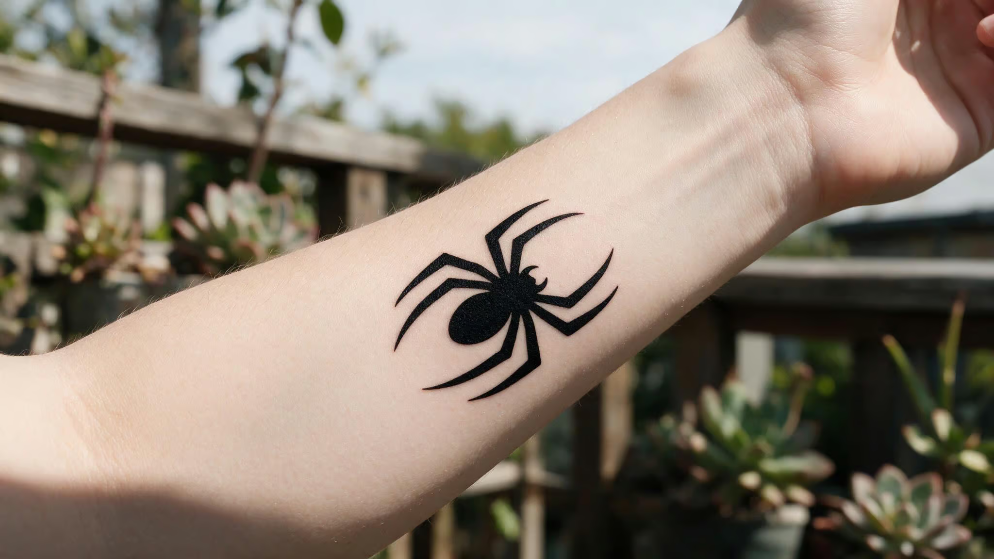
The logo works best in solid black ink because that’s where you get contrast and longevity at small sizes. A 1–2 inch spider on your inner forearm? Readable. Compare that to a scaled-down photorealistic full-body Spider-Man at the same size — you’d lose the face, the web lines would bleed together, and you’d end up with a dark blob that requires explanation. The logo sidesteps that problem entirely.
It also scales beautifully. Fingertip, palm, shoulder, behind the ear — the logo adapts without losing its punch. Artist Steph Alvarez at Main Street Tattoos in Merced, CA has shown how even a small spider emblem can read cleanly when the line weight is right. That’s the structural advantage of a design that was born in a 1962 comic panel: it was already optimized for small reproduction.
Minimalist Mask Line Art — The Surprise Effect
A minimalist mask tattoo is the closest thing to a geek signal. From across the room, it looks like a clean line drawing — maybe abstract geometry, maybe an expressive curve. Then someone steps closer and the eyes click: that’s Spider-Man.
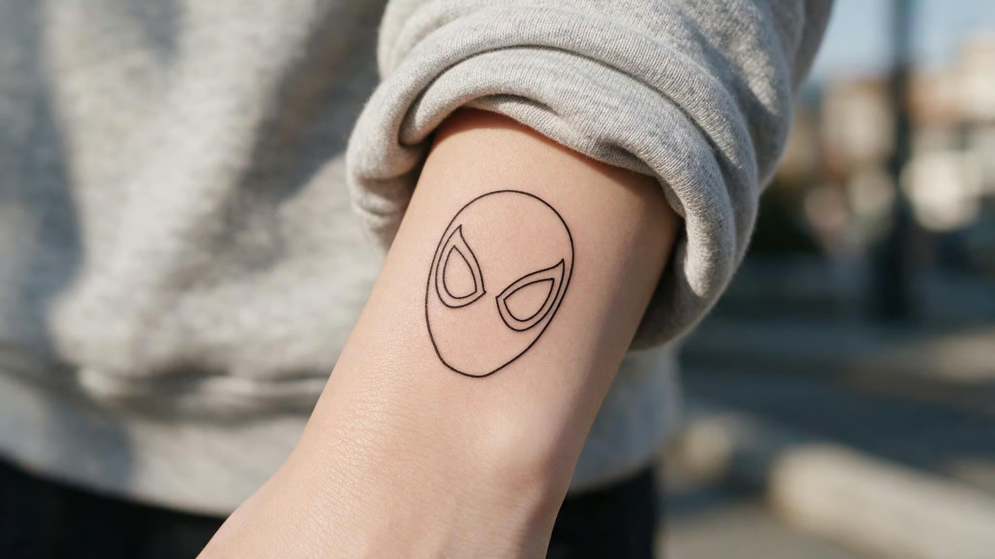
The key is the outline-only approach. No shading, no color, just the mask’s shape and those expressive eyes that Ditko made iconic. The “surprise effect” — small, subtle designs don’t announce themselves immediately, and the reveal is part of the fun. Non-fans see a cool shape; fans see the wall-crawler instantly.
You can pair a mask outline with a small web accent or a single tiny spider without losing the minimal feel. For a first Spider-Man tattoo, it’s hard to beat Spiderman tattoo ideas with meaning.
Web Pattern Accents — Geometric Art or Geek Signal
A web pattern on the wrist is the tattoo equivalent of a secret handshake. Anyone who’s seen a Spider-Man movie or cracked open a comic will recognize those web lines.
That dual-reading quality is what makes web accents versatile. They work as standalone elements or as background texture alongside a logo or mask. The wrist is a natural spot because the pattern wraps around like a bracelet, but an ankle or behind the ear works just as well.
For someone considering their first tattoo, a simple web band is risk-free — subtle enough to hide under a watch or sleeve, geeky enough to make you grin when you catch someone else noticing it.
Symbolic Elements — Spider-Sense and Abstract Spider Motifs
Simple Spider-Man tattoos don’t depict the costume at all — they reference the character’s mythology. A spider-sense tattoo uses radiating lines from a central point to represent that tingle before danger hits. It’s abstract. Only fans decode it.
Then there’s the small spider with simplified legs — a minimalist character reference that doesn’t need the full red-and-blue suit. Artist Steph Alvarez at Main Street Tattoos in Merced, CA pulled off a Spider-Sense piece that proves you can carry decades of character history in a few clean lines. For those seeking a more aggressive look, Spiderman tattoo ideas for guys often feature full sleeves with dynamic action poses or chest pieces centered on the classic red-and-blue suit. Jenn Small at Archery Tattoo in Charlotte, NC did a Wandavision/Marvel Universe tribute that wraps multiple fandom nods into a compact, readable design.
These are the tattoo equivalent of a haiku — minimal but complete. No wasted ink, no filler, yet like these Star Trek tattoo ideas, they can be mathematical poetry mixed with deep space vibes.
Placement and Visibility — Simple Designs Thrive in the Open
Here’s the counterintuitive rule: small simple designs actually prefer visible spots. A logo on the wrist reads clear. A full-body Spider-Man on the same spot? Muddy mess.
The best placements for these minimalist pieces are the ones where clean lines can do their job without competition:
- Wrist — web patterns wrap naturally; logos sit in the center
- Inner forearm — enough real estate for a mask outline or spider emblem
- Ankle — subtle, easy to show or hide
- Behind the ear — tiny mask or spider logo, almost hidden
- Finger — micro spider emblem, very low commitment
- Hand — bold but visible; requires careful artist selection to avoid blowout
Hand tattoos carry their own considerations. The source notes they’re “expressions of identity, creativity, and rebellion,” but the skin on hands is different — faster fading from washing, higher blowout risk with fine lines. A simple design lowers that risk because clean bold lines hold better than intricate shading. But if you go hand, commit to sun protection.
The common mistake I see in galleries: people bring in a detailed full-body Spider-Man image and ask the artist to shrink it to palm size. That never works. The detailed elements compress into each other, and within a year the tattoo looks like a bruise. Start simple, keep it simple, and let the placement do the work.
Aftercare for Color Longevity — Simple Doesn’t Mean Maintenance-Free
Here’s the catch with Spider-Man’s color palette: those bold reds and blues that make him instantly recognizable are also the most UV-sensitive inks in tattooing. The source is explicit — red and blue pigments are particularly susceptible to fading if not properly maintained.
A simple spider logo in solid black ink? Low maintenance. Black fades less, and clean line work stays readable for years with basic care. But if your simple design includes any red or blue elements — even a small colored spider or a web line, you’ve got a sun-protection commitment.
UV exposure hits red pigment hardest. That classic costume red can turn dull brownish within a few years if the tattoo lives on a wrist or hand that sees daily sun. Moisturizing helps keep the lines crisp, but the real trick is sunscreen. Small tattoos often get neglected because people assume “it’s small, it’s fine.” Small exposed spots get full sun without the coverage a sleeve would provide.
For black-ink-only designs, the risk is lower but not zero. Line blowout and fading still happen. The difference is that a black logo that fades a bit is still recognizable. A faded red spider becomes an indistinct blur. Choose your pigment accordingly.
Evolution from Simple to Photorealistic and Back
Spider-Man tattoos have come a long way since the 1960s. They started simple — bold comic-style outlines, flat colors, clear readability. Over the decades the trend shifted toward photorealistic portraits, dynamic action scenes, and complex shading. That’s impressive craftsmanship, but it created a gap for fans who wanted something quieter.
The pendulum is swinging back. Simple designs, traditional comic book style with bold outlines — that’s popular again. Those Ditko-era lines age better than any photorealistic portrait. They were designed to be read at a glance, and on skin that means they stay readable through the natural wear of years.
Choosing a simple Spider-Man tattoo isn’t settling. It’s the thoughtful play. You’re honoring the character’s original visual DNA — the same shapes that made him instantly recognizable on a 1962 newsstand. What started as a necessity of comic printing is now a deliberate design choice for longevity.
The Small Ink That Says Everything
The most iconic Spider-Man tattoo might be the simplest one: the spider emblem. It carries everything — the hero, the struggle, the 1962 origin and the whole mythology. One shape. That’s it.
A small spider logo, a mask outline, a web pattern — these aren’t compromises. They’re distillations. Sixty-plus years of character history compressed into clean lines that any fan recognizes in half a second. That’s an impressive trick for a piece of ink that fits behind your ear.
The ultimate geek tribute doesn’t need to scream. It just needs to be recognizable.
People Also Ask
What does a Spider-Man tattoo mean?
A Spider-Man tattoo often symbolizes responsibility, resilience, and the everyday struggle of balancing ordinary life with extraordinary challenges. It can also represent a deep connection to the character’s 1962 comic-book origins and the idea that heroism comes from within, not from powers alone.
What is the best small tattoo for a man?
For a small, impactful tattoo, the classic spider emblem in solid black ink is a top choice — it’s instantly recognizable, scales down to 1–2 inches without losing detail, and works on spots like the wrist, inner forearm, or behind the ear. Minimalist mask line art or a web pattern accent are also strong options that read as intentional design rather than a scaled-down version of a larger piece.
Why does a simple Spider-Man tattoo age better than a detailed one?
Simple designs with bold outlines and solid black ink stay readable over time because they don’t rely on fine details that blur or fade. A scaled-down full-body Spider-Man can turn into a muddy blob within a year, while a clean spider logo or mask outline remains crisp and recognizable even as the skin naturally changes.