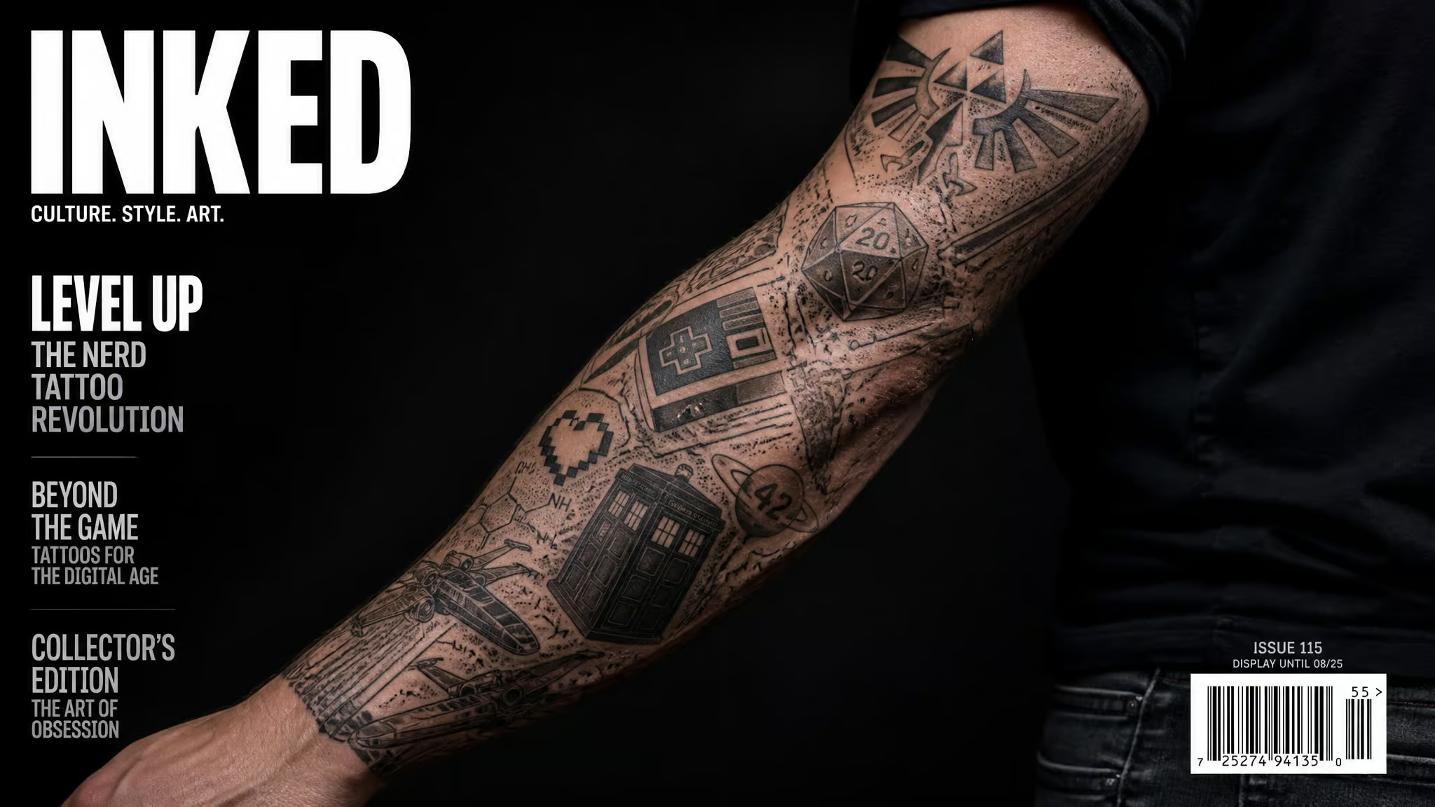
There’s a specific fear that stops a lot of us from ever booking that first appointment: you love three franchises, not one, and the mental image of your future arm looks like a sticker book that lost an argument with a scrapbook. Zelda next to Berserk, all fighting for attention, none of it landing. So here’s the reframe I found after falling way too deep into this rabbit hole: a nerdy tattoo sleeve is usually a patchwork sleeve. That means individual tattoos placed on one arm over time, each standing completely on its own, but together forming one unified visual story.
That’s different from a traditional sleeve, which is conceived as a single continuous image mapped across the whole arm from day one. And patchwork isn’t a compromise. It’s a collector tradition. American Traditional sailors and soldiers got inked one port at a time, adding pieces in other countries a year later.
They weren’t executing a master plan. They were collecting. The multi-fandom arm is that same instinct with better lore.
Key Takeaways
Cohesion comes from a consistent visual language (palette, line weight, style, scale), not a shared universe; experts Erin Odea and Becca Genné-Bacon both said a theme is “not at all” required.
Expect 20 to 40+ hours across multiple sessions, with pricing usually hourly (per Genné-Bacon), so building a piece or two at a time is the budget-friendlier path.
Protect negative space early: hero pieces go on the outer bicep, outer forearm, or flat of the inner forearm, and crowding your first tattoos limits everything you can add later.
Table of Contents
One big design or patchwork? Choosing how your fandom sleeve gets built
Here’s the decisive fork: commit to a single-image sleeve only if you’ve committed to one universe and one lead artist. If your tastes might shift (and ours always do), patchwork is the build that tolerates it.
A single-image sleeve works like planning a big build before writing any code. The artist maps the whole arm up front, then fills it in over multiple sessions. Becca Genné-Bacon, who tattoos at Kings Avenue in New York City, iterates session by session because designs on paper don’t always translate to skin. That’s true of every big project: the mockup and the real thing disagree, and you adjust. It’s also possible to build a single-image sleeve around tattoos you already have, though it’s constrained. Not all old pieces fit a new design, and some areas of the arm limit what you can add.
Honest caveat: single-image fandom sleeves absolutely exist. One planned anime scene mapped shoulder to wrist is a real thing people do, and it can look incredible. Don’t let anyone tell you every nerd sleeve has to be patchwork. But patchwork is a hugely common route to a sleeve for a reason: the ink grows alongside your life. You don’t need the whole roadmap on day one, and you can add work from every artist you love.
You don’t need one fandom, you need one visual language
Cohesion comes from a consistent visual language, not a shared universe. Palette, line weight, style, scale. When those line up, pieces from completely unrelated stories read as one arm. When they don’t, even two pieces from the same franchise can clash.
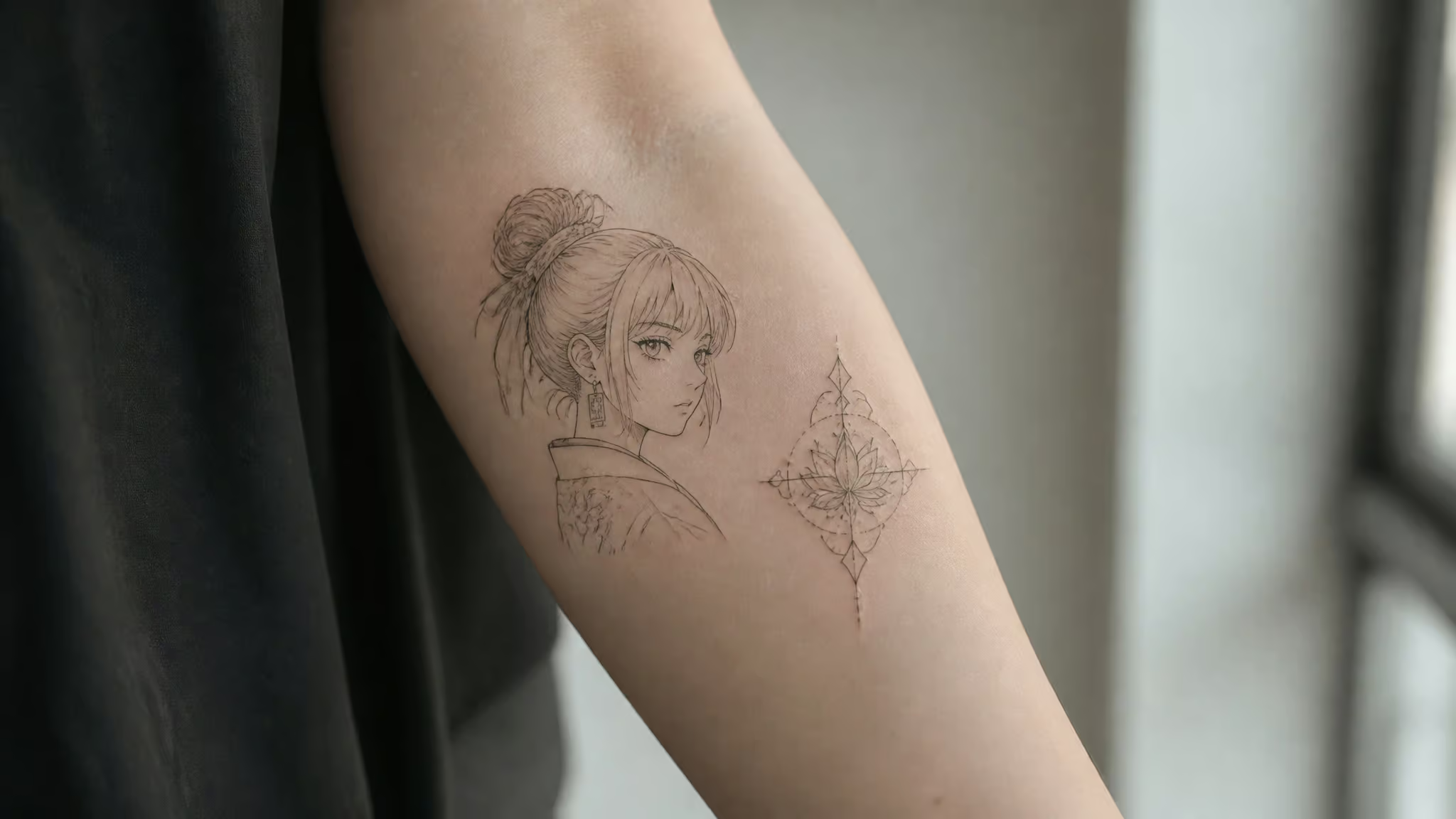
Erin Odea, owner of Crossed Keys Society in Fort Lauderdale, and Genné-Bacon both said a theme is “not at all” required. Sticking to one can be fun. It’s a necessity for exactly nobody.
Anchor decision: commit up front or let it emerge
Pick your hero fandom before anything else and let it anchor the arm, or get your three or four favorite pieces first and let the anchor emerge from what you actually chose. Experts endorse both. Either works, as long as the pieces share style, scale, or palette.
Pick the mode that matches how you actually operate. If you’re the kind of person who specs the project before ordering parts, commit up front. If you prototype by building, collect first.
For context, common sleeve themes run through nature, mythology, Japanese traditional, personal mottos, wildlife, religious and cultural imagery. Fandoms are an extension of theme commitment, not a replacement for cohesion. Choosing “all things Ghibli” is choosing a theme. Choosing “everything I’ve ever loved” is choosing a visual language problem, which is a solvable one.
Proof by analogy: the horror movie and the grandmother
Here’s my favorite detail from the whole research dive. Genné-Bacon has a client with a forearm tattoo of an obscure horror movie sitting right beside a bicep tribute to their grandmother. Completely unrelated subjects. Totally different emotional registers.
It coexists through shared craft. That’s the whole mechanism in one example. The same thing lets a Zelda piece sit beside a Berserk piece. Fandom and family on one arm, and it works, because what holds them together is the making, not the plot.
Matching tattoo style to fandom source material
The working rule: match the rendering technique to the source material’s actual art style, and you’re most of the way to cohesion. A few reasoned pairings (these are logic, not artist-verified laws):
- Fine line and single-needle for delicate game iconography and UI-style imagery. Controller emblems, sigils, small motifs. These styles don’t hog the canvas, so they leave breathing room for future pieces. (If you’re going tiny, our guide to small nerdy tattoo ideas covers what detail actually survives at small scale.)
- Black and grey realism for portrait-heavy anime and cinematic work. Shading does the depth work, and it ages well. Illustrative blackwork and palm-sized micro-realism, like animals or flowers, are also common patchwork approaches.
- Bold forms for comic and poster-style art. Neo-traditional, Japanese traditional, and watercolor-adjacent work suit source material that was already loud on the page.
Now the failure pattern, and it’s a real one. A collector adds a saturated anime portrait right next to a delicate fine-line emblem, and suddenly the arm reads like it belongs to two different people. The clash was never the fandoms. It was the rendering styles. One arm, one or two consistent rendering modes.
Placement and spacing: where your hero pieces go
Put your hero pieces on the outer bicep, the outer forearm, or the flat of the inner forearm. That’s prime real estate, and the pros treat it that way. Genné-Bacon starts with the three or four largest images and lets the spaces in between dictate the smaller connecting pieces. Big components first, wiring after.
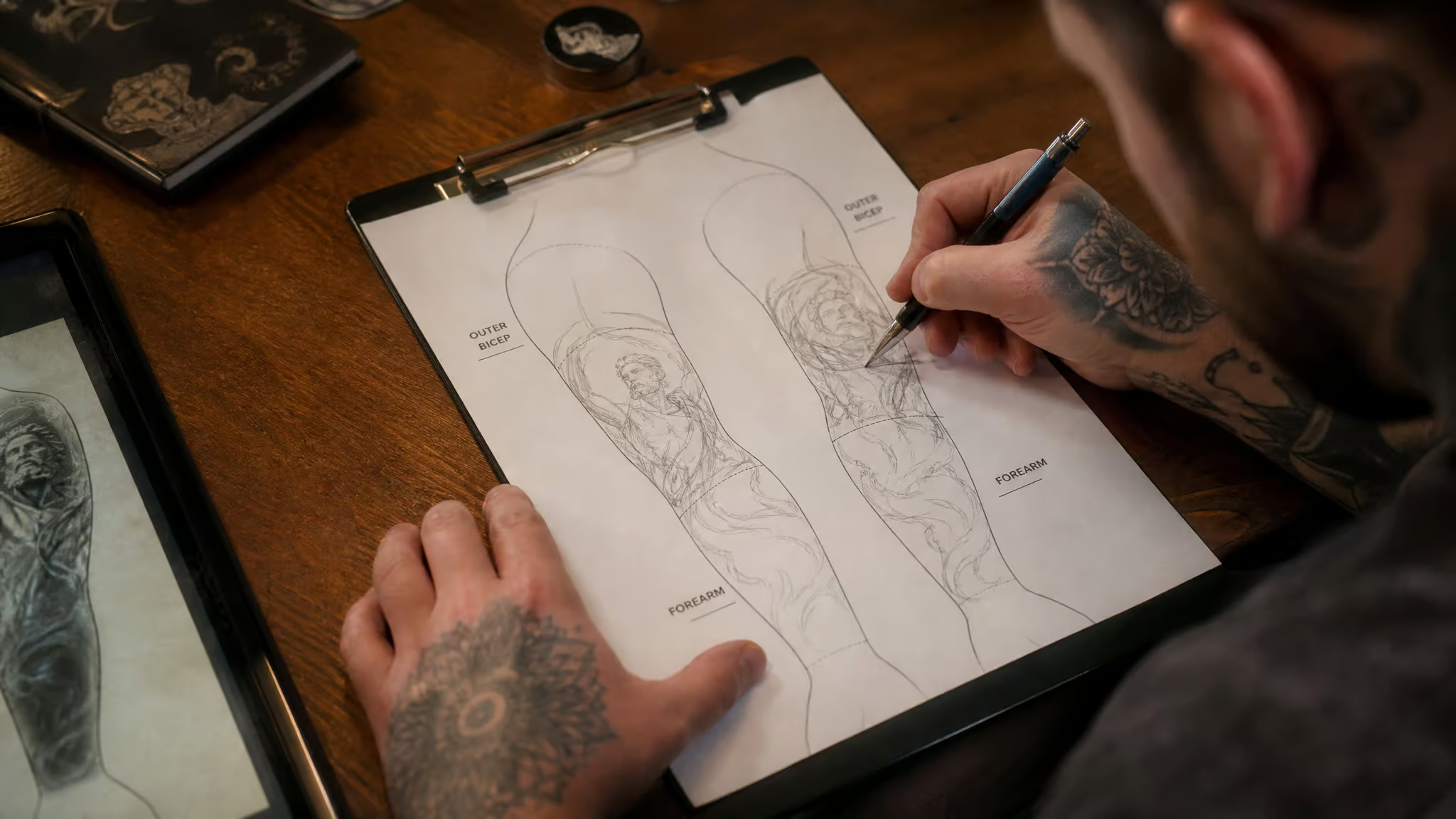
Amanda Wachob, the NYC artist known for abstract, watercolor-like designs, puts show-stoppers on the visible outside of the arm, and she’s factoring in musculature, curvature, and how images wrap. The arm isn’t a flat canvas. It’s a curved, moving one.
Sleeves come in three sizes:
- Full: shoulder to wrist
- Half: shoulder to elbow, which stays concealable in conservative workplaces
- Quarter: shoulder to mid-bicep
And here’s the counterintuitive part: the gaps matter as much as the tattoos. Negative space is your budget for future pieces. Crowd your first tattoos and you’ve spent it. The typical regret pattern, in practice: piece one grabs the outer forearm because that’s where it reads best, and by piece four there’s no clean canvas left for the piece the collector actually wanted most.
Field note: Big components first, filler after — locking in hero placement early preserves the negative space you’ll want later.
Some practical hardware-wear caveats. Clothing friction damages fine detail, so think twice before investing intricate work where your sleeve rubs daily. The elbow is a weird mounting point: Genné-Bacon says she likes to ask early on how a client envisions using their elbow, and if they want something circular or symmetrical, like a ship’s wheel, she recommends starting with that. And the starting spot has shifted: Odea notes clients increasingly begin at the forearm because employers accept it more, whereas sleeves historically started at the top and worked down.
Filler that turns a random assortment into a growing gallery
Filler works when it’s a deliberate, simple vocabulary. The classics come straight from American Traditional: stars and dots scattered in the negative space, the same tradition the sailors started. The modern toolkit is dotwork, botanical accents, geometric patterns, and thin linework bridging gaps. Flowers are honestly the go-to of that set. Odea notes they’re a popular filler choice, and they slot into small spots without demanding complexity.
Now nerdify it. Tiny sigils, constellations, geometric accents, a little fun symbol tucked between big designs nerdy tattoo ideas like these work best small. As Genné-Bacon puts it, depending on the size of the areas, small trinkets can go in between big designs, though keeping them simple is what lets them slot into small spots. Tiny pieces can’t carry complexity, so resist the urge to cram a detailed crest into a two-inch gap.
She gets accurate tracings and draws for exactly the spot being filled, because things with organic edges manipulate more easily. The filler fits the actual hardware, not a template.
Density is a fork, not a grade. Some people love a fully packed arm with almost no skin showing. Others keep generous negative space. Both look cohesive if they’re intentional, which is genuinely the keyword for this entire article.
Artist Bryan Gutierrez, of Bang Bang NYC, notes that more visible skin reads airier and less overpowering. So yes, “jammed to the shoulder” and “spacious with connective tissue” are both legitimate builds. Chaos is fine when it’s curated.
Finding an artist who can actually draw your fandom
Portfolio fluency in your fandom’s style is the decisive criterion, full stop. Wachob’s framing is blunt in the best way: there are amazing artists who specialize in different styles, and it wouldn’t make sense to approach a traditional Americana artist and ask them to do something delicate. Match the artist’s aesthetic to what you want.
The strategy depends on your sleeve type
This is the part most advice flattens. A single-image sleeve wants one lead artist, because switching mid-project disrupts the flow. Patchwork tolerates multiple artists you love, which is half its charm. The middle path is a same-studio relationship: one studio can keep line weight, shading, and aesthetic consistent across a team. Multiple artists, one coherent system.
Contact, waitlists, and consultation prep
Check the artist’s website for their preferred contact method and booking openings. Join the mailing list instead of firing off an Instagram DM. If your dream artist has a months-long waitlist, the wait is worth it: waiting can save money and prevent regret, and permanent body art justifies a queue. Travel is worth it too, for the right person.
Before the consult: bring reference images, write down three to five fandom ideas or personal meanings, and know your actual budget range. Know that most artists prefer an outline over a finished client drawing, and most won’t preview the design before the session. It’s a collaboration, not a spec-for-spec build. And don’t over-art-direct.
Wachob warns it kills the artist’s enthusiasm, and micromanaging a creative gets you worse work and a worse time. Gutierrez’s reassurance is the trust fall: if you like the artist’s style, you’ll be happy even if the final idea wasn’t yours.
The research workflow
Now the fun part, the actual rabbit hole:
- Pinterest: search “tattoo sleeve” plus your theme. The visually-similar search is a genuinely underrated discovery engine that surfaces artist websites and Instagram accounts.
- Google Images reverse lookup: this is the trick I’m most delighted by. Reverse-image-search existing anime and game tattoos, and you surface the artists already doing that exact style.
- Reddit: /r/Tattoos, TattooDesigns, best_tattoos. Add “sleeve” to searches and sort by Top/All Time. The sort is the pro move.
- Instagram: #sleevetattoo, #sleeve, #fullsleeve for what’s happening right now.
- Tattoos Wizard: a filterable directory, searchable by location and tags, like New York plus Sleeve plus Black & Grey.
The consult friction pattern worth naming: collectors arrive with a folder of screenshots spanning five fandoms and five styles, and the conversation only moves once they can articulate what they love about pieces they already have. If you already have ink, this is you: find the common threads in what’s there. Black and grey? Fine line?
Floral? That pattern is your starting point for filling the rest.
For more motif-level inspiration before you book anything, the nerdy tattoo ideas guide tours the whole fandom spectrum, and Star Wars tattoo ideas goes deep on the biggest sci-fi franchise specifically.
The 10-year test for franchise ink
The two biggest regret risks for a fandom arm are crowding your early pieces and, uniquely for this genre, trend-riding. Mainstream advice says “tattoos are forever” but almost never points the longevity check at hype cycles, which is exactly where fandom ink lives or dies.
Wachob’s test is the cleanest single question in this whole piece: will this design still resonate with you 10 years from now? Timeless over trendy. Applied to franchises, the screening question becomes: have you loved this universe for years, across its highs and lows, or only during its current season? One honest answer filters more regret than any placement rule on this page.
Quick test: Ask whether you’ve loved the franchise across its highs and lows, or only during its current season.
The counterweight, and it’s a good one: patchwork means a regrettable piece is one piece, not the whole arm. You contained the blast radius by design.
What it costs, how long it takes, and keeping every piece healthy
The honest numbers: a fully completed sleeve runs roughly 20 to 40+ hours across multiple sessions. One source puts it at around $4,000 and up to 25 hours, but treat that as a single-source ballpark, not gospel. Pricing models are per piece, hourly (the most common, per Genné-Bacon), or a day rate, so ask which one your artist uses before you book. A full sleeve usually can’t happen in one sitting anyway.
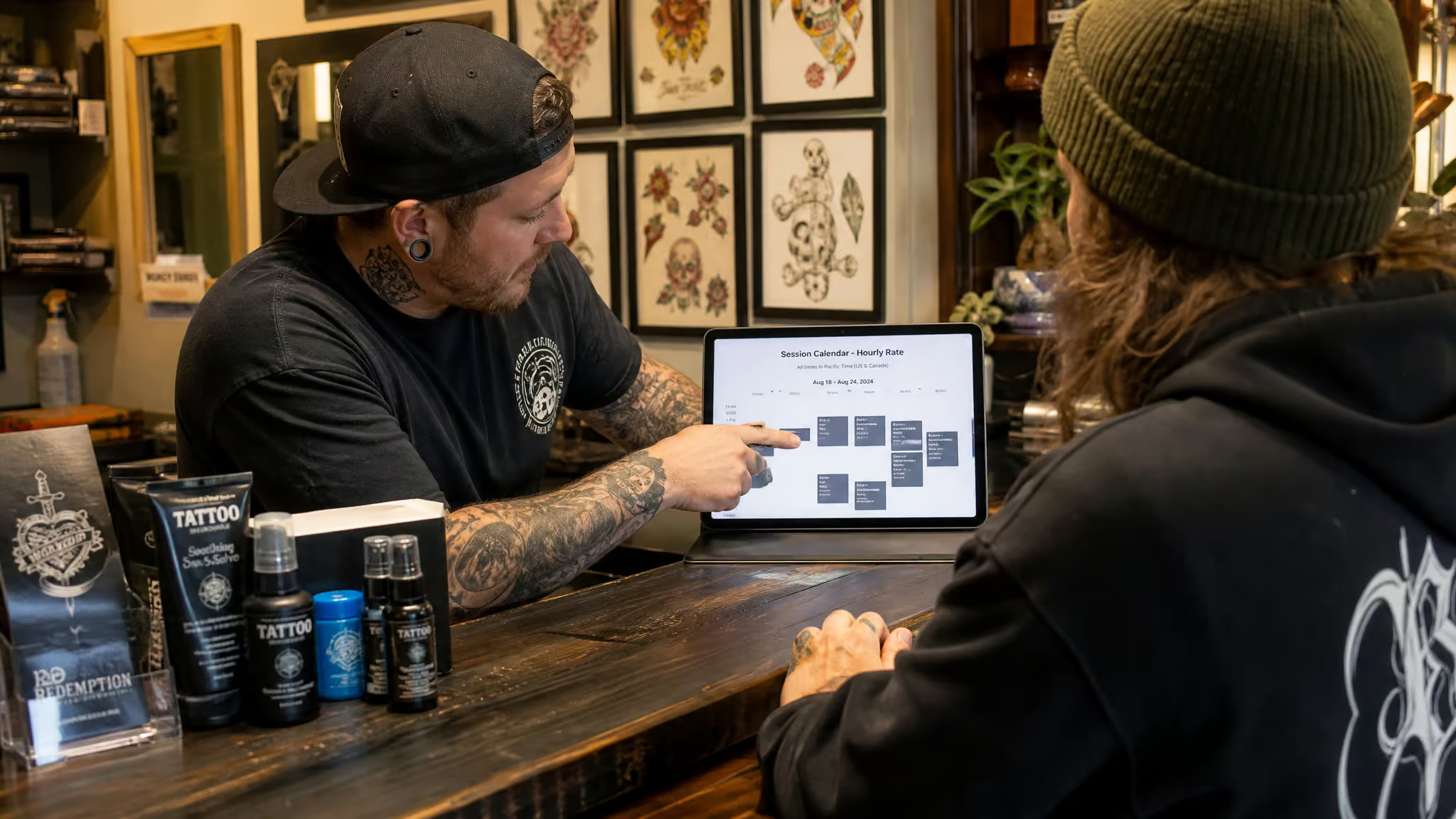
Genné-Bacon takes sleeves a piece or two at a time, which eases the hourly cost. That means patchwork isn’t just the artistically safer path. It’s the budget-friendlier one, spreading the spend across the life of the project.
Timeline? It varies wildly. Gutierrez puts it anywhere from two days to a year or more. Odea’s answer is similar: days, sometimes years. Wachob books sessions on the same weekday and time, two weeks apart, because consistent appointments are easier to keep and two weeks is enough healing.
One commenter in the community goes every four to five weeks. Pick what your skin and your calendar can sustain. And here’s a useful constraint if you go color: one source suggests completing a colored sleeve within the same year, so older sections don’t lose contrast against newer work.
Wachob’s take on money is worth sitting with: price shouldn’t dominate permanent body art. A sleeve is an investment. If you love an expensive artist, save up. Budget for aftercare and touch-ups too, not just the tattoo. The sticker price isn’t the whole price.
Black and grey, color, and mixing styles
Black and grey relies on shading for depth, blends more easily with neighboring pieces, and ages well. Color has more impact and stylistic variety, but it can look busy, needs extra sun care, and fades faster than black and grey, per Gutierrez. One more myth to bust: color intensity depends on technique and design, not on which specific colors you pick.
Style mixing is absolutely possible with smooth transitions and intentional design, and it matters for anyone whose Zelda piece is watercolor while their Berserk piece is blackwork. Gutierrez has a low-effort constraint hack for exactly this: “I think when there’s a few different styles, keeping things cohesive with all black and gray tattoos looks really great.” One shared property does the cohesion work. Mixing black and grey with color can also work, but only when it’s deliberate. Random mixing breaks the flow.
Prep and healing
Session prep is low drama: sleep well, eat a solid meal, skip alcohol for 24 hours beforehand, and wear loose clothing you don’t mind getting ink-stained. A safe numbing cream is an option if you want it. Then respect the maintenance window. Healing takes months, and neglect in the first two weeks can cause scabbing, color loss, infection, and lasting damage. Sessions are spaced weeks apart because skin needs time to recover between runs.
If you already have pieces
No technically wrong spot exists for a first arm tattoo. Pick something you feel strongly about, in a style you’re drawn to, and mention your half or full arm goals even if you’re only getting one small piece. That last part is the quiet pro tip: the first piece sets the palette every future piece answers to, so tell the artist the long-term plan early. Retrofitting a sleeve around existing tattoos is possible but challenging.
Not everything you already have will fit a new design, and some areas limit additions, but early planning still helps. And know that some spots are simply hostile to detail over time; a family portrait on the tricep is the cautionary example floating around the community.
The arm that never has to be finished
So here are the two reframes worth walking away with. First, the fandom arm isn’t a trend. It’s a collector tradition with a century of history behind it, sailors adding pieces port by port, and you’re just doing it with better source material. Second, cohesion is craft, not theme.
You don’t need one universe. You need one visual language.
Patchwork’s unfinished quality is the point. Each session adds a chapter, and viewer comments in the community consistently read patchwork built over time as carrying more sentimental value than a single planned run. Lil Peep’s tattoos get cited as random but flowing together. Ed Sheeran gets whatever, whenever, and that’s also a style. Patchwork honestly doesn’t get enough love.
Which leaves you with one decision, and it’s a good one to have: name your hero fandom, or book your next favorite piece. Either way, you’ve started a collection that never has to be finished.
Frequently Asked Questions
What should you avoid with sleeve tattoos?
The biggest mistakes are crowding your early pieces — negative space is your budget for future pieces, and once you’ve spent it there’s no clean canvas left — and trend-riding a franchise you’ve only loved during its current season. Also avoid mixing rendering styles randomly (a saturated anime portrait next to a delicate fine-line emblem reads like two different arms), and skip intricate detail where clothing friction or the elbow’s weird curvature will destroy it.
Where should I place my first nerdy sleeve tattoos — forearm, bicep, or full arm?
Put hero pieces on the prime real estate: the outer bicep, the outer forearm, or the flat of the inner forearm. Starting at the forearm has become increasingly common because employers accept it more, whereas sleeves historically started at the top and worked down. Mention your half or full arm goals even if you’re only getting one small piece — the first piece sets the palette every future piece answers to.
How do you know if a fandom tattoo will still matter to you in 10 years?
Ask whether you’ve loved that universe for years, across its highs and lows, or only during its current season — that honest answer filters more regret than any placement rule. Timeless beats trendy, since hype cycles are exactly where fandom ink lives or dies. The counterweight: patchwork means a regrettable piece is one piece, not the whole arm, so you’ve contained the blast radius by design.