Every fandom has its one symbol. You know the one: the Triforce, the Deathly Hallows, the pixel heart that’s been your Discord avatar since 2014. And eventually the thought shows up: I could just… have that. On me.
Forever. That’s where most searches for small nerdy tattoo ideas start, and it’s where a lot of them end badly, because almost nobody tells you the thing that actually matters. A tiny tattoo isn’t a shrunken screenshot. It’s a graphic design that has to survive a decade of skin biology and sun exposure on 2-3 inches of canvas.
Some motifs are basically pre-engineered for that. Others are guaranteed to blur into abstract art by year five.
So this isn’t another list of logos. It’s a rating: which designs hold up at small scale, which don’t, and where on the body to put them so the answer is still “yes, that’s a Triforce” in ten years.
Key Takeaways
At 2-3 inches, negative space matters more than line thinness: a simplified glyph with open spacing outlives a dense screen-accurate logo, and ink depth has to land in the upper dermis at 1.5-2mm or you get blowouts (too deep) or early fading (too shallow).
Placement carries the risk data: wrist/inner forearm runs 3-4/10 pain with 5+ year touch-up intervals, while fingers and hands sit at 6-8/10 pain and need touch-ups every 6-12 months.
Vetting an artist comes down to healed-photo portfolios of dedicated small-scale work, not fresh-ink photos, which always look sharp.
Table of Contents
Why tiny fandom symbols suit fine line tattoos
Minimalist and tiny designs are what the small-tattoo space actually looks like in practice: constellations, zodiac symbols, Roman numerals, single-line drawings, simple glyphs. That’s not a limitation, it’s the entire appeal. Search interest backs it up too, with “minimalist tattoo” and “tiny tattoo designs” pulling serious keyword volume on their own.
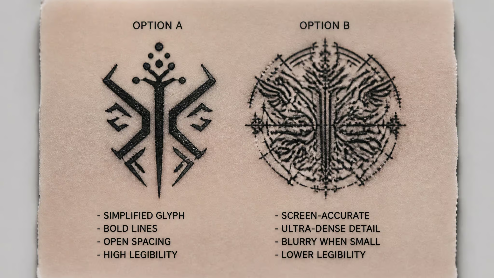
Here’s the mechanical reason this matters for geek ink specifically. Fine line artists, including Hollyanna Jandarian of Burned Hearts Tattoo in Columbus, Ohio, will tell you the margin for error in small fine line work is virtually zero, and that the real skill is engineering negative space so the design stays legible a decade down the road. Now look at what fandom logos actually are: flat color, high contrast, minimal shading, and deliberate empty space. A Triforce is three outlined triangles with nothing inside them.
A Deathly Hallows symbol is a circle, a triangle, and a line, arranged to make meaning out of what isn’t filled in. These were already designed like fine line art, decades before fine line tattooing was trendy. Logos barely need translation at small scale; they need, at most, a simplification pass.
The other draw is control. At 2-3 inches, hiding is a toggle, not a commitment. Inner wrist, behind the ear, back of the neck: cover it for the client meeting, show it at the convention. That hide-or-show flexibility is a genuine feature of small work, and it’s a big part of why tiny geek ink became the entry point for so many first-timers.
What detail actually survives at 2-3 inches
Yes, detail survives at 2-3 inches, but only when two conditions hold: the design is built around engineered negative space, and the ink lands at the correct depth. Get either wrong and the answer flips fast.
The technique, treated like the spec sheet it is
Fine line work runs on single-needle (1RL) or tight 3RL round liner configurations, typically with #8 or #10 bugpin needles. Translation: the “RL” means round liner, needles soldered in a tight circle, and a 1RL is literally one needle. The bugpin sizing means ultra-fine gauge hardware. What I love about this setup is how clean the result is: it puts down an ultra-thin line while barely disturbing the surrounding tissue. Honestly kind of elegant.
But the hardware is only half the spec. This work needs dedicated machine calibration and a lighter hand speed than standard tattooing. The needle is the component; the artist’s control is the firmware. That’s not gatekeeping, it’s just the honest spec: thin lines punish sloppy technique immediately.
The depth window, and its two failure modes
Ink has to land in the upper dermis at 1.5mm-2mm. That’s the tolerance window, and there’s a failure mode at each edge. Go too deep and you get a blowout: the pigment spreads under the skin and turns into a hazy blue blur around your crisp glyph. It’s a known bug, not a rare horror story, and it happens when depth control slips.
Go too shallow and the ink sits where the body sheds it, and the line fades prematurely. Same window, two very different crashes.
Spacing beats thinness
This is the counterintuitive part, and it’s the thesis of the whole article. Jandarian’s point, published in November 2025, boils down to this: what you leave empty does the work. A slightly bolder glyph with open space around each element will still read correctly in ten years, while the ultra-delicate micro tattoo that looks stunning in a fresh Instagram photo slowly loses its identity. It’s good layout design logic applied to skin: fewer elements, sharper result, and the contrast between line and empty space is where legibility lives.
Artists describe the same pattern constantly: someone brings a dense game or anime screenshot, and the design gets simplified before it ever touches skin. Not because the artist is lazy, but because detail density below a certain threshold stops being detail and starts being noise. If you’re set on maximal fandom accuracy at tiny scale, that’s a real constraint to plan around.
Small gaming tattoo ideas that stay legible
The gaming motifs that survive at 2-3 inches are the flat, geometric ones: a simplified Triforce outline, a pixel heart, a simple d-pad, a geometric diamond. Each of these is basically a high-contrast icon with built-in negative space, which is exactly the profile that ages well.
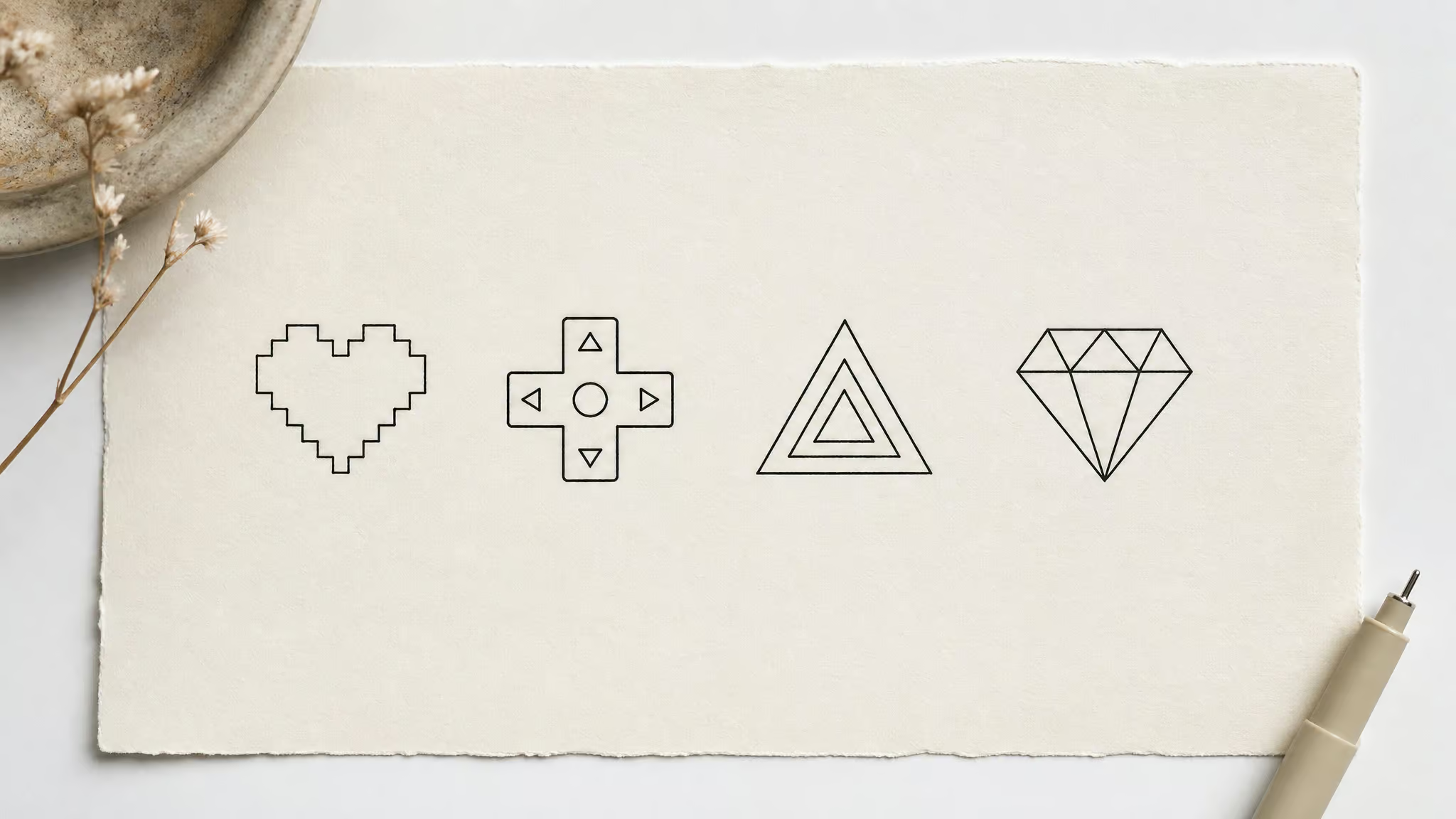
The pixel heart is the sleeper pick. It’s blocky by design, so even if the lines soften slightly, the shape stays unambiguous. Same logic for the d-pad: it’s a cross with a border, four directions, zero fine detail. The Triforce outline works because it’s three nested triangles; keep the internal spacing generous and it reads from across a room. A geometric diamond (Zelda-adjacent or otherwise) is pure line-and-space, nothing to blur.
Placement pairings, using the risk data: a pixel heart or d-pad on the inner wrist or forearm is a well-tested config, 3-4/10 pain, low fading risk, touch-up intervals of 5+ years. If you want it hidden, the back of the neck is discreet with barely any skin movement.
The failures are the ones you’d guess: dense screen-accurate emblems and full logo lockups. A company’s complete corporate logo, wordmark and all, crammed into two inches is the classic mistake. Every letter becomes a smudge candidate. Simplify to the icon, or size up.
Red flag: A full logo lockup with a wordmark crammed into two inches guarantees every letter becomes a smudge candidate.
If you want the full tour of bigger fandom territory, including pieces where detail density is actually workable, there’s a broader nerdy tattoo ideas guide that covers the whole spectrum.
Small sci-fi, fantasy, and anime tattoo ideas
For anyone leaning toward forearm or shoulder placements, geometric symbols beat portraits at this scale, full stop. The shortlist: the Deathly Hallows symbol (literally a negative-space design, which is why it’s the mascot of this entire category), a minimal TARDIS silhouette reduced to its box-and-window essentials, lightsaber hilt line art as a single clean vertical, and single-line character outlines that capture a silhouette in one continuous stroke.
Pairing the larger motifs with collarbone or shoulder placement works well: that zone runs 5-6/10 pain, low risk, with 5+ year touch-up intervals. Planning a full geek sleeve means thinking about continuity too: a lightsaber hilt running along the inner forearm, arguably the highest-traffic real estate in geek ink, sits in the friendliest tier there is: 3-4/10 pain and low fading.
Script motifs like Elvish or katakana-style lettering are viable, but they have a hard rule: size them for clarity and never cluster the characters. Tengwar crammed into a half-inch band turns into decorative static within a few years. Give script room to breathe or skip it.
Character portraits are the trap. A tiny anime face is micro-realism territory, and micro-realism at 2-3 inches is where the highest blur risk lives. If the character matters more than the format, a single-line outline of their silhouette or a signature prop will outlive a miniature face by years. (For feminine-leaning takes on these motifs, there’s a separate piece on feminine and minimalist nerd ink with small-canvas placement ideas.)
Celestial, coding, and typographic ideas
Not every fandom symbol needs to be a logo. Some of the best small nerdy tattoos are glyphs that carry meaning through translation: a date, a coordinate, a string of binary. This section covers the motifs that work because they’re already built from dots, lines, and open space.
Constellations and zodiac symbols
These are, no exaggeration, the most naturally nerdy survivable motifs in the whole space. A constellation is dots connected by thin lines with vast amounts of empty sky between them. That’s engineered negative space handed to you for free. Behind the ear and along the neck suit tiny celestial symbols especially well: 5-7/10 pain, low-to-moderate risk, touch-ups in the 3-5 year range, and maximum discretion.
Coordinates, Roman numerals, micro-script
Release dates in Roman numerals, hometown coordinates, a fandom quote in a small elegant font: all of these work, and they’re where the “meaningful small line tattoos” search demand actually lands. A launch date rendered as numerals is a fandom-flex with personal history baked in. The constraint is the same as any script: short strings, clear sizing, no clustering.
Coding and math motifs
Here’s a clean example: binary encoding of a meaningful date. A row of ones and zeros is geometric and high-contrast, and it only means something to people who bother to translate it, which is the point. Simple operators work too, as do unclosed crescent moons and single-line art that read as elegant nerd glyphs even to people outside the fandom. If a symbol is meaningful to you and simple enough to execute cleanly, it’s an easy win at small scale.
The five design categories, rated for survivability
Minimalist line art, tiny symbols, and typography age well at small size; micro-realism demands a specialist artist and carries the highest blur risk. That’s the whole verdict. Here’s each category with the specifics:
- Minimalist line art. Thin clean lines making elegant, quiet designs. This is the category for anyone who wants subtle but still stylish, and it ages gracefully because there’s nothing dense to degrade.
- Tiny symbols. Hearts, stars, arrows, infinity signs, zodiac symbols. Simple shapes carry personal meaning and are genuinely easy to execute small, which is the practical half of the win.
- Nature-inspired elements. Done subtly, nature reads surprisingly well at small scale. The butterfly is the transformation motif, stated once and lightly. Botanical stems and olive branches pair naturally with the inner wrist or collarbone, and that design-to-placement pairing is worth copying for any motif. Mountain silhouettes work the same way: Mandy Moore’s mountain-climb dedication tattoo is the mainstream proof that a simple landscape shape carries a whole story.
- Micro-realism. Detailed portraits or objects at very small scale: a tiny bird, a paw print, a miniature portrait. This is wild territory, genuinely, the scale-versus-detail tension is real, but it requires a highly skilled artist, and it’s the category where definition loss over time shows up first.
- Typography. Words or short phrases in small elegant fonts. Legibility is the real constraint here; sized right and unclustered, it holds. Cramped, it fails.
One structural note that applies across all five: don’t cluster multiple small tattoos together. They compete for legibility, and at fine line tolerances that competition gets ugly.
Where to put it: risk tiers and hidden spots
The placements that hide a small fandom tattoo and age well are the back of the neck, behind the ear, and the inner wrist/forearm. For more nerdy tattoo ideas in those spots, these three give you discretion plus some of the best numbers in the risk table below.
The placement risk table
| Placement | Pain | Fading risk | Touch-up interval | Best for |
|---|---|---|---|---|
| Wrist / inner forearm | 3-4/10 | Low | 5+ years | Micro-script, botanical stems, constellations |
| Ankle / lower leg | 5-6/10 | Moderate | 3-5 years | Micro-geometrics, wave outlines, vines |
| Behind ear / neck | 5-7/10 | Low-moderate | 3-5 years | Single initials, tiny celestial symbols |
| Collarbone / shoulder | 5-6/10 | Low | 5+ years | Continuous line art, short quotes |
| Fingers / hands | 6-8/10 | High | Every 6-12 months | Minimal dots, micro-symbols, bold line icons |
Read that last row twice before committing to it. Not as a prohibition, just as the fine print.
The hidden-placement paradox
Discreet doesn’t mean safe. Fingers get chosen partly because they’re visible, and they repay the choice with touch-up cycles every 6-12 months. The mechanism is worth understanding: your hands get constant washing and constant friction, and both pull pigment out of thin lines faster than anywhere else on the body. Feet fade the same way, just from shoes and socks instead of soap.
Ribs and stomach carry a different risk: the skin stretches with weight changes, pregnancy, and aging, and stretched skin distorts fine lines. Elbows and knees blur from bending, which is basically a moving-joint wear problem, the tattoo equivalent of a cable rated for fewer flex cycles than your application needs.
The best picks, with reasons: upper arm and shoulder, because the skin stretches less there; ankle, the best of the discreet options but honest about its moderate fading risk and 3-5 year touch-ups; back of the neck, discreet with skin that barely moves; and forearm/wrist, which gives you good visibility plus stable skin. That’s the trade-off triangle: discreet, durable, visible. Pick two.
Size, direction, and flow
Before you commit to anything, three things deserve actual thought: size, direction, and flow. The clearest treatment I’ve found is Jo Chastney’s YouTube video “Small tattoo placement ideas,” and it covers the fundamentals clients and artists both need. It’s a small channel, around 3.58K subscribers, the passionate-specialist kind rather than the mega-influencer kind, and the chapters are useful if you want to jump around: intro at 0:00, basics at 0:23, movement at 3:18, back placement at 4:58. If you want more after that, Tattooing 101 has a sizing video with 247K views, HAYLEE TATTOOER’s placement guidelines sit at 368K, and Sorry Mom covers placement at 70K.
One convention worth flagging as a convention: there’s a reported industry rule that tattoos with faces should face inward. I’d call it low confidence, because the comments on that video show it’s genuinely unresolved. One viewer planned an Alice in Chains three-legged dog on the outer forearm and sparked a whole orientation debate. Someone else, working on a gender-equality triangle at the wrist, asked whether it should point toward or away from the palm. Nobody resolved it.
And the most relatable comment in the whole thread: someone booked a Cyberpunk 2077 tattoo for their left arm 15 hours out and still wasn’t sure where on the arm it was going. Idea first, placement last. It’s an extremely common sequence, and it’s worth breaking on purpose.
Which small nerdy tattoos don’t age well
Designs whose legibility depends on line weight below what a single needle can hold at that size will blur: screen-accurate dense emblems, micro-portraits, and tiny finger script are the repeat offenders. Simple glyphs with engineered space hold.
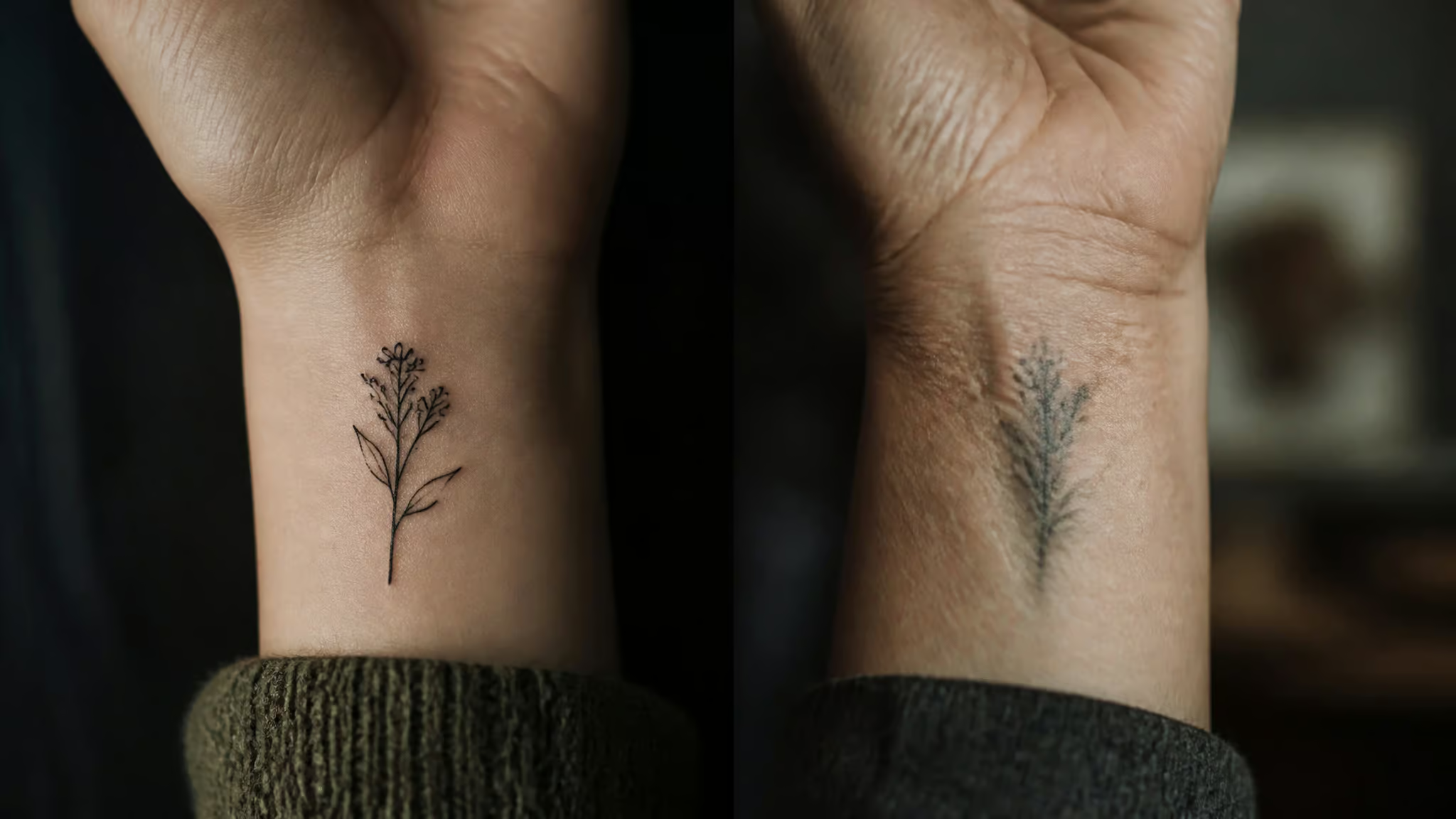
The underlying engineering trade-off is straightforward: fine line work deposits less pigment than bold work, so it softens faster. You’re trading durability for resolution, and at small scale the resolution advantage is what makes the tattoo possible at all. Sun exposure accelerates the fading, which makes daily broad-spectrum SPF 50 the cheapest high-value fix in this entire article. And if a line does soften, a touch-up re-traces it without thickening it, so fading is a maintenance item, not a fatality.
Pros and cons
Tiny detailed tattoos are a good low-commitment entry point for first-timers, as long as the design and placement avoid high touch-up cycles. That’s the whole answer; everything else is the spec sheet.
The case for
Small ink is subtle but significant, and modern equipment is what makes intricate detail possible at 2-3 inches in the first place. Pain is milder than heavy shading or bold outlines because the tiny needle configs cause less surface trauma, though placement still rules the experience: 3-4/10 on the forearm versus 6-8/10 on fingers. Sessions are quick and healing is quicker than larger pieces. Upfront cost is lower than big complex work, though pricing varies with intricacy. And you get the hide-or-show toggle: discreet at work if you want it, on display when you don’t.
The honest ledger
Fading is real. Aftercare is fussy, because minor scabbing or peeling that a bold tattoo shrugs off can compromise micro detail; small canvas, small error budget. There’s distortion risk in stretchy placements, touch-ups are a genuine line item, and intricate work has a shorter lifespan than simple glyphs. Friction spots blur faster, which the placement table already told you.
Here’s the math worth doing before you book: a cheap tiny tattoo with a 6-12 month touch-up cycle can cost more over ten years than one slightly bolder piece that ages without intervention. Sticker price isn’t total cost.
Cost check: A cheap tattoo needing touch-ups every 6-12 months can outcost one slightly bolder piece over ten years — compare totals, not sticker price.
Aftercare: protecting tiny fandom detail
The lines survive healing if you follow the protocol. Small canvas means small error budget, so the checklist actually matters here:
- Leave the Saniderm second-skin film on for 3-5 days. That’s the spec, not a suggestion.
- Wash twice daily with lukewarm water and fragrance-free antibacterial soap.
- Pat dry with a paper towel. Pat, don’t rub.
- Apply thin layers of fragrance-free lotion. Never heavy petroleum jellies; they’re too occlusive for fine detail work.
- Once it’s fully healed, broad-spectrum SPF 50 becomes a daily habit. That’s the UV defense that keeps thin pigment lines sharp for years, and it ties directly back to the longevity math from earlier.
None of this is complicated. All of it is load-bearing.
Finding an artist who can execute micro fandom work
The test is a healed-photo portfolio of dedicated small-scale work. That’s it, that’s the gate. Fresh ink always looks sharp, every single time, which makes fresh photos the demo. Healed photos are the debug: they show whether the technique holds without blowouts or fading, and whether an artist understands how pigment migrates in living skin rather than just how to make a photo look good on day one.
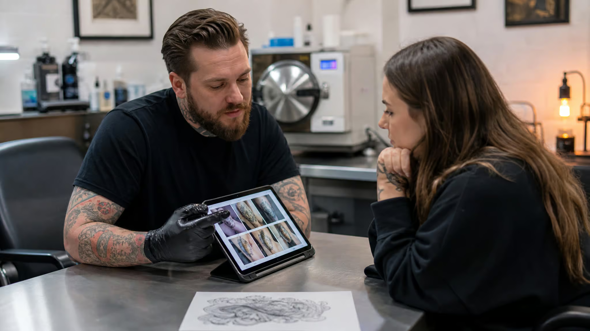
Ask about touch-up policies before booking, not after. Sizing matters too: make sure the design is big enough that its details stay clear, because “tiny” has a floor, and a good artist will find it with you rather than take your money and trace a smudge.
Quick test: Skip fresh-ink photos. Ask for healed shots of dedicated small-scale work — that’s where blowouts and fading show up.
How custom studio booking actually works
Ministry of Ink in St. Petersburg, Florida is a good worked example of the process. It’s 100% custom, no flash books, meaning every piece is designed for the person wearing it, which is exactly what you want when your design starts as a dense screenshot: custom means the design gets adapted to your skin and your placement instead of copy-pasted. The flow: you describe the piece you want on a consultation form, they match you with an artist by specialty, a design consultation refines concept, placement, and sizing, and a non-refundable deposit secures the appointment. Consultation requests get reviewed in 2-3 business days, so you know when to expect a reply.
Financing runs through Affirm and Shop Pay Installments, and checking your eligibility doesn’t hit your credit. On the safety side: private rooms, medical-grade sterilization, single-use disposables, hospital-grade autoclaves, and protocols that exceed Florida Department of Health standards. Their artists are Nenad, Dima, Oleg, and Rusina, and the detail that says more than any ad copy: a client named Lena K. flew in from out of state for Nenad’s realistic work. If you’re local, the practical block: 2700 Central Ave, St. Petersburg, FL, Tue-Sun 12pm-8pm, closed Monday.
The thing to expect from any good custom process: your dense screenshot gets redrawn for skin longevity, not traced for screen fidelity. That’s studio practice at every competent shop, not a limitation of one studio. Burned Hearts Tattoo in Columbus, Ohio specializes in custom miniature work, exactly the niche this article lives in, and it’s the kind of studio whose artists keep fine line pieces crisp. Lunar Ink in Houston takes appointments and walk-ins alike if you’re the impulsive type, 281-747-7076.
Pricing honesty
There’s no source-backed answer to how small a $100 tattoo is, so treat $100 as a typical session ballpark, not a quote. Micro work gets priced on time and precision, not square inches, which means a fine line specialist can legitimately charge more for a tiny piece than a generalist charges for something twice the size. You’re paying for depth control at a 1.5-2mm tolerance. That’s the skill you’re buying.
First-timers, placement anxiety, and why tiny geek ink went mainstream
At 2-3 inches, hiding is a choice now, not a necessity. That changes the whole decision: instead of picking placement out of fear of being seen, you can pick it from aging data, which is what the risk table is for. Tiny fandom designs are also the low-anxiety entry point for a first tattoo: less commitment, quick sessions, and a smaller psychological leap than a sleeve.
The placement anxiety is real and extremely common. The comments on that Chastney video are full of first-timers and hesitant returners: one viewer worried about annoying her artist by changing her mind on placement, and a commenter named Carol, turning 70, said the video gave her the confidence to plan her first tattoo. Seventy. First tattoo.
That’s the energy this category deserves. The practical fix for the anxiety: settle placement and orientation in the consultation, not the night before, and remember that artists answer these questions for a living. Nobody who’s good at this job is annoyed by you caring.
Tiny geek ink went mainstream the ordinary way: visibility. Kendall Jenner and Hailey Baldwin got matching friendship tattoos, Kylie Jenner collected a whole minimalist set, Mandy Moore turned a mountain climb into a permanent dedication, and the Pretty Little Liars cast got matching group ink. None of that makes any of them a style authority, but as proof-of-concept that small ink is normal? Case closed.
There’s even a first-principles argument for the whole enterprise: Christian Schneider’s July 2026 piece in National Review, “Let People Ink for Themselves,” makes the autonomy case, that ink decisions belong to the person getting inked. No committee required.
So here’s the resolved promise: pick a survivable glyph, one with flat contrast and engineered negative space. Pair it with a placement from the low-risk tiers. Verify your artist with healed photos. Do those four things and the tattoo you get at 25 still reads clearly at 35, and it still says exactly what you meant it to say.
Frequently Asked Questions
What are some ideas for a small, tiny tattoo?
The small tattoos that hold up best are flat, geometric designs with built-in negative space: constellations, zodiac symbols, Roman numerals, single-line drawings, pixel hearts, and simple glyphs like a Triforce outline or a Deathly Hallows symbol. These survive at 2-3 inches because they’re high-contrast icons with deliberate empty space, so they stay legible as lines soften over the years.
What tattoos do not age well?
Designs whose legibility depends on line weight below what a single needle can hold at small size blur the fastest: dense screen-accurate emblems, full logo lockups with wordmarks crammed into two inches, micro-portraits, and tiny finger script. Fingers and hands also fade fastest physically because constant washing and friction pull pigment out of thin lines, needing touch-ups every 6-12 months. Simple glyphs with engineered negative space are the ones that hold.
What are some cool nerd tattoo ideas for men?
For forearm or shoulder placements, geometric fandom symbols beat portraits at small scale: a simplified Triforce outline, a pixel heart, a d-pad, a minimal TARDIS silhouette, lightsaber hilt line art, or a Deathly Hallows symbol. A lightsaber hilt along the inner forearm is a proven pairing — 3-4/10 pain, low fading risk, and touch-up intervals of 5+ years. If you want a character, a single-line silhouette or signature prop outlives a miniature face by years.
What are the best small nerdy tattoo ideas for subtle fandom ink under 3 inches?
The survivable shortlist at 2-3 inches: a simplified Triforce outline, a pixel heart, a simple d-pad, a geometric diamond, the Deathly Hallows symbol, a minimal TARDIS, lightsaber hilt line art, or a constellation. All of these are flat, high-contrast designs with engineered negative space, which is exactly the profile that ages well. Skip dense screen-accurate logos and micro-realistic faces — those are the highest blur-risk territory.
What small nerdy tattoo ideas suit women who want subtle geek ink?
Feminine-leaning small fandom ink works best with the same geometric logic: constellations and celestial symbols behind the ear or along the neck, botanical stems or olive branches on the inner wrist or collarbone, a pixel heart or geometric diamond on the forearm, and short script quotes at the collarbone. These placements run low fading risk with 5+ year touch-up intervals, and all stay easy to hide or show. Single-line character outlines are a strong pick too.
What detail level survives in a tiny fine line tattoo, and why do intricate designs blur?
Detail survives at 2-3 inches only when the design is built around engineered negative space and the ink lands in the upper dermis at 1.5-2mm. Intricate designs blur because fine line work deposits less pigment than bold work, so it softens faster — you’re trading durability for resolution. Below a certain density threshold, detail stops being detail and becomes noise, which is why dense screenshots get simplified before they touch skin.
Which placements hide a small fandom tattoo best while still aging well?
The back of the neck, behind the ear, and the inner wrist or forearm combine discretion with the best aging numbers: neck and behind-the-ear run 5-7/10 pain with 3-5 year touch-ups, while wrist and forearm are only 3-4/10 pain with low fading risk and 5+ year intervals. The back of the neck is especially good because the skin barely moves. The trade-off triangle is discreet, durable, visible — pick two.
How do I find a tattoo artist who can do detailed small fandom designs well?
The test is a healed-photo portfolio of dedicated small-scale work — not fresh-ink photos, which always look sharp and are the demo, not the debug. Healed photos show whether the technique holds without blowouts or fading. Also ask about touch-up policies before booking, and expect a good artist to help you find the size floor where your design’s details stay clear rather than tracing a guaranteed smudge.
Is a tiny fandom tattoo worth it for a first tattoo?
Yes, if the design and placement avoid high touch-up cycles. Tiny pieces are the low-anxiety entry point: less commitment, quicker sessions, milder pain than heavy shading or bold outlines, faster healing, and a lower upfront cost. Do the long-term math, though — a cheap tiny tattoo needing touch-ups every 6-12 months can cost more over ten years than one slightly bolder piece that ages without intervention.