I fell down this rabbit hole the way most of us do: 1 a.m., one time-lapse video, then suddenly it’s three hours later and I’m watching an artist pack pigment into a Sailor Moon galaxy background. Somewhere in that scroll, the real question clicked. It’s not “which character do I love?” It’s “which idea will still be recognizable in 10 years?”
Because there are two ways an anime tattoo dies. One, the fresh-ink screenshot that fades into blur, because pastels and fine lines are the first things skin gives back. Two, the floating character face that was cliché the day it healed. So here’s the list, organized by style, the same way you’d sort through gamer tattoo ideas, each idea judged by how its linework and color actually survive on skin.
Key Takeaways
Black-and-grey manga panels age more consistently than full-color portraits because contrast carries the image; color pieces typically need touch-ups every 2-4 years.
Small symbolic motifs (kanji, Poké Balls, swords, masks) work precisely because they’re readable at small scale, while tiny hyper-detailed character faces blur.
Vet artists on healed portfolio photos, not fresh ink; fresh photos are the demo, healed work is the production build.
Table of Contents
How to pick: two axes, one tiebreaker
Most anime tattoo idea galleries just name characters and call it a guide. That skips the actual decision, which has two axes. Axis one is content: what the piece depicts. The popular anime styles break down into kawaii, manga panels, shonen, waifu, and minimalist symbols. Axis two is execution style, and Sorry Mom‘s style-guide video (a genuinely useful reference, go watch it) breaks tattooing into five dominant modes: black-and-grey realism, full-color realism, old-school traditional, new school, and neo-traditional.
Here’s the elegant part: any anime character can be rendered in any of those styles. The character is the content, the style is the renderer. Cross the axes and you get options a character gallery never shows, like a neo-traditional Sailor Moon or a Blackwork Luffy. Suddenly you’re choosing a build, not picking from a tier list.
Now the tiebreaker, and let’s answer the big one first: black-and-grey manga panels age more consistently than color work over 10 years, because they run on contrast instead of pigment vibrancy. Contrast carries the image even as ink softens, so these pieces need fewer touch-ups. Color realism captures the screenshot energy but leans on exactly the pigments that fade first, and it typically wants a refresh every 2-4 years. With skilled work and good placement, anime ink of either flavor stays clear 10+ years, and 20+ is possible with professional care.
The honest caveat: anime pieces do fade faster than heavy-outline traditional work, since they trade on vibrancy and fine detail. Not dramatically, with decent care. But it’s a real spec difference, not a rounding error.
Full-color portrait ideas: the showstopper category
This is the “look what the artist pulled off” lane, where the artist’s skill is basically the whole point. Two finds from the rabbit hole worth your time: Neo Ink Art (the community hub for this niche, 144K subscribers and active 2025 playlists, so very much a living repo) has a 32:05 Ultra Instinct Goku time-lapse that’s watchable proof of the whole process. And the Sailor Moon piece I kept circling back to, with Chibiusa and a galaxy background, took 4-5 sessions. Plan accordingly: big color pieces are a project, not a weekend.
The tradeoff is day-one drama vs. decade-one consistency. Layered color packing is how artists get pigments bold enough to read like a screenshot; think of it like running a shader multiple passes to get real saturation. But light colors fade first: yellows, pinks, light blues. If you’re choosing a palette, bias toward bold primaries and complementary contrast (purple against yellow holds) over big pastel fields. And remember your skin’s undertone acts like a color profile over the ink: the same pigment renders differently on different people.
A color portrait, in other words, is a subscription. The pigment refresh is the price.
Black-and-grey manga panels: the longevity pick
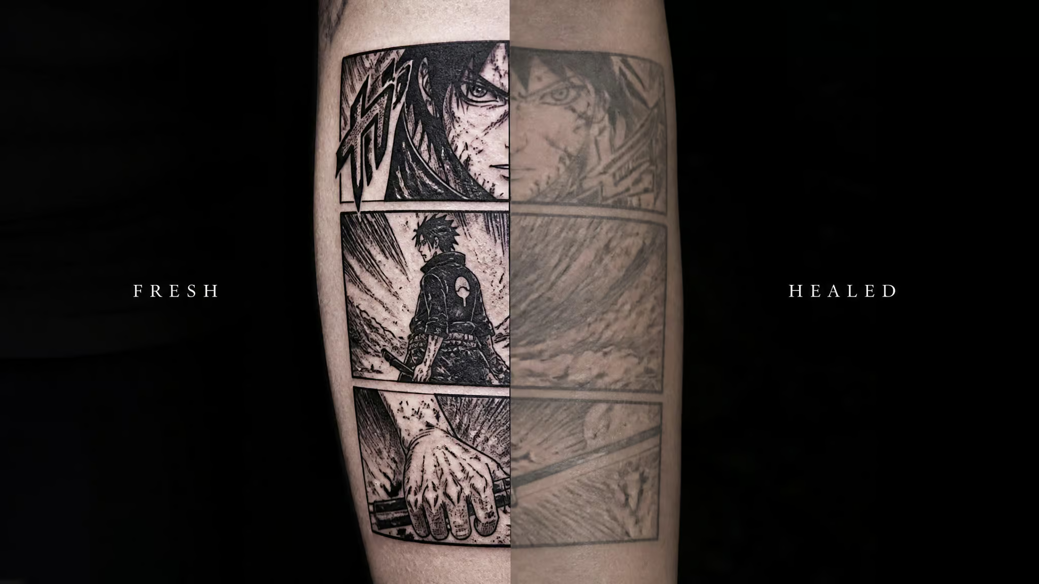
Black-and-grey manga-panel work mimics inked manga frames, and it works because it borrows the same tricks the original artists used: bold outlines, dramatic shading, screentone texture and detail straight off the page. The least glamorous option might be the best engineering choice. This is manga-frame energy, not grayscale photo realism. The original medium was ink on paper; this is ink on skin. The format was pre-optimized.
The aging logic is simple. Contrast survives even as vibrancy fades, which means fewer failure modes and fewer touch-ups. Inspiration galleries imply that color is the default; this style inverts that assumption.
The taste upgrade matters too: excerpt a meaningful scene rather than copying a floating face. A curated panel from the chapter that actually got you reads intentional. A screenshot of whatever the algorithm served reads like a screenshot.
Bottom line: Contrast carries the image long after pigment vibrancy fades, so manga-panel ink needs the fewest touch-ups of any style here.
One fairness note: this isn’t a claim that black-and-grey categorically wins. Aging is conditional on skill, placement, and aftercare regardless of style. The manga panel just has the most forgiving physics.
Kawaii ideas: cute drawn to survive
I will defend the kawaii lane with zero irony. Totoro and Studio Ghibli pieces are their own beloved corner of the genre, and honestly Ghibli ink reads as comfort-media tattooing; a tattooer named Kim has had friends request Totoro work, which tells you demand comes from real people, not trend dashboards, it’s the same honest appeal she maps across the whole spectrum of nerdy tattoo ideas. And the cursed-cute end of the pool delivers too: there’s Halloween flash of Charmander dressed as Guy Fieri, and it’s exactly the ridiculous-in-the-fun-way energy flash culture exists for. Sincere delight. No notes.
Pastels are the pigments that go first on the fading curve, so kawaii designs, pinks, light blues, sparkles, need bolder outlines, slightly larger scale, or strategic saturated accents to keep their silhouette after the soft tones soften. The fix is craft, not avoidance. Cute lasts when it’s drawn to survive.
Minimalist and symbolic ideas: small doesn’t mean safe
The motif set that reads intentional. If you want the low-key build, the parts bin is well stocked: kanji lettering, masks, emblems, swords, Poké Balls, magical items. These props are iconic, and recognizability at small scale is exactly why they work. A Poké Ball is three geometry elements and a color joke; it stays readable long after a detailed face wouldn’t. Kanji is its own minimalist lane, the classic pick, with the obvious implication: get the characters right, from someone who actually reads them.
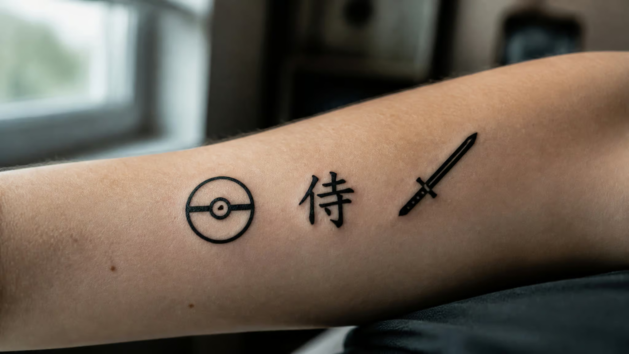
Where small pieces blur. Now the contrarian beat, because skin’s resolution is finite. Tiny hyper-detailed anime work blurs over time; skin isn’t a 4K display. Hands, fingers, ribs, and feet are friction zones, basically mechanical wear on a moving part.
The good real estate for detail: upper arms, thighs, shoulders, backs. A pattern artists report over and over: fans arrive wanting a tiny fine-line face on a hand because the screenshot looked crisp, and the artist steers them toward a bolder, simplified motif at honest scale. Take that deal. Go bolder and simpler than your reference image.
Quick test: If the detail wouldn’t survive at thumbnail size, it won’t survive on a hand — go bolder and simpler instead.
None of this means small is bad. Minimalist pieces hold up well when they’re properly scaled and placed. Scale is the variable, not size.
Shonen, waifu, and the rest of the genre tree
Shonen energy. The brief for a shonen piece is “paused fight scene”: dynamic poses, motion lines, energy effects. One Piece and Luffy are the natural citation here, everyone already knows the repo. The technical catch: energy effects demand saturated color, and saturated color fades.
Genre choice is technique choice; the action lane costs more maintenance than it looks. Beyond Luffy, my notes on per-series shonen designs get thin fast, and I’d rather admit that than invent a catalog.
Waifu and everything else. The waifu category is the pin-up treatment of anime female characters, classic pin-up tradition meeting anime character design, and it deserves a straight, affectionate, self-aware look rather than a snicker. Practical note: skin tones shift with your undertone, same filter as every other palette. Beyond that, the genre tree runs magical girls, mecha, slice-of-life, fantasy, and horror/dark, plus Blackwork, which proves the format is portable into basically any execution style.
On the “for guys vs. for female” search split: the demand pattern I kept seeing skews shonen/action toward guys and Sailor Moon, magical girl, and kawaii toward women, but the source material is thin here, so treat that as a suggestion, not data. Two personality beats before we move on: Michaela’s anime-eyes neck tattoo got called GOAT-level work by the community, a genuinely bold placement done right. And in one interview, two artists argued about first crushes: Tuxedo Mask (wholesome) versus Spike Spiegel (…decidedly not). This fandom is fine.
Fresh vs. healed: judge every idea by how it heals
Why dense color backgrounds won’t heal like the photo. Working tattooers critique oversized, dense-background pieces, the large Kayo work being the concrete example: they won’t look healed the way they look fresh. Fresh appearance systematically overstates long-term results on big, dense color fields. That’s not artist-bashing; it’s bench-test honesty.
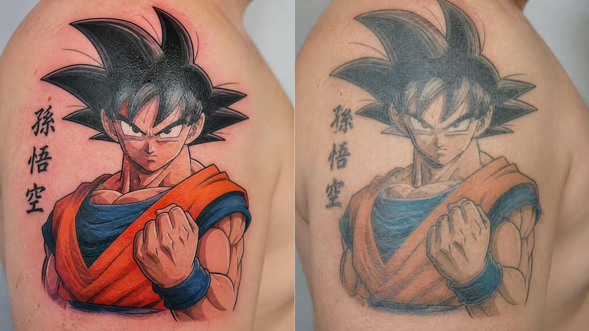
Fresh photos are the marketing shot. Healed is the benchmark.
How anime linework actually translates to skin. The craft stack is three techniques: layered color packing, clean linework, smooth shading. Needle depth is a tight tolerance, too light and the ink fades fast, too deep and you get blowouts. Small features like eyes, hair, and text demand steady, sharp linework, and the eyes are the tell; if the eyes survive, the piece survives, the same discipline that defines classic Japanese style tattoos. Your hardware is a variable too: oily or textured skin can spread pigment, thicker skin holds detail better.
The diagnostic, so you can read your own ink: healthy aging means crisp outlines, little to no blowout, even fading, and faces and eyes that stay recognizable. Red flags are patchiness, early blurring, and blowouts, which point back to application problems. And here’s the single best tip in this whole article: vet artists on healed portfolio photos, not fresh ink. Don’t review the demo, review the production build, the same way Star Wars tattoo ideas hold up only when the design and style are chosen with aging in mind. While you’re in the portfolio, match styles; don’t hand your shonen piece to a realism artist and hope for the best.
Field note: Oily or textured skin can spread pigment, and thicker skin holds detail better — same artist, different canvas, different result.
Worth knowing the craft history, because it explains why tiny anime faces are risky. For most of the genre’s existence, anime faces were only viable at large scale with bold outlines. Roughly a dozen years back, the artists in these interviews could name only one anime-style tattooer, Hori Benny, whose work carried the angular 90s faces with square eyes. The genre debugged itself through trial and error from there. Tiny fine-line anime is a recent technical achievement, which makes it the newest feature and still the riskiest bet.
Choosing your palette and effects without the fading regret
Color symbolism and known-good schemes. Anime color meaning is a fun quick-hit list: red for passion, energy, and power; blue for calmness and loyalty; green for nature, growth, and balance; yellow for happiness and optimism; pink for innocence. Symbolism is cultural context too. The US flag runs the same palette with a different encoding: red as valor, white as purity, blue as justice. Same pigments, different assignment.
The known-good palettes, picking a color theme for your skin dashboard: bold vibrant primaries (matches how anime itself uses color), soft pastels (the kawaii pairing, with the fading caveat above), high-contrast black-and-grey with accent colors (the hybrid route where contrast does the heavy lifting), complementary pairs like purple/yellow for drama, and monochromatic depth via saturation and brightness shifts. Two checks before locking anything: does it match the character’s mood (candy pinks on a brooding character miss the point), and does it harmonize with your skin undertone. These are community meanings, not universal law, and no palette prevents fading. It just changes which colors go first.
The shader layer. Gradient/ombre, glowing/neon, and metallic/shimmer effects add depth, and they’re gorgeous when they land. But they depend on exactly the light, saturated pigments that break down first. Run them as accent layers over a linework skeleton, never as the skeleton itself.
Making your chosen idea last
The reframe up front: your design choice is your maintenance plan. A color-heavy sleeve is a subscription; a manga panel is a one-time purchase. Pick with the total cost of ownership in mind.
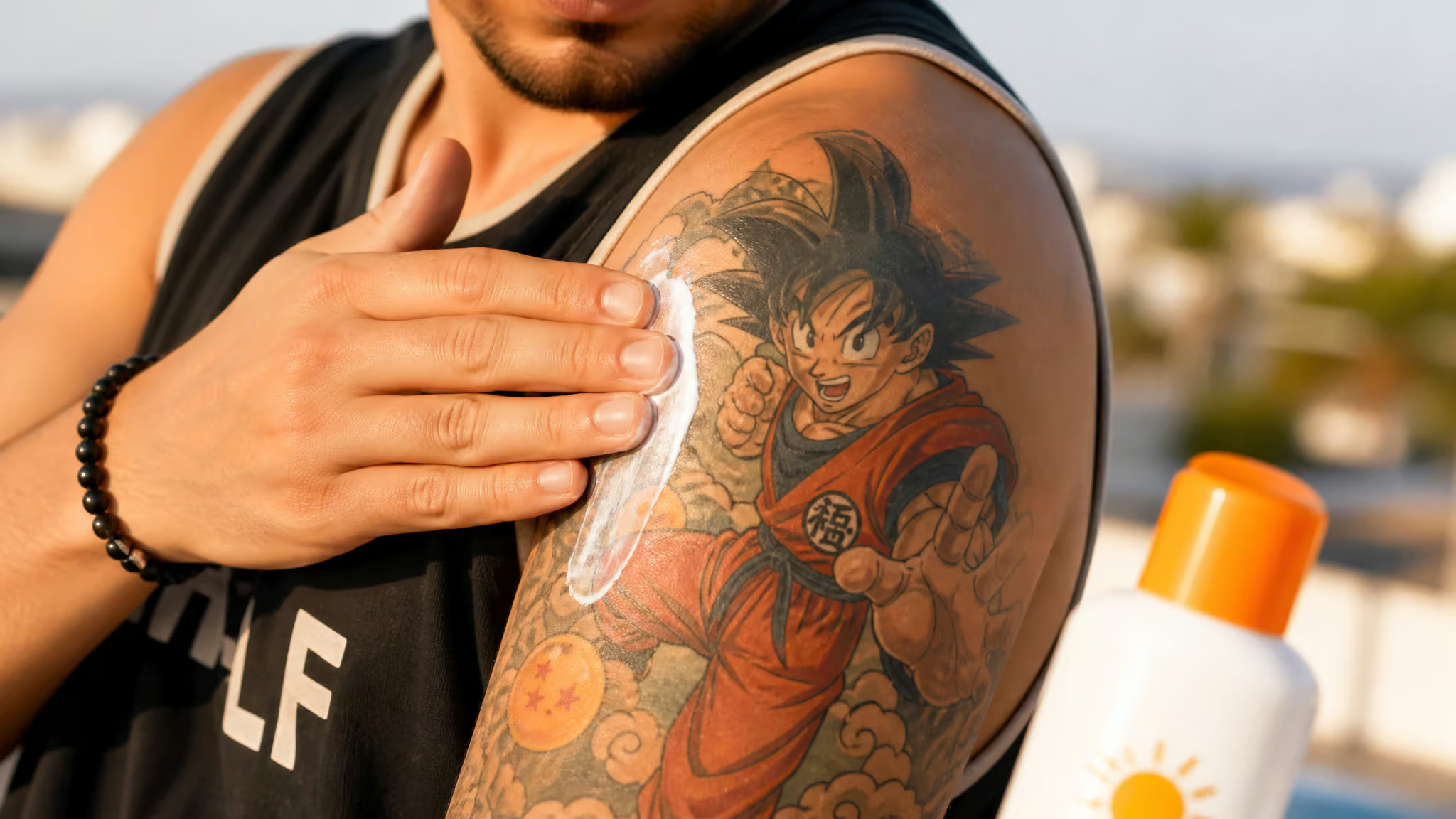
The aftercare script is short. Gentle washing, no picking at scabs, regular moisturizing, keep it clean. Then daily sunscreen, the one config change that never expires, because UV is the main environmental enemy of ink and strong exposure genuinely accelerates fading. If you want the sharp example: Denver’s high altitude means stronger UV, so sun protection matters even more there. Think of SPF as the firmware update you apply forever.
Numbers for planning: touch-ups every 2-4 years are normal upkeep for most anime pieces, not a flaw. And there’s an upgrade path: pieces that are a decade or a decade and a half old can often be reworked with more pigment, stronger outlines, or expansion. Old ink isn’t dead ink. These intervals are typical guidance, not guarantees; your mileage varies with skill, placement, and sun.
Curated vs. cliché: what you’ll still love at year 10
Here’s my honest filter, owned as taste: uncontextualized floating character faces and bare kanji read as weeb cliché to me. Scene excerpts, screentone textures, and symbolic props read as intentional. The reason isn’t that anime is embarrassing; it’s a problem of translating craft between media. Straight screen copies ignore that skin can’t render flat colors and crisp lines.
Designs that borrow anime’s visual grammar, its panels, its hatching, its props, respect the medium instead of fighting it. (If you’re browsing the wider nerd-tattoo landscape, the same filter holds across fandoms.)
The meaning layer is what makes it stick. People get these to mark fandom, nostalgia, personal growth, milestones; a tattoo as the save point for a life moment. Sincere, not saccharine. It’s also why anime pieces make a gentler first-timer on-ramp than most genres: the meaning lowers the emotional stakes, so you can (see what we did there) enjoy the process. And yes, I’ll say the quiet thing: wearing your save file is a perfectly legitimate reason to get inked.
The legitimacy arc deserves its closing beat. For years, mentors dismissed anime as “not real art” and apprentices got stuck doing roses, skulls, and script. Kim’s high school art teachers banned it too, all the way down the stack. Then client demand changed the industry: Kim, 12 years tattooing now, owns Black Rabbit Tattoo, an all-female shop in Richmond, Virginia, and Courtney Raimondi traces her values to anime’s female-centered stories, having first watched Sailor Moon around age 12.
Events like Denver Fan Expo and the reach of streaming platforms show the adoption curve in the real world. The gatekeeping era lost. Delightfully.
So the swap instruction, one line: take the verbatim screenshot and replace it with a design tied to one scene or milestone that matters to you, rendered in a style that survives skin.
Quick-reference decision checklist
- Name the content category: kawaii, manga panel, shonen, waifu, or minimalist-symbolic.
- Name the execution style: color realism, black-and-grey, traditional, new school, or neo-traditional.
- Check the palette against the fading curve; pastels and fine lines go first.
- Check scale and placement friction; hands, ribs, and feet eat detail.
- Verify the artist on healed portfolio photos, matched to your style.
- Budget the touch-up cadence: every 2-4 years is normal upkeep.
Pick the idea that survives both the sun and your own taste at year 10.
Frequently Asked Questions
Full-color anime tattoo vs black-and-grey manga panel tattoo: which ages better over 10 years?
Black-and-grey manga panels age more consistently, because contrast carries the image even as ink softens — the format was pre-optimized, since the original medium was ink on paper. Full-color portraits capture screenshot energy but lean on exactly the pigments that fade first, and they typically want a refresh every 2-4 years. Either can stay clear 10+ years with skilled work and good placement; aging is still conditional on skill, aftercare, and sun.