I was poking around the history of candy tattoos the other night, fully prepared to write them off as a TikTok-era bit, and instead I fell straight through the floor. Turns out “nerd candy tattoo” isn’t some 2024 invention. A candy blogger was writing about people with candy ink back in 2008. A whole newsroom was showing off geek tattoos in 2016.
And the Nerds-specific wave we’re seeing now on image platforms and related searches? The pattern suggests it’s a revival of a documented tradition, not a fresh meme. Which raises the actual question you’re probably here with: is a permanent Nerds tattoo charming nostalgia, or the kind of thing you’ll outgrow faster than a box of the actual candy? I dug into the documented history and the documented disasters, and I’ve got an evaluation for you, not just a gallery.
Key Takeaways
Candy tattoos are older than the current revival: a 2008 Candy Addict blogger found whole groups of people with candy ink after watching Miami Ink, and a 2016 Twin Cities Geek essay showed geek ink had gone mainstream-normal.
The documented failure mode is incoherent mashups: a green M&M’s tattoo with odd shoes and screaming demons, and a Gonzo-plus-PEZ combo the 2008 coverage called the stuff of nightmares.
A Nerds tattoo works when it anchors a real memory and stays inside candy’s own visual language: the dual-chamber box, the pebble clusters, the neon purple-pink-green palette.
Table of Contents
What a Nerds candy tattoo actually looks like
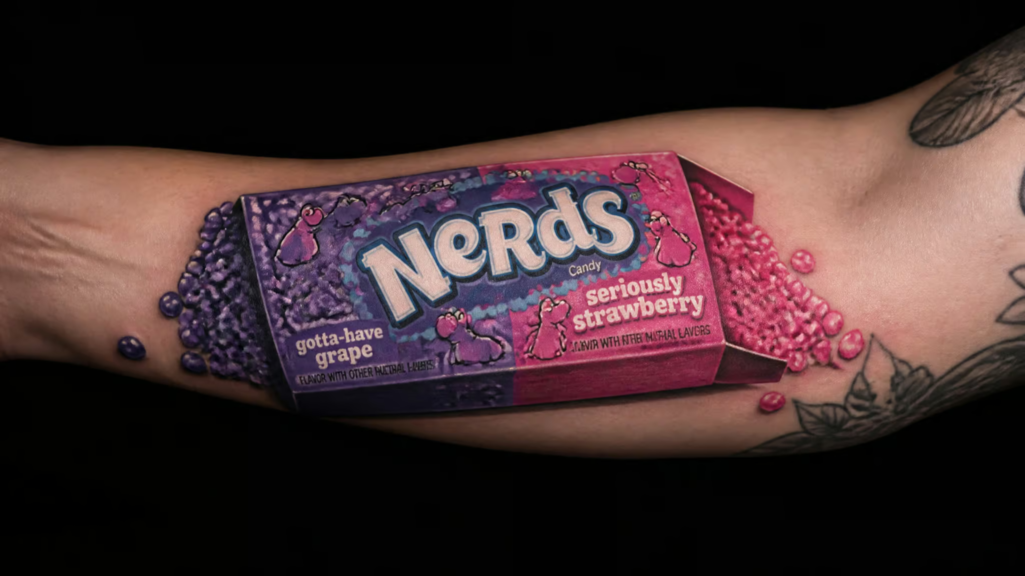
A Nerds candy tattoo is a nostalgic design built from the candy’s visual vocabulary: the dual-chamber box and the pebble clusters. That’s the whole design space, and it’s honestly more flexible than it sounds.
The classic dual-chamber box
The box is the hero asset. You know the one: two compartments, one flavor per side, bright contrasting colors, chunky cartoon lettering. On skin it reads instantly, even at small sizes, because the layout is so iconic. Common approaches:
- Small single box, two or three inches, forearm or ankle. The minimalist move.
- Box as a sleeve panel, where the split two-flavor layout gives you a natural vertical composition between other pieces.
- Box tilted or popped open, with pebbles spilling out, which bridges into the cluster style below.
The dual-chamber split is doing real design work here. It’s basically two color fields with a divider, which means an artist can pack saturated color cleanly without fighting fine detail.
Gummy clusters and pebble gradients
A single tiny cluster, maybe a dozen ovoids in two or three neon shades, works as a minimalist small piece, the kind of thing you get on a whim and never regret explaining. Push it bigger and you get cluster gradients: fields of pink, purple, and green pebbles packed like color-work, which is where Nerds ink gets genuinely pretty. And within a larger candy sleeve, individual pebble pieces are perfect filler.
They slot into gaps between a Wonka bar, a gobstopper, whatever else you’re collecting. Think of them as the drop cap of a candy sleeve.
Placement-wise, small clusters want relatively flat, low-abuse real estate: inner forearm, upper arm, calf. Fine pebble detail on hands and feet is where small round shapes get muddy over the years.
Mascots, lettering, and filler pieces
Beyond box and pebbles, the design vocabulary extends to the brand’s mascot-style characters and the rounded, bubbly lettering. Those work as centerpieces in sleeve-scale candy collages, or as accents that tie a multi-candy piece together.
One honesty note before we go further: I couldn’t find verified photo documentation of Nerds-specific tattoos in the material I dug into for this piece. What exists is a recognized design vocabulary that image-platform demand clearly supports, so treat the above as a well-informed description of the style space, not a catalog of documented client work.
Where the trend came from
Fast forward to 2016: a Twin Cities Geek writer proposed a geek-tattoo article, and within days practically the entire staff responded with stories or photos.

In 2008, a blogger at Candy Addict was watching Miami Ink, the reality show where the best part was always hearing why people got inked. Curious, they searched Google for candy tattoos and got genuinely stunned: whole groups of people with candy tattoos, an entire subset of body art they had no idea existed. That’s a documented community of candy ink seventeen years before the current wave.
Not debate, not “tattoos are for sailors,” just an enthusiastic show-and-tell, mainstream-normal enough that a newsroom couldn’t wait to share theirs.
Today, image-platform demand and related searches (Nerd candy tattoo designs, ideas, sleeve) point to a nostalgia-driven Nerds revival. I want to hedge this properly: the pattern suggests a revival, and I’m not going to invent viral moments or view counts to dress it up. But the shape of the thing is clear. Nerds launched in the 1980s under Wonka, sat squarely in the neon 1990s childhood aesthetic, and candy nostalgia of that era is exactly the flavor the current wave wants.
Candy ink isn’t a TikTok invention. The Nerds wave is the latest entry in a documented tradition, with Miami Ink-era themed ink as the connective tissue.
What a candy tattoo means (and what it doesn’t)
A candy tattoo means nostalgia, playfulness, and personal memory. It signals a sweet tooth and a playful personality, not a values allegiance, and that distinction is the entire point of this section.
The best framing I found comes from a 2016 Twin Cities Geek essay that treats tattoos as a journal written on the body: they mark things done, dreams, triumphs, failures, and each one is a symbol, word, or picture with intense personal meaning. Miami Ink ran on the same insight, episode after episode: people get tattooed as reminders of a person or event, or as self-expression. Candy fits the second bucket and only gestures at the first. It has no moral narrative, no ethic to encode. So the meaning comes entirely from the wearer’s own story.
That’s what the recurring theme in tattoo-community discussions gets right: the wearer isn’t declaring fandom of the candy. The candy is the container for a story. A grandparent who kept a box of Nerds in her purse. A corner-store ritual after school, a specific candy run with specific people.
Strip the story out and you’ve got brand art. Keep it, and the pebbles become a bookmark in the journal of your skin.
Why people get nostalgic candy tattoos
People get nostalgic candy tattoos as self-expression, chosen deliberately: they’re picking humor and lightness on purpose, not by accident.
That matters, because it’s easy to read playful ink as impulsive. It usually isn’t. Choosing a Nerds box over, say, a memorial portrait is choosing a warm register for your skin, one of many nerdy tattoo ideas that treat ink as expression rather than impulse, and the 2008 Candy Addict coverage nailed it: candy addicts use tattooing to express their true love. Same human need as any other ink, sweeter subject.
There’s a simple two-bucket distinction underneath all of this, and it’s worth stating once plainly. Some tattoos remember a person or event. Others express who you are or what you love. Nostalgic candy tattoos live in the second bucket, and they fit readers who want ink that’s warm rather than heavy.
The trade-off is built in: it’s playful by design, so if what you actually want is gravitas, this isn’t the vehicle. But choosing lightness deliberately isn’t a lesser choice. Watching the pattern play out across the sources, that deliberate lightness looks less like impulse and more like someone who knows exactly what register they’re writing their body journal in.
Nerd ink and candy ink are two different kinds of meaning
The “nerd” in Nerds candy tattoo pulls double duty, and the two readings encode completely different things: fandom ink encodes values, while candy ink encodes memory.
Fandom ink encodes values
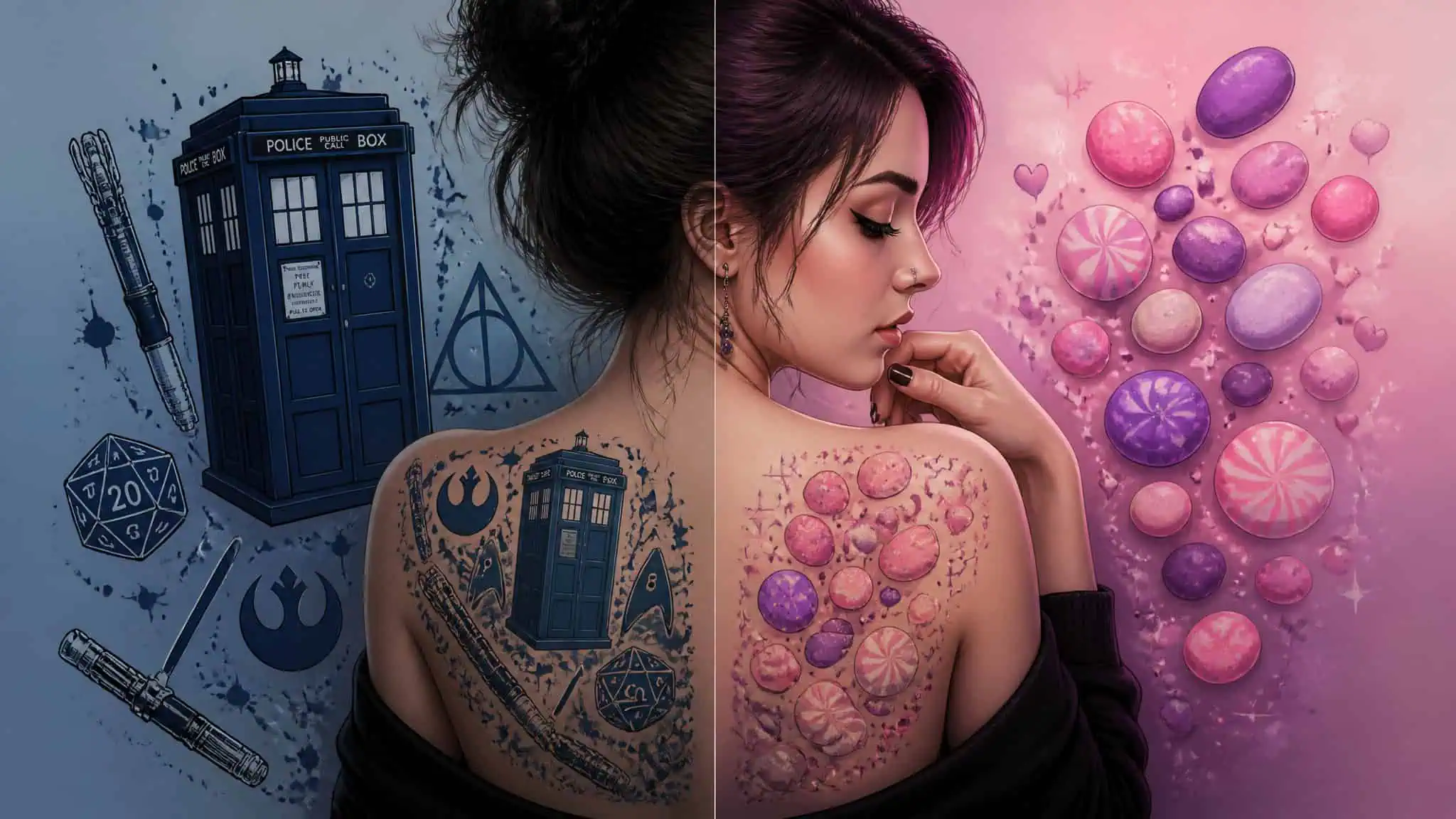
The geek reading of the keyword is rich territory, and the Twin Cities Geek essay maps it well. That writer has nine tattoos, after thinking tattoos were stupid as a kid and changing their mind years ago. One of them is a TARDIS on the arm, the blue police box that’s bigger on the inside, chosen because Doctor Who helped them through a time of needing to feel smart, not just out of show obsession (though they admit the obsession is real too). They also have a circular Gallifreyan piece, the Doctor’s written language, which is a genuinely cool use of an alien script. And a semicolon, which we’ll get to.
The essay’s roll call of staff ink reads like a convention floor: Supernatural, Nightcrawler, Disney princesses, Lord of the Rings, Spider-Man, Final Fantasy VII, Piglet, molecular structures, autographs, the first line of a book, more TARDISes. Their friends wore Green Lantern symbols, Slytherin houses, Mjölnir, lightsabers, Death Stars, Starfleet insignia. The range is the point.
And each of those carries a value, not just a franchise. Mjölnir can only be lifted by the worthy, so wearing Thor’s hammer is a statement about self-worth. “With Great Power Comes Great Responsibility” reminds the wearer how to live their life. Star Trek teaches tolerance and curiosity; X-Men is about racism and homophobia; Lord of the Rings says the will to do good matters more than strength.
Geek tattoos work as pride markers, and here’s the caveat that has to come with it: that’s a partial analogy to pride flags only. The Twin Cities Geek writer says it plainly, and I’ll preserve it plainly: comparing a Doctor Who tattoo to a pride flag literally would be insulting to the LGBT community. Partial analogy. Moving on.
Candy ink encodes memory
Now the asymmetry, which is actually the design constraint that makes Nerds ink interesting. Doctor Who ships with a whole value system pre-installed. Nerds has none. No moral narrative, no ethic, just bright pebbles and a two-flavor box.
Which means the meaning has to come from you, the wearer’s story, the memory the candy is a container for. And that’s exactly why it survives permanence scrutiny: a tattoo whose meaning you supplied yourself has nothing to outgrow except your own relationship to the memory. If you’re weighing this against the broader world of nerdy tattoo ideas, this is the fork in the road: values shorthand on one side, memory container on the other. Both are legitimate. They’re just not the same tattoo.
Good candy tattoos vs. bad: the mashup problem
The decisive difference between a great candy tattoo and a regrettable one is whether the design stays inside candy’s own visual language. That’s the rule, and the sources document both sides of it. The M&M’s example fails it with odd shoes and screaming demons, and the Gonzo-with-PEZ mashup fails it so hard the author calls it disturbing, while the candy tattoo that works earns praise precisely for expressing love of candy without being disturbing.
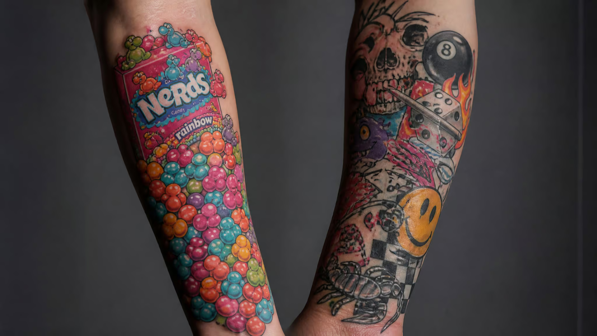
The failures are gloriously specific. 2008 Candy Addict coverage, echoed in the 2016 essay, describes a green M&M’s tattoo featuring odd shoes and screaming demons and skulls. No mention of why. The blogger found the meaning baffling and wondered aloud whether it stemmed from a bad experience with small chocolate candies. Honestly, same. It’s cursed-image territory: every individual element is technically real, and the combination is incoherent menace.
Then there’s Gonzo holding a PEZ dispenser, which the 2008 coverage described as the stuff of nightmares. And look, Gonzo’s inherent weirdness is doing some of the comedic work here, but the mashup logic is what breaks it: Muppet plus candy-dispensing hardware is a design decision from someone who asked “what if” and nobody said stop. The blogger joked about a high-speed PEZ dispenser; I’ll just note that building a dispenser capable of firing PEZ at harmful velocity is a classic overengineered-weekend-project impulse, and it does not belong on skin.
The success case is quieter: one candy tattoo the coverage praised as quite beautiful, for expressing a love of all things candy without being disturbing. That “without being disturbing” is load-bearing.
Quick test: If a candy tattoo mixes in elements that don’t belong to candy’s own bright, playful world, that’s the documented failure mode.
So the tell is simple. Both documented failures imported unrelated pop-culture menace: demons crashing a green M&M’s, Gonzo with a PEZ dispenser. The one the coverage praised stayed on-theme. Neither person is named, and that’s how it should stay.
Should you get one? Fading, touch-ups, and regret
Yes, bright candy tattoos age faster than darker work, when the design leans entirely on the neon end of the palette. The 2008 Candy Addict blogger wouldn’t get one themselves but mused about what the ravages of time might do to a giant gummy bear tattoo, and the joke smuggles in a real constraint: neon pink, purple, and green are exactly the colors tattoo communities commonly report fading least crisply, prompting touch-ups. I want to keep all of this qualitative and hedged, because that’s what the evidence supports: no timelines, no costs, no before-and-after claims. But the practical read is that a Nerds tattoo built only from the lightest pastel pebbles will need more maintenance attention than one where the artist packs darker backing and deeper saturation under the neon. The 2016 essay echoes the same self-deprecating humor about aging ink, which tells you the concern is a running gag with a kernel of truth.
Is it a bad idea? A Nerds candy tattoo is a good idea when it anchors a real memory and stays inside candy’s visual language. It’s a bad idea when it’s an aesthetic impulse with no story behind it, or when it’s a mashup design drifting toward screaming-demon territory. Apply the beautiful-versus-disturbing criteria from the last section: if a stranger looking at your forearm would ask “but why the demons?”, you’ve drifted.
What should you actually ask the artist? The right conversation covers palette depth, whether the neon shades need darker backing for longevity, line weight for the small pebble-cluster detail, and placement and sizing for how the design will wear. Those are conversation prompts, not prescriptive rules; a good artist will have opinions, and if you’re hunting for one, the guide to finding geek-specialist tattoo artists covers the portfolio-vetting questions that matter for detail-heavy work like this.
Here’s the full decision test, then: Section 7’s design rule, plus the memory test. Does the design stay inside candy’s language, and does it anchor your story? Two yeses and you’re clear.
The closing frame is the one the Twin Cities Geek essay earned, so let me hand it back to the documented material. Playful ink sits at one end of a real spectrum. At the other end: memorial tattoos, names and portraits that keep lost loved ones present, and the essay draws that parallel to fandom ink gently, because both keep something important close. There’s the semicolon tattoo, an anti-suicide symbol, a promise not to kill oneself and a quiet signal of help to those who recognize it.
The essay’s writer has one on their arm. Related context: the Always Keep Fighting campaign, started by Jared Padalecki, Sam Winchester on Supernatural, sold T-shirts supporting To Write Love on Her Arms, and it breathes the same air as the semicolon’s meaning. There’s the chemical-formula tattoo reminding its wearer that depression can be a fixable chemical imbalance, hope encoded as chemistry, cousin to those staff molecular-structure pieces. And there’s the radioactive spider on the shoulder, a reminder that like Peter Parker you don’t get to choose when greatness is thrust upon you, only how you’ll deal with it.
Against that spectrum, a Nerds tattoo is a deliberate choice for lightness. Valid, not lesser. To everyone else it may look like a candy wrapper. To the wearer, it’s a story, a pride symbol, an obstacle overcome, another entry in the journal of your skin.
Frequently Asked Questions
What is the saying for Nerds candy?
Nerds candy itself doesn’t carry a famous moral slogan the way franchises like Spider-Man do — its identity is built on visuals instead: the dual-chamber box, one flavor per side, chunky cartoon lettering, and neon purple-pink-green pebble clusters. That’s why Nerds ink encodes memory rather than values. Any meaning has to come from the wearer’s story, not the brand’s words.
What are Nerds candy supposed to be?
Nerds are the small, ovoid, crunchy pebble-shaped candies launched in the 1980s under Wonka, sold in the iconic dual-chamber box with a different flavor on each side. Their neon pink, purple, and green palette sits squarely in the 1990s childhood aesthetic, which is exactly the nostalgia the current Nerds tattoo revival draws on.
What are some tattoos to avoid?
The documented candy-tattoo failure mode is the incoherent mashup: a green M&M’s tattoo with odd shoes and screaming demons, and a Gonzo holding a PEZ dispenser, which 2008 coverage called the stuff of nightmares. The rule is to stay inside your subject’s own visual language — if a stranger would ask ‘but why the demons?’, the design has drifted. A tattoo that’s an aesthetic impulse with no personal story behind it is also a regret risk.
Why do people get nostalgic childhood candy tattoos as self-expression?
Because choosing playful ink is a deliberate register, not an impulse. Picking a Nerds box over a memorial portrait means choosing warmth and lightness for your skin on purpose — the same human need as any other tattoo, just a sweeter subject. It signals playfulness and a sweet tooth, and deliberately choosing lightness isn’t a lesser choice.