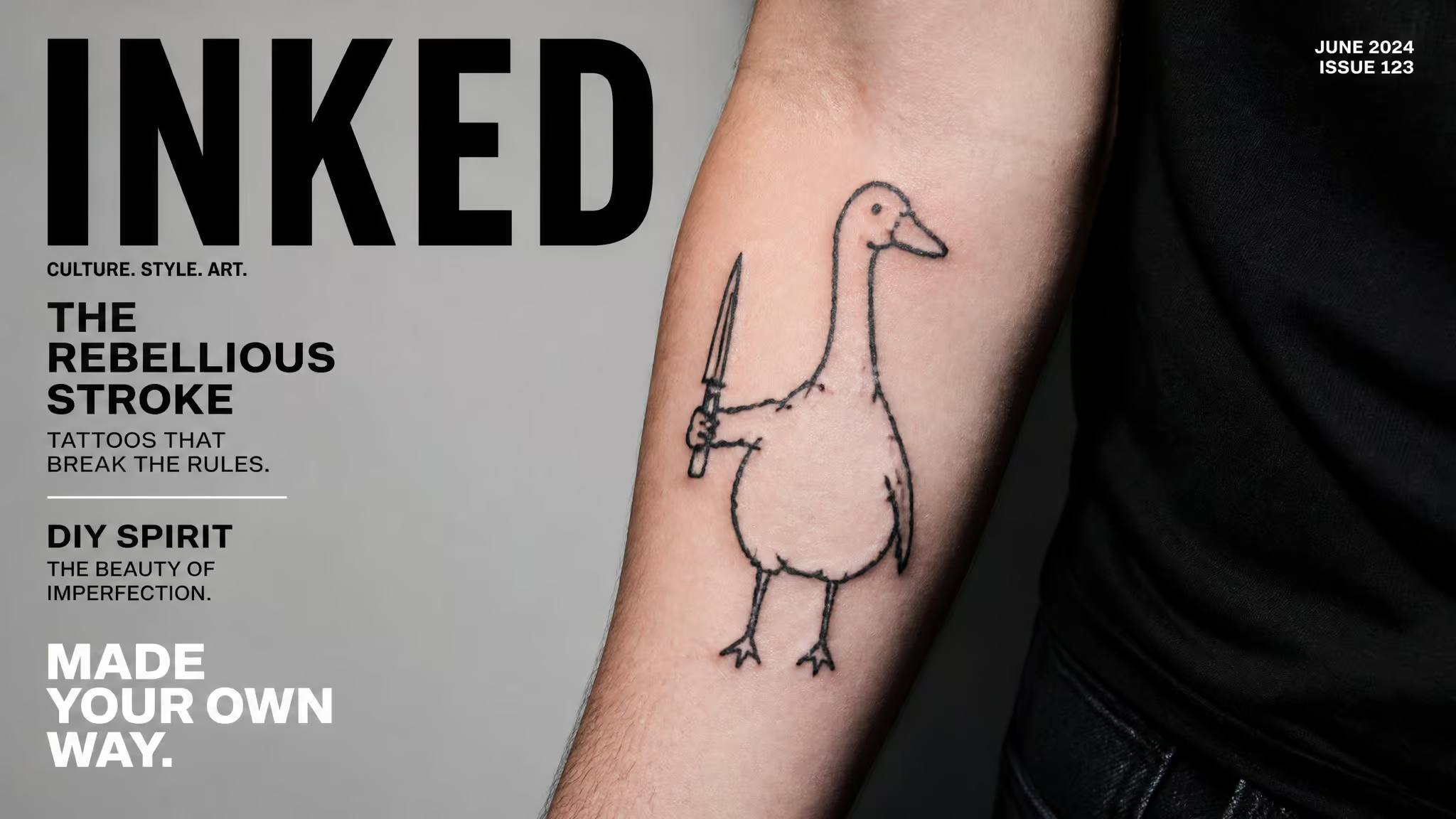
So there you are at a coffee shop, and the barista’s forearm has what looks like a marker doodle of a goose holding a knife. Your first thought, if you’re honest, is: did this person get robbed? Was the shop out of actual talent that day? Then you notice the other pieces, all the same deliberately wobbly cartoon linework, and it clicks: this isn’t a bad tattoo.
It’s an ignorant style tattoo, a genre where the crude, DIY, margin-doodle look is the entire spec. An ignorant style tattoo is a deliberately crude black-linework genre, all doodle cartoons and irony with little or no shading, popularized in 1990s Paris by ex-graffiti artist Fuzi Uvtpk, who dates the term to around 1996. Its roots run through old Russian-style prison tattoos and 1970s punk DIY culture, plus graffiti, which is literally where Fuzi came from. You’ll also see it called Naive Style, Outsider Art Tattoos, or DIY Tattoos, and the cruder slang (“shitty tattoos,” “fail tattoos”) floats around too, some of it crude by design.
We cover deliberately unpolished aesthetics here all the time, pixel art, lo-fi hardware, cursed dongles that work fine, and honestly, this is the tattoo-world version of exactly that sensibility. “Bad” as a feature flag, not a bug.
Key Takeaways
Ignorant style tattoos are intentionally crude black-linework doodles popularized by Fuzi Uvtpk in 1990s Paris; he dates the term to around 1996, and the crudeness is deliberate irony, not incompetence.
The mainstream breakthrough was the “lucky you” horseshoe Scarlett Johansson got in 2016, tattooed by Fuzi himself; Miley Cyrus, Pete Davidson, Harry Styles, and Dua Lipa are among the wearers.
The best way to find an artist is Instagram (@ignorant_tattoos, @ignorantstyletattoo) or a Tattoodo search for “ignorant style” plus your city, and flash images are inspiration, never something to copy exactly.
Table of Contents
What is an ignorant style tattoo?
Ignorant style is intentional irony, not a trashy tattoo by accident. The name formally means lacking knowledge or sophistication, and critics read it literally, but the term actually conveys deliberate humor and irony rather than lack of skill, wearers treat it as a badge of honor. The tell is whether the crudeness is systematic: consistent doodle-style linework, deliberate asymmetry, proportions that are warped but confident. A botched tattoo looks random and apologetic; an ignorant style piece looks like someone drew it exactly that way on purpose, because someone did.
The name throws people. Formally, “ignorant” means lacking knowledge or sophistication, and critics read it literally, as if the artist is admitting failure up front. Wearers treat it as a badge of honor instead. If you’ve ever proudly run a janky homelab built from castoff hardware that you wired yourself and that works beautifully, you already understand the energy.
The label signals intentional humor and irony, not a lack of skill. In practice, the tell between the genre and a genuine mistake is simple: real ignorant style is consistent, self-aware, and confident in its own rules.
What do ignorant style tattoos look like?
Ignorant style tattoos look like bold, simple black linework with little or no shading, doodle-like cartoons with warped proportions, asymmetry, and unfinished elements. Tattoo artist KC Wladichuk described them as designs deliberately made to look as if they were done in someone’s basement. She meant it as a description; the genre took it as the goal. Think of the margin sketches in a dev notebook that somehow shipped as the final interface.
The imperfections are the charm, like visible breadboard wires on a build that clearly works. The genre weights spontaneity over technical polish, a deliberate priority inversion, not a skill deficit.
Lettering
Text in this style is a whole sub-system of its own. The “font” isn’t a font: it’s simulated scrawl, like something hurriedly written on a post-it note. Mistakes get left in. Words get crossed out.
All caps show up a lot. Some lettering resembles graffiti tags, which tracks, because graffiti is literally where the style came from. Broken on purpose, and it reads great.
Colour
The default palette is black, full stop. Some artists do line work in other colours, red being the classic accent. Andrea (@nolseytattoo) uses colour only when it’s necessary to convey the message, which is restraint as a design principle: no shading gradients, no full-colour renders, just the minimum payload that still lands the joke.
Cartoon DNA
Andrea cites Looney Tunes, old-timey cartoons, and her father’s comic and cartoon drawing as her influences, and she describes ignorant style as a looser, freer way of drawing, one that drops the usual rules for shading, shapes, and proportions. Keep that framing in mind, because it matters later. The style also evolves hand in hand with contemporary art and social media. It’s a living project with active development, not a museum piece.
Who invented ignorant style tattoos?
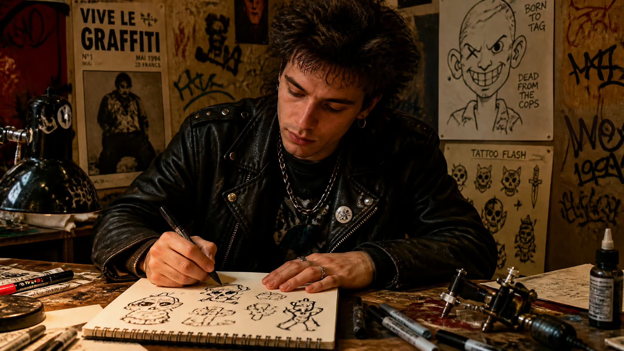
Fuzi Uvtpk, an ex-graffiti artist, popularized the style in Paris during the 1990s and puts the birth of the “ignorant style” terminology at around 1996. He’d already been pushing simple cartoonish illustrations in his graffiti before pivoting to tattoos in the 1990s, so it was a natural fork, not a career reboot. Small human detail: he’s lived in California for six years now.
Fuzi’s rules
Fuzi ran his work like a strict linter he chose for himself. Rule one: unique designs only, no copy-paste, which is the exact opposite of the flash-sheet clone economy. Rule two: clients had to accept his style, take it or leave it. Rule three: he wouldn’t tattoo in shops, keeping the whole thing outside the standard setup. And here’s the classic side-project-got-weird arc: he says the style was never intended as a movement, and it became a worldwide scene anyway.
The lineage
The style didn’t spawn in a vacuum. Its dependency list includes old Russian-style prison tattoos (mentioned here respectfully and briefly), the 1970s punk DIY philosophy of “build it yourself, perfection optional,” graffiti, and underground art scenes that were already pushing back on mainstream standards. Zoom out further and you find the broader Ignorant Art movement, which took shape in the late 20th century as a pushback against slick, polished mainstream art, spanning painting, drawing, graffiti, tattooing, and mixed media. Its influence list reads like a starter pack: folk art, outsider art, street culture, comics, zines, graphic design, notebook scribbles, American traditional.
If you want to see the naive-drawing side in galleries, look up Rose Wylie and David Shrigley. And Jean-Michel Basquiat and Keith Haring sit in the punk-adjacent lineage too, though to be clear, neither tattooed in this style.
Why ignorant style exists: rebellion against realism and meaning
An ignorant style tattoo doesn’t need hidden meaning. Mocking the idea that tattoos need symbolism is the point.
The style ran as a countercurrent against two things at once. First, realism: in the 21st-century mainstream, realism was the most lauded style, and artists described feeling like photocopiers, reproducing the same realistic lion-and-pocket-watch image over and over. Ignorant style rejects that and restores creative freedom. The practical payoff for customers: you’re much likelier to walk out with genuinely unique art.
Second, required meaning. The genre started as a counter to the “every tattoo must have a backstory” convention, and it’s self-referential satire about what a tattoo “should” be, like a program that jokes about being a program. It’s mostly humor and satire, but not all jokes; there are moments of introspection and vulnerability mixed in, and that tonal contrast is part of the design.
Then there’s the permanence angle. As tattooing mainstreamed, it lost some of its grit and cache. Just getting inked isn’t cultural defiance anymore, so enthusiasts found a new way of, in Struthless’s framing, “laughing in the face of permanence.” Fuzi put the contrarian case to Vice like this: “Now so many people have tattoos but they are meaningless, but people are beginning to want something more authentic.”
Sit with that for a second. In a mainstreamed industry of polished realism, the crude ink is the authentic option.
From underground to mainstream: celebrities and the 2016 breakthrough
Celebrities carried ignorant style into the mainstream, and the crossover moment comes down to a single tattoo: Scarlett Johansson’s “lucky you” horseshoe from 2016, a small piece tattooed by Fuzi himself. Once the right accounts picked it up, the project went viral, as these things do.
The wearer list grew from there: Miley Cyrus, who grew a sticker sleeve over time, Pete Davidson, Machine Gun Kelly, Harry Styles, Dua Lipa, Brooke Candy. One honest complication: Davidson later began removing his tattoos. People’s relationships with their ink evolve, and that’s worth knowing without turning it into a remorse narrative.
By 2023, ignorant style was sitting in the trend landscape alongside neo-traditional, anime/video game, microrealism, minimalist, tribal/cultural, abstract, sticker sleeve, and hand-poked work. The drivers were celebrity visibility (Davidson’s tattoos got partial credit), discovery through tech and social media like Instagram and Pinterest, and the economy: downturns push people toward smaller, more affordable designs, which is exactly this style’s wheelhouse.
Bad tattooing or democratic art?
Fair look at both sides. Traditionalists see a deviation from tattooing’s heritage and craftsmanship: no skill, no finesse, no artistic merit, a style that flunks the standards the craft spent a century building. Some critics even find the term itself problematic, arguing that labeling a style “ignorant” dismisses the artist’s vision.
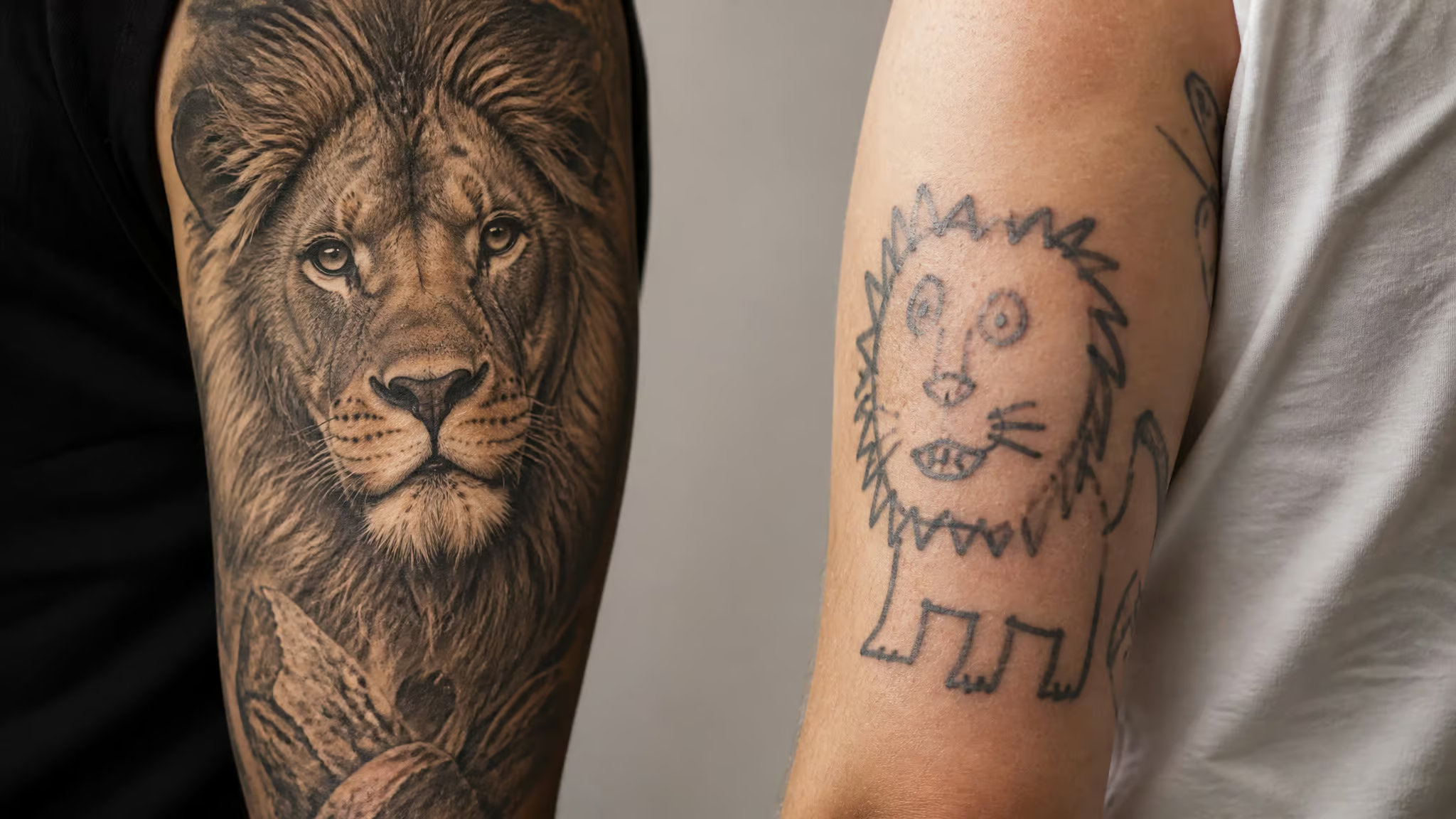
Defenders reframe it entirely: rebellion, liberation from perfectionism, an opening of the gates to wearers and artists outside the usual gatekeepers of taste and privilege. Both camps land real hits, so no verdict here. But the useful turn comes from artist Celle Est, whose point is that the usual markers of a good tattoo, straight lines and cohesive designs among them, simply don’t apply when you’re judging the ignorant style. Which means the real quality question becomes: is the crudeness deliberate or accidental?
You judge this genre by line confidence and artist intent, not by whether it passes the traditional checklist. The debate isn’t skill versus no skill. It’s intent versus incompetence, and once you see it that way, the whole controversy deflates. Sometimes not knowing the rules is the whole point.
Quick test: Look for consistency and confidence. Deliberate crudeness follows its own rules; a botched tattoo looks random and apologetic.
Ignorant style tattoo ideas (including nerdy references)
The best ignorant style tattoo ideas are mundane, silly, or self-referential subjects elevated to permanence, because the joke is the design. Flash in this genre often reflects the artist’s mood: Andrea (@nolseytattoo) describes her design pages as a mood log, some pieces silly, some physical expressions of feelings. Popular subjects run from stick figures, smiley faces, flames, knives, and wine glasses to animals doing human things like geese holding knives or raccoons going through bins. It’s a very different spirit from Japanese style tattoos, which lean on tradition rather than irony, and that contrast is part of why copying misses the point: flash designs are for inspiration, not duplication.
Minimalist
The genre meets minimal footprint here: stripped-back lines and shapes, fewest elements that still read as the joke. Some designs get black fill; others stay pure linework, which keeps the minimalist feel.
Small
The compact form factor. Stick figures, a wine glass, smiley faces, bare numbers, a Doberman, flames, knives and daggers. These usually only need a small patch of skin to land the message. A wine glass made permanent is the genre in miniature: mundane object, permanent placement, that’s the joke and the charm.
90s
The 90s are a hot tattoo trend, and the nostalgia cycle collides neatly with the style’s own birth decade. Kids’ cartoons, tribal motifs, dolphins, all getting an ignorant take. We’re reporting the tribal nod as a trend, not endorsing it.
Colour
Mostly black by convention, with occasional red line work as the exception. And per Andrea’s rule: colour only when it’s necessary to convey the message.
Animals
Animals doing human things, geese holding knives, raccoons going through bins. The absurdity is the content. My advice: pick your favourite animal doing something fun and/or dumb. That’s the whole design brief.
Other subjects
Cyber tribal, frogs, car air fresheners, cartoon characters, receipts from McDonald’s, invites to a party of Tom’s. The world is the design corpus. Inspiration can come from literally anywhere, which is the most encouraging thing about this genre.
The nerdy references, and why this style de-risks them
Here’s my theory, and I keep coming back to it: ignorant style is maybe the best-kept secret for nerdy tattoos. Think about why fandom tattoos go wrong. It’s usually over-commitment, a hyper-serious realistic portrait of a character, rendered with maximum gravity, that you have to explain at every wedding for the rest of your life. A crude doodle version carries built-in humility. The joke is baked into the execution, so it ages better emotionally than a piece that takes its own fandom too seriously.
And per Andrea’s framing, cartoon treatment isn’t an adaptation in this style, it’s the native format. The genre grew out of Looney Tunes and comic-drawing DNA, so games, anime, cartoons, and inside jokes don’t need to be forced into it. They drop in cleanly, like a library built for exactly your use case. There’s also a pattern people cite of regretting over-committed realistic fandom pieces, and while there are no hard stats on this, the logic holds: the doodle version has an exit ramp emotionally, because it never claimed to be solemn.
Fuzi himself says the style was never meant to be a movement, so nobody can tell you this pairing is official. That’s exactly why it works. If you want a broader tour of fandom-specific options, our nerdy tattoo ideas guide covers the full landscape.
How to get an ignorant style tattoo
The fastest route to finding an ignorant style tattoo artist you’ll actually like is Instagram (@ignorant_tattoos and @ignorantstyletattoo) and a Tattoodo search for “ignorant style” plus your city or country. Artists post finished tattoos, available designs, and flash, so the feed is basically live inventory. It’s the same discovery pattern as finding any niche maker: follow the accounts, watch the work, see who’s taking bookings. For geek-fandom work specifically, our guide to nerdy tattoo artists near me covers portfolio vetting, which applies here too.
Finding artists
A few names to start with, lean entries, no rankings: @diny_land (London), @_harrymckenzie (Brighton), @floppy_pigeon_pokes (UK), @arual.tattoo (Brighton), and Andrea (@nolseytattoo), whose work we’ve already talked about. Kirstie and Ivy of KTREW also work in this space. On Tattoodo, the listed artists include Fuzi Uvtpk, Sean from Texas, Auto Christ, and Egbz.
Flash etiquette
Flash is inspiration, never a duplicate. Lifting someone else’s existing tattoo isn’t cool, and here’s why it goes deeper than manners in this genre: flash reflects the artist’s mood, feelings, and humour, so a copied design is a mood translated by the wrong translator. The recurring friction goes like this: a client brings a saved flash image expecting an exact duplicate, and the artist treats it as mood-reference and pushes toward a unique design instead. That’s Fuzi’s unique-designs-only rule in action, decades later.
Placement and sleeves
Short version: it can go anywhere, and it usually goes somewhere visible. Arms, legs, neck, against the broader trend of hiding ink. The style wants to be seen. A sleeve works like a giant doodle pad, and individual pieces can mix with other styles into a patchwork bodysuit. The style plays well with others.
If you’re thinking patchwork or sticker sleeve, ignorant style is a perfect individual twist on the format. Two useful facts: recognisable per-artist styles actually amplify cohesion, so a sleeve assembled from multiple artists can still look unified when each has a signature. And counterintuitively, the best patchwork sleeves take significant planning despite looking unplanned. Logistics: a well-planned patchwork arm sleeve can be done in a single day sitting (emphasis on well-planned), and pieces done around the same time tend to age more cohesively.
Sticker sleeves are the incremental-commitment model: quick, budget-friendly, and they can grow over years, which is how Miley Cyrus built hers. If your artist pushes back on placement, that’s experience talking. Listen. If you’re budgeting, our small tattoo cost breakdown covers the pricing math.
Handpoke
Many artists handpoke, needle and ink applied by hand rather than machine, for a handmade, authentic DIY feel that matches the aesthetic. The honest trade-offs: it’s often less painful but takes more time, and some people find it cathartic. The constraint shapes the design: carefully placed lines and dots, which fits the whole constraints-breed-creativity thread. One firm line: this is done by specialist artists, not at home.
Red flag: Handpoke work belongs with specialist artists only — this is not a DIY-at-home technique, no matter how simple the aesthetic looks.
Custom designs, colour, and how the style ages
Two practical questions come up once you’re past the ideas stage: can you get custom work and colour in this style, and what happens to crude linework over the decades? Short answers: yes with caveats, and it’s an open question. Here’s the detail.
Colour and custom
Yes on both, with caveats. Colour is conventionally black-dominant with red accents as the known exception, and any customization is a negotiation with the artist’s vision. Fuzi’s clients-accept-his-style rule is basically how this conversation has always worked in the genre: you bring the idea, they bring the execution language.
The economics and the long game
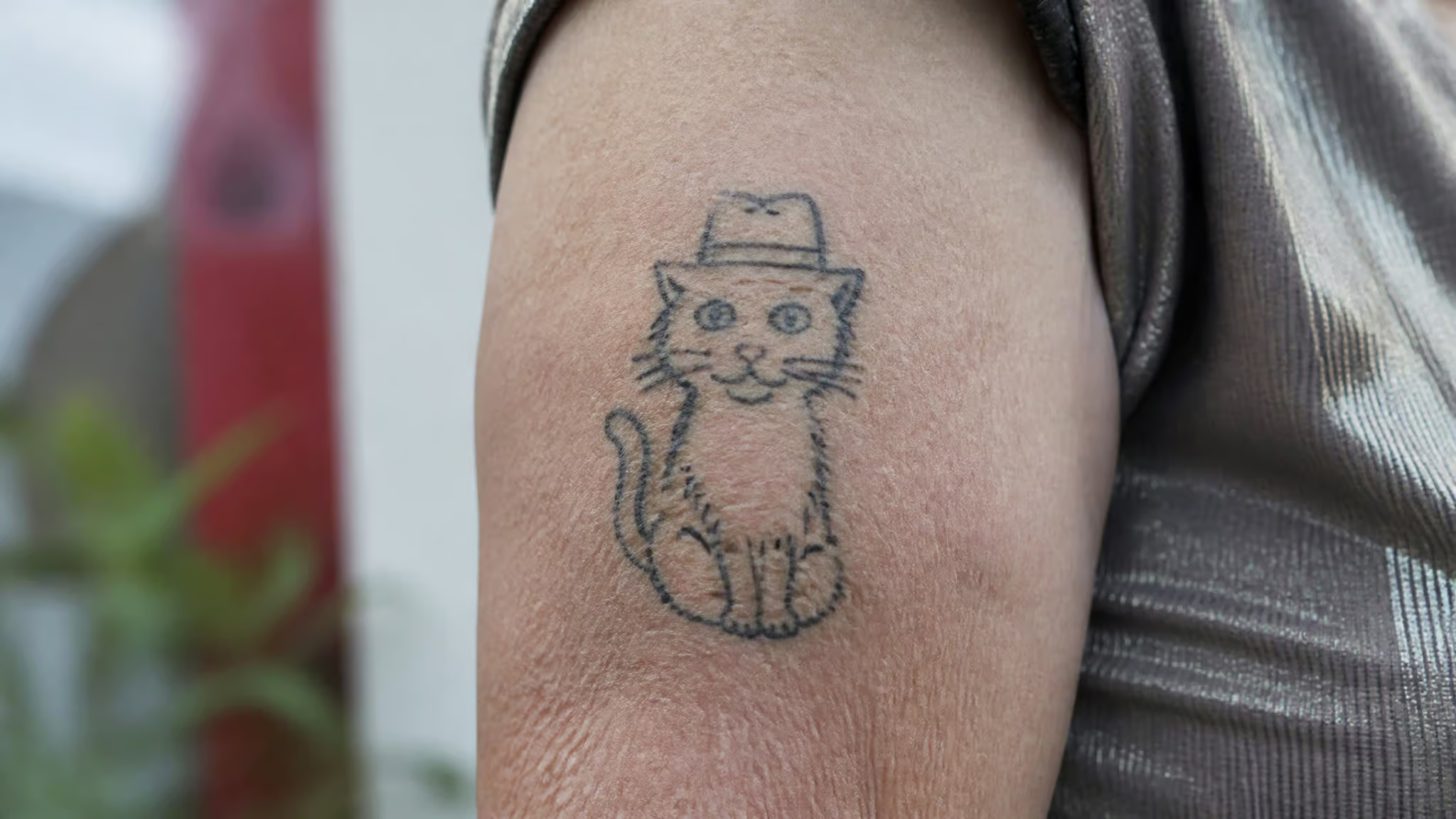
Constraints breed creativity here, but the causality runs backwards: the low barrier to entry generated the lo-fi aesthetic, not the other way around. Beginner artists can succeed with something as simple as a cat wearing a little hat (verbatim example, and I love it). Per the Struthless video essay, tattoo starter kits on eBay, around $60, put tools in anyone’s hands, and economic downturns pushed smaller, more affordable designs. Those figures come from the video essay, not independent statistics. The trade-off is real and worth saying straight: the open barrier produced more bad tattoos and more infections, balanced against more artists actually earning money from their art.
Now the permanence paradox. So, is an ignorant style tattoo a regret waiting to happen? Yes, when you treat it as a disposable gag; no, except when the joke is the point and you’re fine owning it forever. The honest framing is fad-versus-lasting-shift: the same open question people asked about hip-hop’s early days, and nobody has the answer yet. By roughly 2070, the generation getting inked today reaches old age as the first fully tattooed elderly cohort, and a style built on laughing at permanence is still an open question. Honest note: the sources here don’t address healing times or how thin crude linework ages over decades specifically. The general guidance, clearly attributed as general, is that fine lines can spread and fade over time, and standard tattoo aftercare applies.
What I’d actually take from this: when picking an artist, prioritize line confidence, not just style membership. A confident wobbly line and an incompetent wobbly line look similar at the door and very different in twenty years.
The appeal, in the end, is pretty simple. In a feed of polished, filtered, algorithmically smoothed images, deliberately imperfect ink feels refreshingly authentic, and it’s individual expression in the plainest sense: unique output for unique input. It’s a democratic force too, in plain words, artists from diverse backgrounds, often without formal training, using humor and irony to push back. Fuzi’s observation, as he told Vice, was that wearers are increasingly after something more authentic, and the loop from the intro closes here: that doodle you thought was a mistake?
It’s a coherent choice. It only works if the artist’s crudeness is deliberate. That’s the whole diagnostic. Embrace the imperfections, seek the playfulness, and remember: sometimes not knowing the rules is exactly the point.
Frequently Asked Questions
What is ignorant tattoo style?
It’s a genre of deliberately crude black-linework tattoos — doodle cartoons, warped proportions, asymmetry, and little or no shading — where the “bad” linework is intentional irony, not incompetence. Ex-graffiti artist Fuzi Uvtpk popularized it in 1990s Paris and dates the term itself to around 1996. The tell is consistency: a real ignorant style piece looks like someone drew it exactly that way on purpose.
What do ignorant style tattoos look like visually?
Bold, simple black linework with little or no shading, doodle-like cartoons with warped but confident proportions, deliberate asymmetry, and sometimes unfinished elements. Lettering looks like hurried scrawl with mistakes left in and words crossed out. The palette is almost entirely black, with red as the classic accent colour.
Are ignorant style tattoos just trashy tattoos or is it intentional irony?
It’s intentional irony. The difference between the genre and a botched tattoo is that ignorant style is systematic, self-aware, and confident in its own rules, while a genuine mistake looks random and apologetic. The crudeness is a deliberate design choice mocking the idea that tattoos need polish, realism, or deep symbolism.
How does ignorant style compare to stick and poke and naive tattoos?
They overlap but aren’t identical. Ignorant style is defined by deliberate crude doodle linework and irony, while stick and poke (handpoke) is a technique — needle and ink applied by hand — that many ignorant style artists use for a handmade DIY feel. “Naive style” is one of the style’s alternate names, and the broader naive-drawing side shows up in galleries through artists like Rose Wylie and David Shrigley.