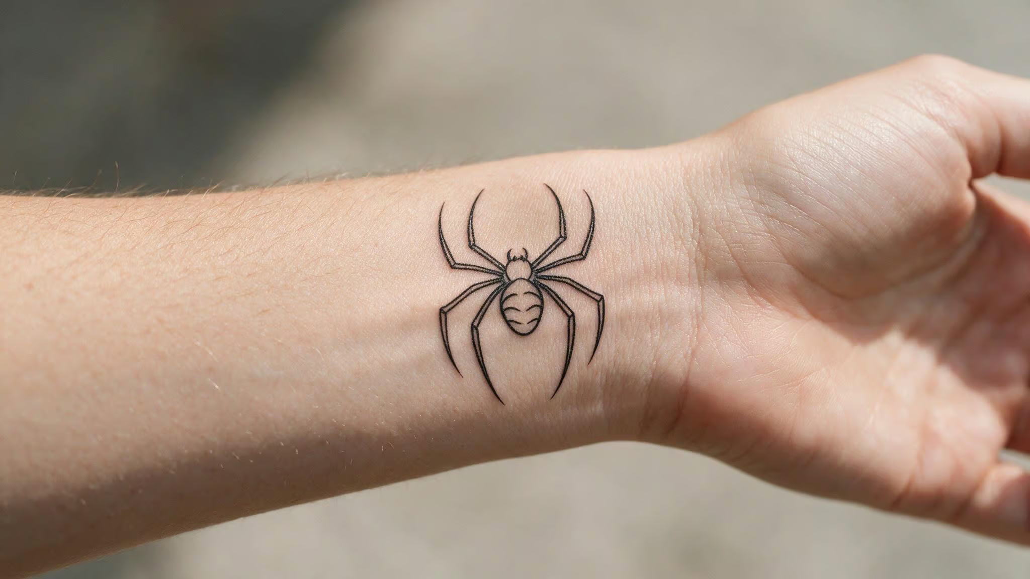
I’ve been down this rabbit hole myself. Hours of scrolling, hopping between Pinterest boards and Reddit threads, hunting for that perfect Spider-Man tattoo that feels personal. The problem is that most collections throw a hundred designs at you without giving you a way to think about what actually fits your fandom.
Here’s what I found: minimalist Spider-Man tattoos fall into two main families — the emblem and the web, plus the silhouette as a third. If you name the family first, everything else (placement, artist, meaning) gets easier to figure out.
I’ll walk through each one with examples, placement logic, and the tradeoffs that most “best of” lists skip. By the end, you’ll have a framework for choosing something that looks good, holds up over time, and says what you want it to say.
Key Takeaways
The two spider emblems (Peter Parker vs. Miles Morales) create a quiet generational signal — Peter’s rounded classic reads as lifelong fandom, Miles’ angular design signals you came in with Into the Spider-Verse.
The Leap of Faith silhouette from Into the Spider-Verse carries emotional weight as a minimalist design because the single pose already represents vulnerability and courage — no detail needed.
Fine-line tattoos on fingers and hands fade and blur faster than other placements; you can still do them, just set realistic expectations about touch-ups and aging.
Table of Contents
The Spider Emblem: Peter Parker vs. Miles Morales
The chest emblem is the obvious starting point, but the decision isn’t “spider or no spider” — it’s which spider.
Peter Parker’s classic emblem is that rounded, almost organic shape you’ve seen on a million comic covers and movie posters. Even scaled down to wrist size, it carries weight. You recognize it before you register what you’re looking at. A simple red-and-blue outline on your wrist or behind your ear reads like an easter egg for people who know.
Miles Morales’ emblem is a different visual language. It’s sharper, more angular — closer to a geometric icon than a biological spider. The straight lines and clean corners give it a modern, almost technical feel. It works well in a minimalist style because the shape does all the work on its own.
The choice between them is a quiet generational statement. Peter’s emblem signals longtime fandom, while Miles’ emblem signals entry with Into the Spider-Verse — and that’s fine, but being clear about which energy you want makes the rest of the decisions fall into place.
Placement note: The wrist and behind-the-ear spots are ideal for these tiny emblems because they’re easy to show off or tuck away. Think of it as a toggle switch for visibility.
Web Patterns and Geometric Abstracts
Every Spider-Man tattoo doesn’t need a spider. The web pattern is its own design family, and it rewards a second look in a way an emblem doesn’t.
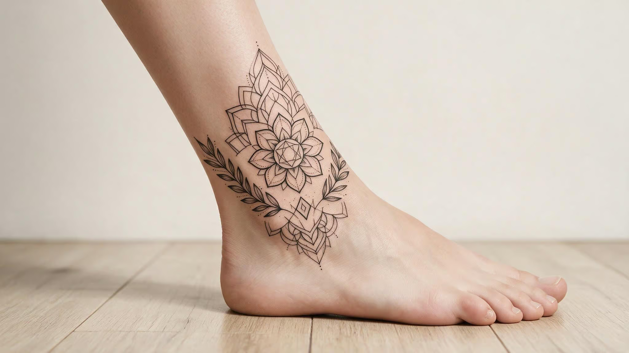
A delicate web traced along your ankle or collarbone is understated enough that most people won’t notice it. The thin lines follow your body’s natural curves, keeping the design organic rather than stamped-on. It reads as a detail, not a statement — and that’s the vibe a lot of minimalist seekers are after.
This is where geometric interpretations come in too. Take the web pattern and clean it up with straight lines and symmetry, and you get something that feels more like modern abstract art than a comic-book reference. Geometric tattoos were surging back in 2018, and they’ve stuck around: they age well, and they pair with minimalist symbols.
Single-line spider sketches fit here as well. A single continuous line that traces the outline of the web or the spider itself — no shading, no fill, just one confident stroke. It’s the fine-line backbone of the whole minimalist approach, and it’s hard to pull off.
Placement note: The ankle and collarbone are great for fine-line work because they let the design follow the body’s curves. A larger geometric web could sit nicely on a forearm or calf if you want more canvas.
The Leap of Faith: Silhouettes and Dynamic Poses
If you want something that tells a story rather than just displaying a logo, silhouettes are where it’s at. And Into the Spider-Verse gave us a strong example.
The Leap of Faith moment — Miles jumping off the building, trusting himself for the first time, captures vulnerability and courage in one frame. As a minimalist tattoo, you’re not trying to render the full scene; you just need the shape of that pose, which makes it one of the compelling Spiderman tattoo ideas with meaning: the silhouette of Spider-Man mid-leap, arms out, falling forward.
A silhouette of Spidey mid-swing or hanging upside down works the same way. The shape is so iconic that you don’t need any facial detail, web-line detail, or costume texture. Just the outline — and a Spider man tattoo on hand takes that minimalist flex to the boldest visible canvas, where the form alone carries the entire meaning of the character.
If you have a specific movie scene or comic panel in mind, bring it to your artist. A single silhouette can capture the whole thing without needing to cram details into a small space.
Placement note: Silhouettes give you more flexibility than emblems because the shape is simpler. A Leap of Faith outline on your inner forearm or calf reads as a personal mantra, not just fan merch.
Choosing a Design Based on Personal Meaning
The core ethos is responsibility, resilience, and always trying to do the right thing. That’s why people get the ink beyond just liking the colors.
Here’s the pattern I’ve seen: a lot of people want something “meaningful” but can’t pin down which trait matters most to them. Minimalism actually helps here because it forces you to choose one. You can’t fit “responsibility, resilience, humor, self-discovery, and hope” into a tiny wrist tattoo. The trait you pick says more about you than the art does.
Ask yourself: is it his humor (lighthearted, self-deprecating, never takes himself too seriously)? His moral compass (the weight of that “great responsibility” idea)? His journey of self-discovery (a kid figuring out who he is while swinging through New York)?
The answer becomes your design’s anchor. The humor fan might want a stylized web pattern that feels playful. The responsibility follower might gravitate toward the classic emblem as a daily reminder. The self-discovery angle fits perfectly with the Leap of Faith silhouette.
Placement Tips for Small, Fine-Line Tattoos
Placement isn’t an afterthought — it’s a design decision that determines how the tattoo feels, ages, and interacts with your body.
Small pieces (wrist, behind the ear, finger, ankle, collarbone): These spots work great for the emblem, a delicate web, or a tiny silhouette. The wrist and behind-the-ear positions are prime real estate because they act as an easy toggle between visible and hidden.
Larger pieces (bicep, calf, forearm): If you want more detail — a geometric web, a full silhouette with some movement, or even a small scene, you need more canvas. Bicep and calf give you room to breathe without committing to a full sleeve.
Now for the honest part. Fine-line tattoos on your fingers and hands will fade and blur faster than anywhere else. High friction, sun exposure, constant movement — these areas just eat up ink faster. A tiny spider emblem on your finger looks amazing fresh, but you should go in knowing you’ll likely need a touch-up within a year or two.
This isn’t a reason to avoid those placements. It’s a reason to have realistic expectations and pick an artist who’s upfront about longevity.
Commissioning Your Tattoo: Choosing an Artist and Going Custom
Clean, confident lines are everything in a minimalist design. There’s nowhere to hide. Varhadi spent five years (2011-2016) honing his craft before opening Lines N Shades, a timeline that signals deep commitment to the art.
Don’t walk into the first shop you see. Scroll through multiple artists’ portfolios. Look for someone whose line quality matches the aesthetic you want — crisp, steady, no wobble. Some artists specialize in fine-line work; others are better at geometric or comic-book bold. Match the artist to the design.
Bring your favorite comic panel or movie scene to the consultation. A good artist can turn that reference into a custom piece that’s genuinely yours. If you want a sense of what a studio built around originality looks like, consider Lines N Shades — a Mumbai studio founded in 2016 by Sanket Varhadi. They’ve done over 5,000 tattoos and won 20 national awards, but the key detail is their policy: they don’t repeat designs. Every tattoo is unique per client.
That’s the custom thinking you want. Even if you’re not in Mumbai, the philosophy applies: find an artist who treats your design as a collaboration, not a production line.
Bottom line: If an artist doesn’t ask about your reference or the story behind the design, they’re treating it as a production line job — move on.
Trend Context: Why Minimalist Superhero Ink Is Having a Moment
Minimalist and miniature tattoos were flagged as a rising trend back in 2018, and they’ve only grown since.
Minimalist superhero tattoos are part of a broader “quiet geek” movement where restraint is the loudest signal of taste. It’s not a rejection of fandom; it’s a more curated, personal way to express it. The spider emblem doesn’t need a full color sleeve to land. A single clean line can say more than a whole sleeve of clutter.
Marvel-themed tattoos are a durable category, and Spider-Man consistently sits near the top. Studios like Lines N Shades (a decade in business, thousands of tattoos) show that custom tattoo artistry is a mature, respected craft.
Beyond the Hype: What Most Guides Don’t Tell You
Real-world examples from community forums or Reddit show what these tattoos look like after healing and aging. Those are often more useful than curated lists.
A single-line spider has nowhere to hide if the artist’s linework is shaky. Fading and blurring are real concerns for fine-line work, especially on hands and fingers. Touch-ups aren’t a failure of the design; they’re part of the maintenance.
One underserved request I’ve noticed: kid-friendly or family-matching small Spider-Man designs. Not every minimalist tattoo is for the hardcore collector. Some are for sharing fandom across generations — a tiny spider emblem that a parent and child can both get, their own version of the same symbol.
The most useful thing I found wasn’t another design list. It was honest guidance on what a tiny, fine-line spider looks like after a year in the real world. That’s what I’ve tried to build here. The rest is up to you and your artist.
People Also Ask
How well do fine-line Spider-Man tattoos on fingers and hands hold up over time?
They fade and blur faster than other placements due to high friction, sun exposure, and constant movement. A tiny spider emblem on your finger will likely need a touch-up within a year or two, but that’s not a reason to avoid it — just set realistic expectations and choose an artist who’s upfront about longevity.
What does the Leap of Faith silhouette tattoo mean?
It captures Miles Morales jumping off a building, trusting himself for the first time — a moment that represents vulnerability and courage in a single pose. As a minimalist design, the silhouette alone carries that emotional weight without needing any facial or costume detail.
How do I choose a minimalist Spider-Man tattoo that has personal meaning?
Minimalism forces you to pick one trait — humor, moral compass, or self-discovery — because you can’t fit everything into a tiny design. The trait you choose becomes your anchor: a playful web pattern for humor, a classic emblem for responsibility, or a Leap of Faith silhouette for self-discovery.
What’s the best placement for a small Spider-Man emblem tattoo?
The wrist and behind-the-ear spots are ideal because they act as a toggle switch for visibility — easy to show off or tuck away. These placements work perfectly for tiny emblems, delicate webs, or small silhouettes.