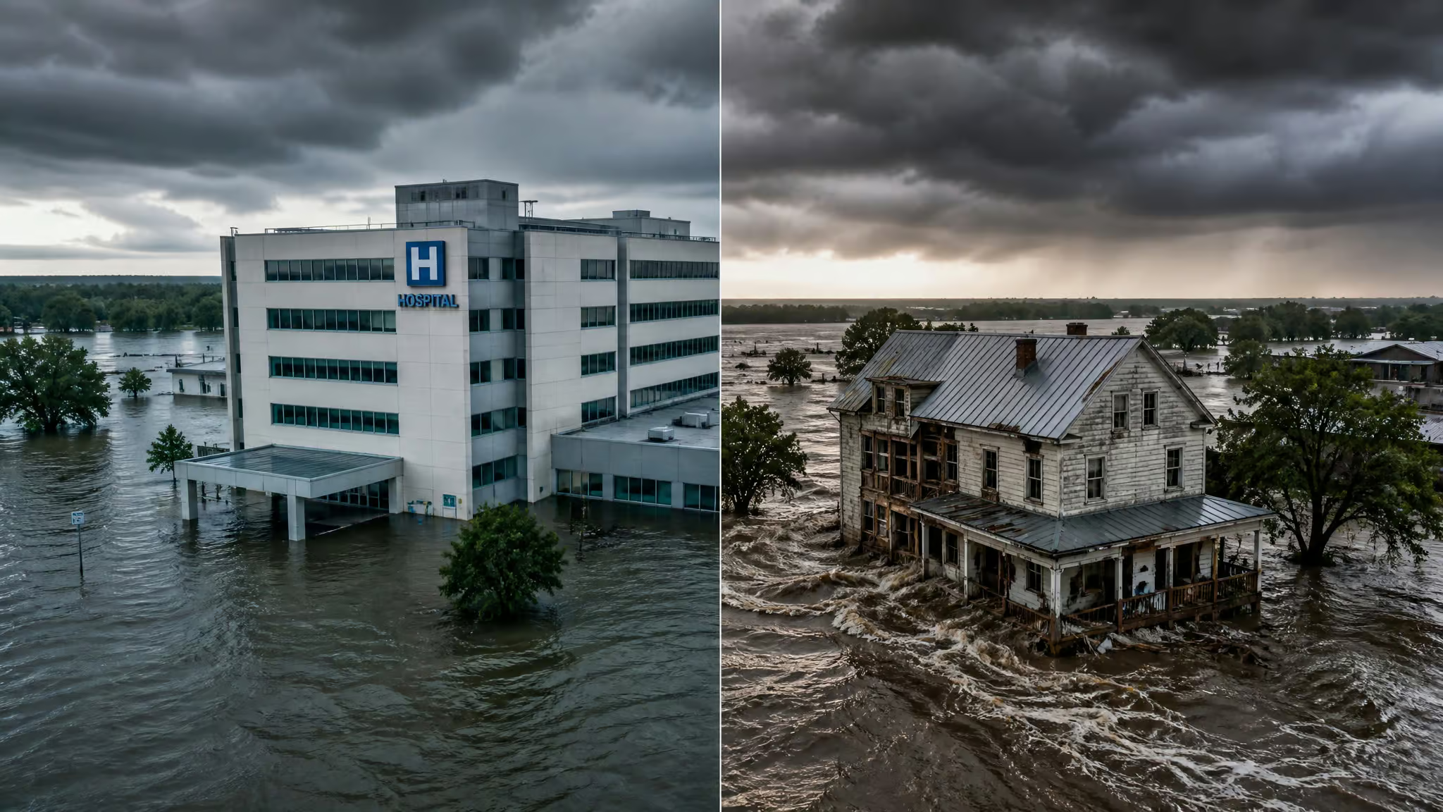
Two buildings in the same floodplain. One is a reinforced concrete hospital, poured foundations, the kind of place you’d want to be standing in during a storm. The other is a wood-frame structure, older, lighter. Same flood event hits both.
Same water, same surge, same location. They are equally exposed. The damage, though, is nowhere near equal, because vulnerability does a lot of work in the background.
That gap between what’s in harm’s way and how much harm actually lands is the entire field of exposure management geography. It starts with a deliberately plain idea: exposure is just what’s in harm’s way. People, buildings, infrastructure, the stuff we’ve built. If it sits in a hazard zone, it’s exposed. Everything else is detail.
A hazard map alone won’t tell you much. It’s a rendered landscape with no entities loaded: the terrain is there, the rivers are there, but nothing’s at stake. Exposure is the layer that puts things at stake. And because it’s defined entirely by location, it’s a geographic problem from the first frame. The same asset in two different places has two completely different risk profiles.
Key Takeaways
The UNDRR defines exposure as the situation of people, infrastructure, housing, production capacities, and other tangible human assets located in hazard-prone areas. Exposure is a necessary condition for risk: a hazard hitting an empty area produces zero risk.
Typhoon Lekima hit 240 km/h winds and caused no impact, while Typhoon Haiyan at 315 km/h affected 11 million people, killed more than 6,000, and caused over $1.5 billion in losses, because people and property were in the path.
You can pressure-test stale building risk assumptions using OpenFEMA disaster declarations, FEMA’s National Flood Hazard Layer, and the NOAA Storm Events Database, all free public data, in about three hours per county.
Table of Contents
What Exposure Management Geography Actually Means
The UNDRR’s Sendai Framework terminology defines exposure as the situation of people, infrastructure, housing, production capacities, and other tangible human assets located in hazard-prone areas. That’s a formal way of saying: if it’s in a hazard zone, it’s exposed. The measure can be as simple as counting the people in an area or cataloging the types of assets sitting there. Simple metrics, but they’re the foundation for everything else.
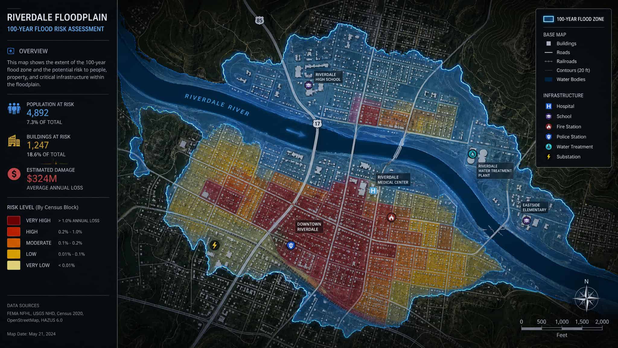
The flip side is the hazard itself, which the UNDRR defines as a process, phenomenon, or human activity that may cause loss of life, injury or other health impacts, property damage, social and economic disruption, or environmental degradation. Put the two together and you get the whole problem space.
The geography part is what makes it interesting. The same asset in two different places has two completely different risk profiles. A warehouse outside a flood zone barely registers in a risk assessment. Move that exact warehouse across town into the 100-year floodplain, and suddenly it’s a headline item.
Nothing about the building changed. Only its location did.
The Risk Equation (and Why Exposure Is Non-Negotiable)
Here’s the mental model. Imagine a town on a river. Hydrologists run hydraulic analysis and map the 100-year flood zone: the area with a one percent chance of flooding in any given year. That’s the hazard, mapped.
Exposure is whatever people and assets sit inside that zone. Risk is the probability that bad things happen to them. Every hazard carries a location, an intensity or magnitude, a frequency, and a probability, and those four characteristics shape how risk plays out on the ground.
Risk is a function of hazard, exposure, vulnerability, and capacity. It’s a combination, not a vibe. But here’s the distinction that trips most people up.
Disaster risk reduction (DRR) is the policy goal of preventing new and reducing existing disaster risk, while disaster risk management (DRM) is the practical application of DRR policies and strategies. DRM actions fall into three categories: prospective (avoiding new risk), corrective (reducing existing risk), and compensatory (sharing or spreading residual risk). The Sendai Framework for Disaster Risk Reduction 2015-2030, adopted by UN member states, sets four priorities: understanding disaster risk, strengthening disaster risk governance, investing in DRR for resilience, and enhancing disaster preparedness for effective response and to build back better. These priorities provide the policy context for the technical concepts discussed here.
The Difference Between Exposure and Risk
Risk is the potential for loss over a period: lives, injuries, damaged or destroyed assets. Exposure is the inventory of what could be lost. If a hazard hits an area with no exposure, there’s no risk. That’s not a subtle academic point; it’s the entire ballgame. You can’t have a disaster without something in the way. Cut hazard, exposure, or vulnerability to zero, and risk goes to zero with it. Hazard is the process or phenomenon that can cause harm, exposure is what’s in the way, and vulnerability is how susceptible that thing is to getting hurt.
Why Exposure Can Matter More Than Vulnerability
Normally, vulnerability determines how much risk an exposed person or asset faces. Two buildings in the same flood zone, one reinforced and one not: the vulnerable one takes the bigger hit. That’s the baseline case.
But in extreme hazards, exposure dominates. Check out Typhoon Lekima. Its winds peaked around 240 km/h, which is a serious storm by any measure. It caused zero impact on people or assets, because nothing was in its path.
Typhoon Haiyan, on the other hand, peaked at 315 km/h and hit one of the most exposed coastlines on Earth. It affected 11 million people, killed more than 6,000, and caused over $1.5 billion in losses. The difference wasn’t wind speed. It was exposure.
The 2004 Indian Ocean tsunami is the extreme case. Everyone in its path was at risk, regardless of income, ethnicity, or social class. Vulnerability barely mattered. Exposure decided everything.
What Drives Exposure
Exposure isn’t static. It’s pushed upward by population growth, migration, urbanization, and economic development, and it has a vicious cycle baked in: previous disasters drive future exposure by forcing people to relocate to even less safe areas. Hazard-prone places keep attracting development because the economic benefits are real, or the land carries cultural significance, or it’s simply what’s available, and in the digital realm, the same principles apply to how organizations prioritize risk, as CrowdStrike Exposure Management demonstrates by turning endpoint telemetry into real-time exposure scoring.
As more people and assets crowd into hazard zones, risk concentrates, then spreads as cities expand. Add large volumes of capital flowing into those areas, and the value of exposed assets climbs. More money at risk means more damage when a hazard arrives. Economic exposure in high-hazard areas is trending upward, and if that trend doesn’t reverse, disaster risk goes up with it.
Measuring and Mapping Exposure
Exposure data combines with vulnerability and capacity information to produce quantitative risk estimates. That’s the recipe: put exposure on the table, layer in how susceptible those assets are, factor in coping capacity, and you get a number. So, what is exposure management? In practice, it’s the convergence of vulnerability and attack surface management with threat intelligence, applied continuously. Exposure modelling is critical to risk assessment, and the data resolution determines whether that number means anything.
Here’s the trap. County-level data hides enormous local variation. Low-resolution data over a large area can make a high-risk pocket look completely safe. A hundred-meter flood zone inside a county that averages out to “low risk” disappears in the aggregate. High-resolution exposure data exists only for specific projects at the local scale, which is exactly where it’s most needed.
Data Sources at Different Scales
At the local scale, you’re working with council and local government records, household surveys, aerial photos, and architectural or structural drawings. These are the gold standard, but they’re expensive and rarely complete. Crowd-sourcing helps fill gaps and validate global data, but it’s limited by data type and quality. In most developing countries, complete geospatially linked inventories of public infrastructure simply don’t exist in any publicly available form.
At the regional and national scale, the sources get more consistent: state agencies, statistical offices, census data, investment and business listings, employment figures, and GIS datasets. They cover more ground but at coarser resolution.
Global-scale datasets aim for consistency across borders, and efforts to build them have grown. But any methodology has to account for exposure being dynamic. Urbanization, demographic shifts, and changing building practices all move the numbers, and a static dataset goes stale fast.
GIS and the Geographic Approach
Every hazard has a footprint, every vulnerability has a location, and every capacity exists somewhere specific. Risk mitigation measures, preparedness plans, and response operations all depend on the geographic distribution of populations and infrastructure. That makes disaster risk management a geographic challenge, and GIS is the architecture that handles it, just as security teams rely on Tenable Exposure Management to map and prioritize their digital attack surface.
When you see risk as geographic, GIS stops being a niche technical add-on and becomes core infrastructure. It connects data from different sectors into a common operating picture. That’s the triple nexus idea: linking humanitarian aid, development, and peacebuilding. Operationalizing it is notoriously hard, because financial silos, different time horizons, and fragmented information systems all get in the way. Modern online GIS and integrated geospatial infrastructure offer a real path through, because they let stakeholders share spatial data and insights across sectors instead of hoarding them.
The Aga Khan Agency for Habitat is a working example. It runs participatory, GIS-enabled disaster risk reduction in disaster-prone regions, using the tooling to bring local communities into the risk conversation rather than treating them as passive data points.
A Practical Method: Pressure-Testing Building Risk with Free Federal Data
Now the part I actually use. From the restoration side, I see the same problem repeating: building risk assumptions go stale. FEMA periodically updates its Flood Insurance Rate Maps, moving properties into and out of high-risk zones. Drainage infrastructure designed for old rainfall patterns gets overwhelmed by current storms. Staff turnover breaks the chain of local knowledge. A building that sat outside a high-risk zone a decade ago might not today, and nobody notices until an insurance renewal or an actual event forces the question.
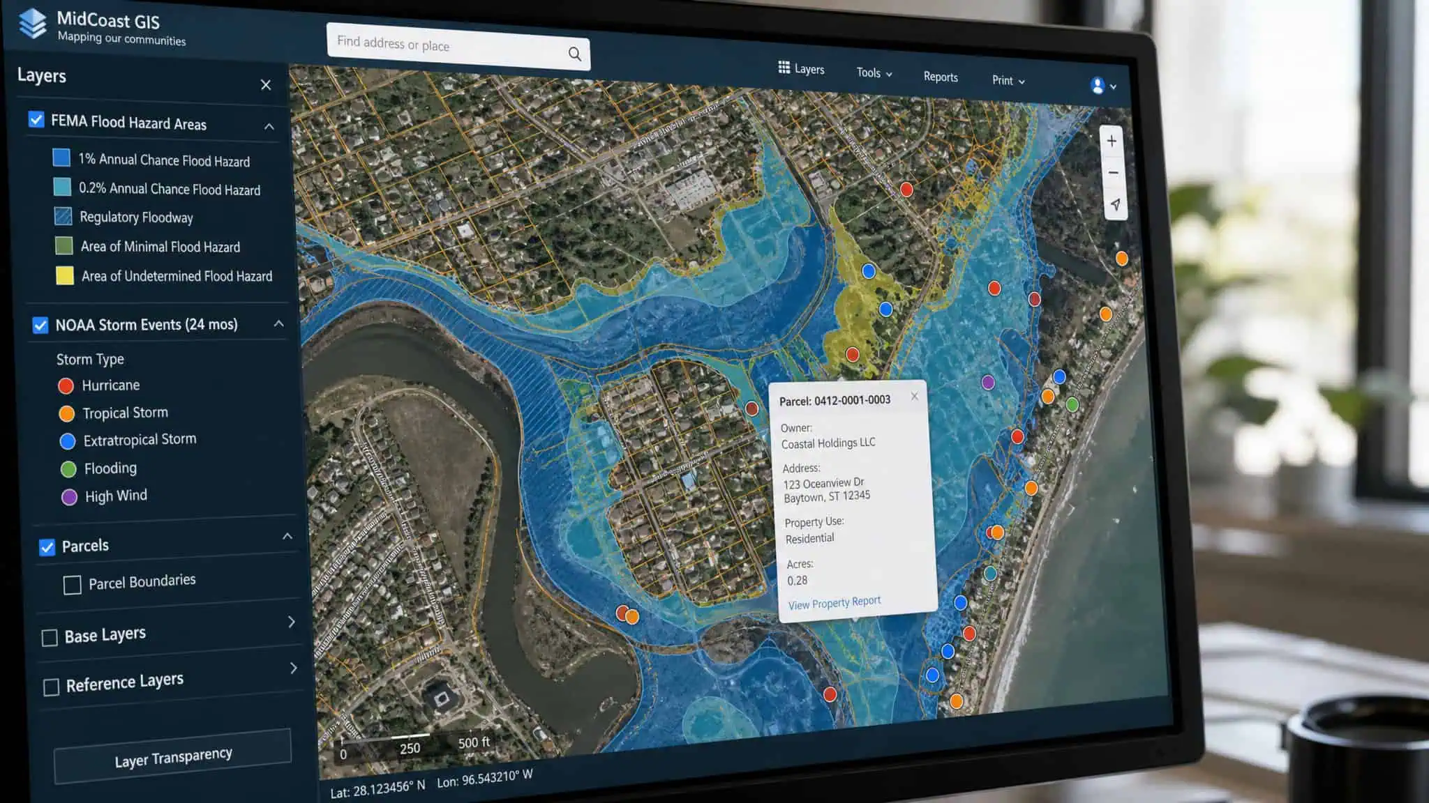
There’s a four-step method for pressure-testing those assumptions, and it runs entirely on free public data from federal agencies:
- Pull your county’s federal disaster declaration history from the OpenFEMA Disaster Declarations dataset. Review every declaration since 2000 and categorize by incident type. This tells you what’s actually been hitting your area.
- Map flood zone exposure at the municipal level using FEMA’s National Flood Hazard Layer. Find the percentage of properties sitting in Special Flood Hazard Areas.
- Layer in storm frequency from the NOAA Storm Events Database over a 10 to 15 year window. The trend line tells you where risk is moving, which is more useful than where it’s been.
- Compare against adjacent markets. Contextualizing risk against neighboring counties keeps a local bias from coloring the picture.
Assembling these three sources by hand for a single county takes a few hours of focused work. All the datasets are public, free, and maintained by federal agencies. Since this kind of analysis is central to what we do, we’ve also published a free aggregation of all three datasets across 35 Northeast counties at advanceddri.com/risk-report, under a Creative Commons license, if you want a head start.
Case Study: Bergen County vs. Ocean County, New Jersey
This method surfaced a genuinely counterintuitive result in New Jersey. Bergen County has had 11 federal disaster declarations since 2000, which sounds like a high-risk county. But only about 9% of its properties sit in designated flood zones. The dominant risk is inland: thunderstorm wind and flash flooding from overwhelmed drainage, not coastal surge.
Ocean County, by contrast, has had only nine federal disaster declarations since 2000. Its reputation is quieter. But roughly 34% of properties there are in designated flood zones, and Long Beach Township is the most exposed municipality in the county. Coastal flood defense, structural elevation, and flood-specific insurance are the central concerns.
Same state, adjacent shoreline, completely opposite risk profiles. County reputation says one thing; the data says another.
Case Study: Dauphin County, Pennsylvania
Harrisburg, Pennsylvania, doesn’t scream flood risk to anyone. But roughly 16% of properties in Dauphin County sit within designated flood zones. The Susquehanna River basin, combined with intense thunderstorm activity recorded in NOAA’s storm event data, makes the Harrisburg market materially higher-risk than its inland geography suggests. It’s a textbook stale assumption: “inland Pennsylvania, low flood risk” is contradicted by the federal data.
Turning Analysis into Operational Decisions
The data only matters if it changes decisions. Here’s what the analysis buys you.
Insurance review comes first. Standard commercial property insurance does not cover flood damage, and most owners discover that after an event. Documented exposure data changes renewal discussions from assertion to evidence. Walking into a negotiation with county-versus-adjacent-county flood zone percentages is a different conversation than “I think we might be at risk.”
Capital prioritization comes next. NOAA trend data showing rising flash-flood frequency in an inland market is a leading indicator that drainage capacity is the weak point. That moves stormwater and drainage projects up the capital priority list, ahead of cosmetic upgrades that don’t protect anything.
Vendor and response pre-positioning rounds it out. Pre-positioned vendor agreements are consistently less expensive and faster to activate than emergency ones. Knowing your exposure profile before an event lets you lock in response capacity while the terms are still favorable.
Reducing Exposure: Land Use, Evacuation, Early Warning
The long game is reducing exposure itself. Land use planning and location decisions are the primary levers: don’t build in harm’s way in the first place. Structural and non-structural measures complement that, but the hierarchy starts with avoidance.
When exposure can’t be avoided, evacuation is the last resort. The 2004 Indian Ocean tsunami showed that clearly. Reducing exposure through timely evacuation was the only possible strategy to save lives, and it relied entirely on early warning systems and preparedness planning. No amount of building hardening would have helped.
Insurance and other risk financing instruments handle the residual. They can’t prevent damage, but they compensate for losses and keep the financial impact from becoming a second disaster. Each layer of the hierarchy has a role, and none of them work without knowing where the exposure actually is.
Building a Data-Driven, Locally Owned Future
Exposure is geographic. Risk is dynamic. The combination means the work never really ends, which is fine, because the tools keep getting better. The GIS4DRM Program, supported by Esri and partners, is a concrete effort to build connected, locally owned, geographically informed systems for disaster risk management. The emphasis on local ownership matters: effective humanitarian response and risk management require local and national actors to drive the work, with GIS as the connective tissue.
The field rewards curiosity and data fluency. And here’s the part I genuinely like: the raw material is sitting there, free and public. Three federal datasets, a few hours of work, and you can pressure-test assumptions that have been quietly going stale for a decade. That’s a pretty good return on a weekend project.
People Also Ask
What is exposure management vs. vulnerability management?
Exposure management focuses on what’s in harm’s way—the inventory of people and assets located in hazard zones. Vulnerability management focuses on how susceptible those assets are to damage. In extreme hazards, exposure can dominate: Typhoon Haiyan caused massive losses because it hit a highly exposed coastline, while a stronger storm hitting an empty area caused zero impact.
Why does exposure matter more than vulnerability in some disasters?
In extreme hazard events, exposure can dominate because vulnerability barely matters when everyone in the path is at risk. The 2004 Indian Ocean tsunami is the extreme case: everyone in its path was at risk regardless of income or social class. Vulnerability determines how much damage an exposed asset faces, but exposure decides whether there’s any risk at all.