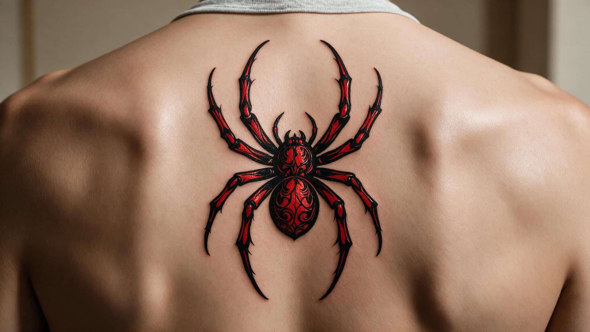
I remember sitting in the tattoo shop, tracing the outline of the classic spider emblem on my phone screen, wondering if I was about to make a mistake. Not about the tattoo itself—I’d been sure about that for months. The question was whether I was choosing the right design for the biggest real estate on my body.
Spider-Man isn’t just a cool character to me. He’s never been about the webs or the wisecracks. What Peter Parker carries—the weight of responsibility, the refusal to quit when everything falls apart, the way he keeps getting up—that’s what I wanted permanently on my back. Resilience, responsibility, inner strength.
Those aren’t just superhero tropes. They’re the reasons I finally booked the appointment.
Let me walk you through what I learned. Not as a professional tattoo artist, but as someone who spent way too long agonizing over every detail and ended up with ink I’m proud of.
Key Takeaways
The back’s bony areas such as the spine and ribs are the most painful spots, but the discomfort is manageable with proper pacing and breaks
A full-back mural packs more storytelling power but risks becoming a muddy blur if scaled wrong, while a focused logo holds its detail better over time
Spider-Man’s deeper meaning—resilience, responsibility, inner strength—turns a fan tattoo into a personal emblem that transcends the fandom
Table of Contents
Choosing Your Design: Logo vs. Scene
This is the fork in the road that every Spider-Man back tattoo faces.
On one hand, there’s the classic spider logo. Clean, bold, instantly recognizable. It’s what I ultimately chose—a solid black-and-red emblem sitting between my shoulder blades. No cityscape, no web-swinging pose, no villains lurking in the background. A Spiderman design can also serve as a cover-up for an existing back tattoo if the artist incorporates dark elements like a black spider or a dense background.
Just the spider. It reads clearly from across the room, works under any shirt, and won’t turn into an unreadable blob in ten years when the ink spreads a little.
On the other hand, there’s the full-back mural. A scene of Spider-Man swinging through New York, web in hand, skyscrapers receding into the distance—that’s a statement. You’re not just getting a tattoo. You’re getting a comic book cover permanently installed on your torso.
A detailed cityscape or action scene needs real estate to breathe. Scale it too small and those beautiful skyscrapers become brown smudges. The webbing blurs.
Spider-Man’s mask loses its definition. Some artists will warn you straight up: if the design can’t hold its shape when you squint, it won’t hold its shape after a decade of healing and fading.
Be honest with yourself about what matters more. If you want people to instantly recognize the symbol from across a room, go logo. If you want a conversation piece that rewards close inspection, go mural. Make sure the artist’s portfolio proves they can handle the complexity you’re asking for.
Bottom line: A logo stays crisp over time; a mural needs enough space and an artist who can prove their healed work holds detail.
Nod to the Eras: Suit-Specific Variations
Spider-Man has worn a lot of suits, and each one translates differently onto skin.
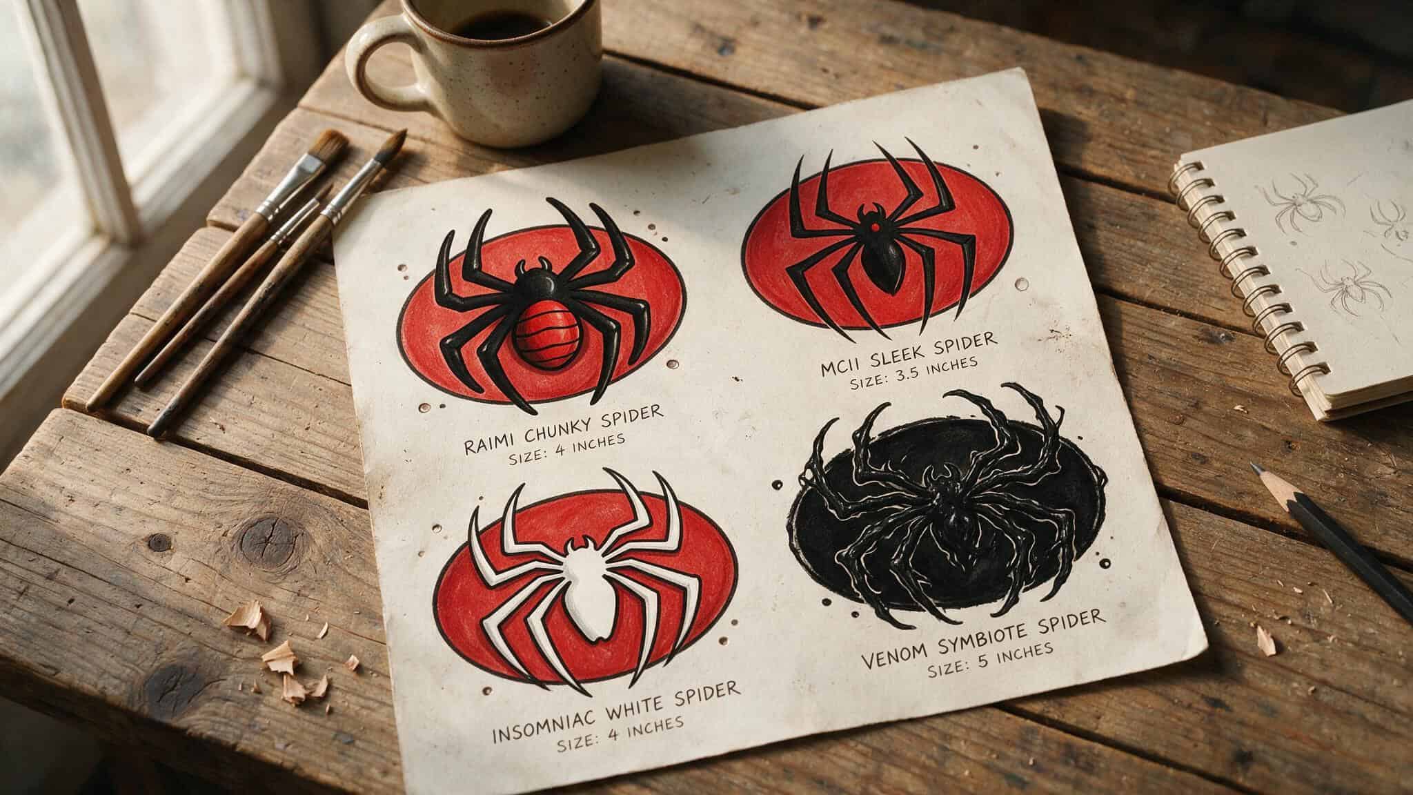
The Raimi suit is the nostalgia play. That slightly chunky, angular spider with the raised webbing—it’s the one Sam Raimi put on screen in the early 2000s, and it hits different for anyone who grew up watching Tobey Maguire catch that falling MJ. The spider is thicker, almost blocky compared to later versions. It says “I was there from the beginning.”
The MCU version is sleeker. The spider is thinner, more techy, with cleaner lines. If you’re more into the Iron Spider vibes or Tom Holland’s high-tech aesthetic, this is your pick. It feels modern without losing the classic silhouette.
Then there’s the advanced suit from the Insomniac games. The white spider. It’s a polarizing choice, but for gamers who spent hours swinging through that beautifully rendered New York, it makes perfect sense. That white logo pops on skin, especially if you go black-and-grey with white highlights.
You could also go full Venom—the black symbiote spider on a dark background. It’s moodier, edgier, and works well if you’re leaning toward a black-and-grey palette anyway.
The point is: don’t grab the first Spider-Man image off Google. Pick the era that means something to you, and check out the spiderman tattoo ideas before deciding. Every fan has their Spider-Man. Your tattoo should be yours.
Color Decisions: Vibrant vs. Black-and-Grey
This is the decision that will haunt you every time you look in the mirror—and every time you sit in a touch-up chair.
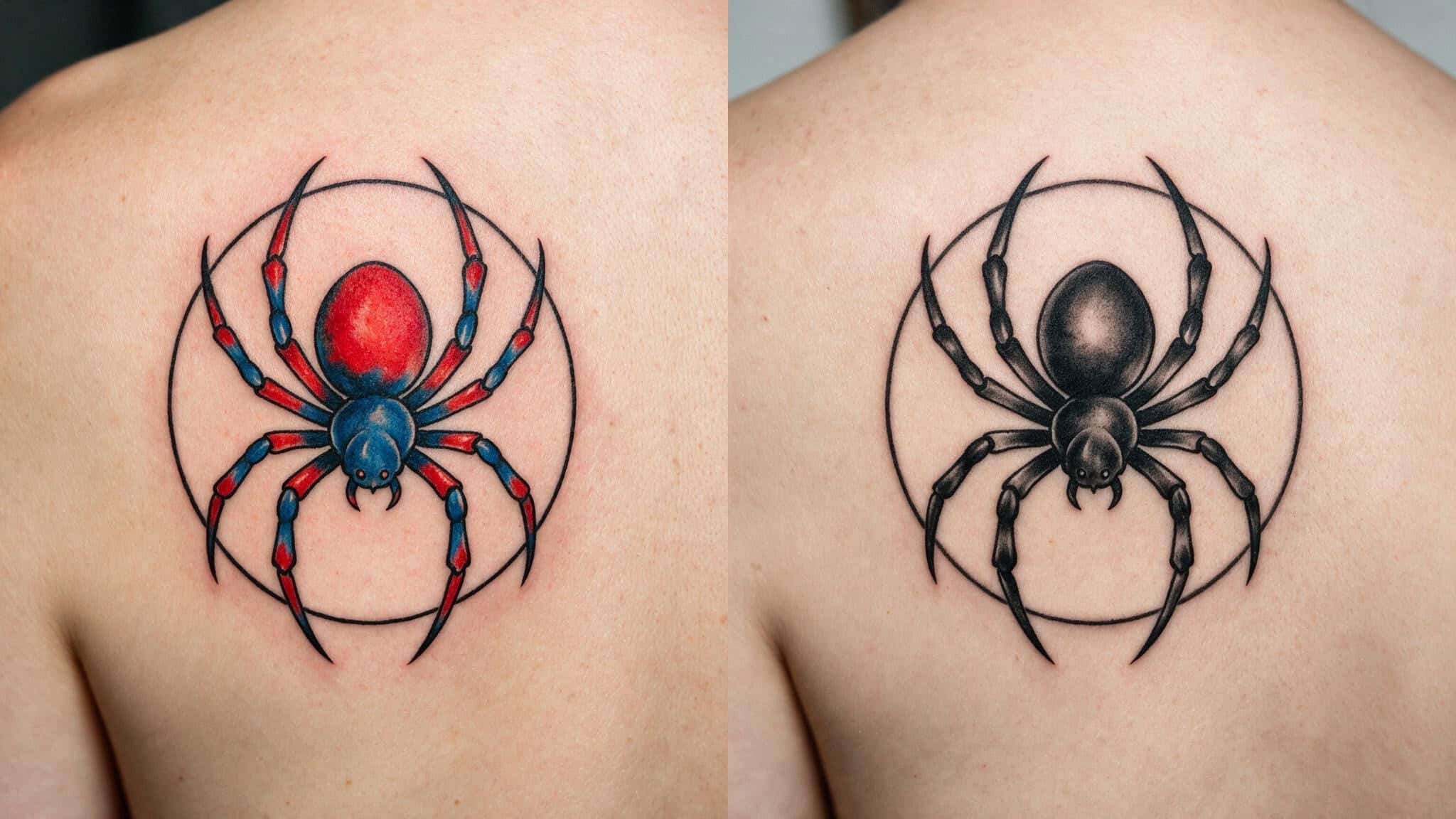
Bold red-and-blue is the classic choice. It’s what we all picture when someone says “Spider-Man.” A bright red spider on a blue background, maybe with some black webbing for contrast. It pops. It’s readable.
Vibrant color demands maintenance. Red fades faster than black. Blue shifts over time. You’ll need touch-ups, and you’ll need to be religious about sunscreen if you don’t want that bright spider turning into a dull pink splotch — which is why many explore Spiderman tattoo ideas for females that use softer palettes and delicate accents to sidestep these long-term color woes.
Black-and-grey is the quiet, timeless option. It hides aging better, fades more gracefully, and honestly?
A well-done black-and-grey spider logo on a back looks elegant in a way that color sometimes doesn’t. It reads as art first, fandom second.
I went with a black spider with subtle red accents on the legs. Best of both worlds, in my opinion. But your mileage will vary based on your skin tone, your lifestyle, and how much maintenance you’re willing to commit to.
Ask your artist to show you healed photos of their color work versus their black-and-grey work. Not fresh photos—healed. That’s the truth.
Quick test: Compare healed photos of color vs. black-and-grey work from your artist—red fades fastest, and you need to know what you’re signing up for.
Your Back as a Canvas: Placement and Sizing
Your back is huge. Most people don’t realize how much space they’re working with until they see the stencil for the first time.
A small logo between the shoulder blades is the most popular choice for a reason. It’s visible when you want it to be, hidden under a t-shirt when you don’t. It doesn’t creep into your collar line. It doesn’t peek out at work. And at that size, the detail stays crisp because the spider isn’t stretched too thin.
An upper back piece takes up most of the space between your shoulders, maybe creeping onto your traps. This gives you room for more webbing, maybe some web-line details trailing down toward your lower back. It’s still concealable, but it makes more of a statement.
Then there’s the full-back mural. This is the 0-to-100 option. It covers everything from your neck to your waist, shoulder to shoulder. The design possibilities are endless—cityscape, action scene, a collage of villains, whatever you can dream up.
But the commitment is real: multiple sessions and longer healing. And you’re signing up for “visible anytime you’re shirtless” forever.
The rule of thumb my artist gave me: the smaller the piece, the simpler the design should be. A tiny spider logo works, and a Spiderman tattoo for kids is a great example of that principle. A tiny full-color cityscape with Spider-Man swinging through it? That’s going to look like a bruise from five feet away.
The Practical Side: Pain, Aftercare, and Finding Your Artist
Let’s talk about the stuff nobody wants to say out loud.
Pain. Your back is not a uniform surface. The fleshy areas around your shoulder blades? Manageable.
Cost. A Spiderman back tattoo varies widely in price. A small logo between the shoulder blades typically runs $500–$2,000, while a full-back mural can cost $2,000–$5,000 or more, depending on the artist’s hourly rate, detail, and number of sessions.
The spine? Different story. That bone-on-needle sensation is sharp and unpleasant.
The ribs, if your design wraps around, are a whole other level of spicy. A few hours of discomfort for something that’s permanent. I’d do it again in a heartbeat.
Finding your artist. This is where most Spider-Man back tattoos go wrong. Someone walks into a random shop, shows the artist a Pinterest photo, and walks out with a spider that looks like a tick. Don’t be that person.
You need an artist who focuses on comic book art. Look at their portfolio for clean lines—that webbing is merciless at showing shaky linework. Look for saturated color if you’re going bold. Look for smooth shading if you’re going black-and-grey.
And look for healed photos. Any artist can make a fresh tattoo look good. The real test is what it looks like six months later.
When I found my guy, I drove two hours to get to his shop. Worth every mile.
Aftercare. The artist will give you a routine. Follow it religiously. Keep it clean.
Moisturize—but not too much—stay out of direct sunlight, and don’t pick at the scabs. If you skip this part, you will hate the result. It’s that simple.
Real People, Real Back Pieces
Sometimes the best way to make a decision is to see what other people have done.
Michael Baxter has 203 characters from The Simpsons tattooed on his back. Homer, Marge, Bart, Lisa, Maggie, Mrs. Krabappel, Principal Skinner, Chief Wiggum, Comic Book Guy—the list goes on. It took him 130 hours total, in 10-hour sessions spaced a month apart for healing. The total cost ran between $12,000 and $13,000 AUD.
He even holds a Guinness World Record for it. His goal? Five hundred characters. That’s the kind of dedication that shows what a themed back piece can become when you commit fully.
Ben Affleck’s giant phoenix back tattoo is famous for all the wrong reasons. First spotted in 2015, it was mocked endlessly. Affleck initially claimed it was fake and done for a movie, then later admitted it’s real. He defended it on Ellen in 2019.
His exes Jennifer Lopez and Jennifer Garner have both commented on it. The phoenix covers other tattoos he had on his shoulder blade—letters and symbols that are now hidden beneath the flames and feathers. The lesson here isn’t “don’t get a big back piece.” It’s “be prepared to own it.” If you love it, the world’s opinion doesn’t matter.
Jordan Chiles, the Olympic gymnast, has a gorgeous koi fish back tattoo that was visible through her leotard at the 2024 Paris Games. It’s a yin-yang design symbolizing balance and harmony. She’s also got the Olympic rings on her arm (matching Simone Biles and Suni Lee), a tribute to her grandfather inked on her left arm, Michael Jordan’s number 23, and a whole collage of symbols on her left bicep. Her tattoos tell a story—achievement, memory, identity. That’s the standard to aim for.
Making It Uniquely Yours
The best Spider-Man back tattoos aren’t copies of something someone else did. They’re personal.
Maybe that means adding your favorite quote in the webbing. Maybe it’s incorporating your own life numbers—a birthday, an anniversary, a date that matters—into the design. Maybe it’s choosing a suit variant that specifically represents the version of Spider-Man that hit you hardest growing up.
For me, it was about the resilience. I’d been through a rough couple of years, and Spider-Man’s whole deal is that he gets knocked down and gets back up. My tattoo isn’t just a logo. It’s a reminder that I can do that too. Yet some people might feel the weight of ‘great power, great responsibility’ as a permanent burden, and it’s perfectly valid to choose a lighter meaning or a design that celebrates the character’s fun side instead.
Think about what Spider-Man means to you. Not what he means to the internet or to comic book historians. What does he mean to you? That’s the design you should get.
Your Spider-Verse Starts Here
A Spider-Man back tattoo is permanent, visible, and a piece of your identity worn on the outside.
But if you invest time in the design, trust your artist, and commit to the process, what you get on the other side is incredible. Not just a tattoo—a permanent reminder of what Spider-Man stands for. Resilience. Responsibility. The strength to keep going when things get hard.
I’ve had mine for over a year now. Every time I catch my reflection in a mirror, I smile. Not because it’s perfect—no tattoo is—but because it’s mine.
Find your design, find your artist, trust the process—your back is waiting.
People Also Ask
How big is a $500 tattoo?
It depends heavily on the artist’s hourly rate, location, and design complexity, but $500 typically covers a moderate-sized piece like a palm-sized logo or a small-to-medium back emblem. For a full-back mural spanning shoulder to waist, you should expect to pay significantly more — often into the thousands — due to the multiple sessions and hours required.
Is the spider web tattoo racist?
A plain spider web tattoo isn’t inherently racist, but the context matters. In prison culture, a spider web on the elbow or neck has historically been associated with white supremacist gangs or time served for violent crimes. A Spider-Man logo or comic-style web design — especially in red and blue — carries no such connotation and is widely read as fandom, not hate symbolism.
What does a Spider-Man tattoo mean?
Most people get a Spider-Man tattoo to represent resilience, responsibility, and inner strength — the core themes of the character’s story. It’s less about the spandex and more about the idea that you keep getting back up even when life knocks you down. For many fans, it’s a personal emblem that transcends the fandom.
What’s the difference between a Spider-Man logo tattoo and a full-back mural?
A logo tattoo (like the classic spider emblem) is clean, bold, and stays crisp over time — it reads clearly from across the room and ages well with minimal blurring. A full-back mural packs more storytelling power with cityscapes and action scenes, but it demands serious space and a skilled artist to avoid turning into a muddy blur as the ink spreads and fades over the years.
Does a Spider-Man back tattoo hurt more than other placements?
The back is surprisingly manageable in fleshy areas like the shoulder blades, but the spine and ribs are a different story — that bone-on-needle sensation is sharp and intense. If your design wraps around to the ribs, expect a spicy session. The pain is temporary (a few hours), and most people say it’s worth it for something permanent.