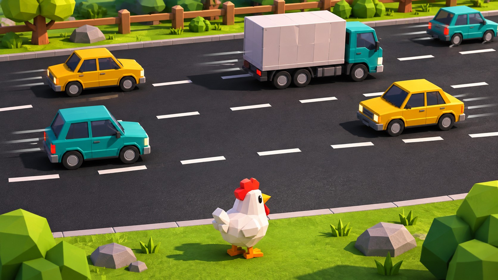
A chicken stands at the edge of a road. Traffic moves across the next lane. The character is small, the cars are larger, and the available gap is obvious. You understand the problem without reading a single instruction.
Then you advance. Another lane appears, the traffic changes speed, and the screen must explain a more complicated situation using the same handful of visual elements. There is no time for a tutorial. The player needs to know where the danger is, where it is going, and whether the next move is possible.
This is the strength of lane-hazard arcade design. A good screen communicates movement, timing and consequence almost instantly. Its visual language survives changes in characters, backgrounds and reward systems because the underlying problem remains direct: something is crossing your path, and you need to read it correctly.
Modern versions sometimes add escalating multipliers, animated rewards and cash-out controls. Every new number competes with the road for attention, while decorative effects risk obscuring the information the player actually needs.
The best examples understand that visual clarity is part of the mechanics. A readable hazard can be challenging. An invisible collision boundary is simply irritating. The difference often comes down to a few pixels, a carefully timed animation or a control placed outside the thumb’s way.
Key Takeaways
Clear visuals make lane-hazard games readable at a glance. Players should immediately recognise their character, approaching obstacles and safe spaces without scores or effects obscuring the road.
Fair gameplay depends on consistent movement, believable collision boundaries and immediate input feedback. Mobile controls should be easy to tap without covering hazards or triggering neighbouring buttons.
The rules should explain what determines each outcome, including whether movement or chance drives results. Multipliers, rewards and cash-out controls should remain clear without distracting from the playing area.
Table of contents
Table of Contents
The First Second Does Most of the Work
Open a well-designed lane-hazard game and your eyes should settle on the playable area immediately. The character establishes your position. The nearest obstacle establishes the threat. The empty space between them suggests a possible action.
Everything else, including the score, multiplier, scenery and menu controls, must work around that relationship.
Consider three moving traffic lanes. A truck approaches from the left, two smaller vehicles travel in the opposite direction, and the player occupies a narrow safe strip. If the vehicles have distinct silhouettes and their movement is easy to follow, the scene remains understandable.
Now add flashing coins, an animated road texture, a glowing character outline and a multiplier pulsing every second. The same obstacle pattern becomes harder to read. The hazards have not changed. The visual competition has.
Four questions should be answerable at a glance:
- Where is the player, and which space is safe?
- Which objects can cause a collision?
- Where are those objects moving?
- What input moves the character forward?
Visual hierarchy determines how quickly those answers arrive. Hazards need sufficient contrast against their backgrounds. The character must remain identifiable among moving objects. Interactive controls should look interactive, while decoration stays in the background.
This matters outdoors. Colours that look beautiful on a monitor can become muddy on a phone under direct sunlight. Dark vehicles against dark asphalt are an obvious failure. Bright warnings against similarly bright scenery are another.
Readable design works under imperfect conditions. Players should not need maximum screen brightness to distinguish danger from decoration.
Hazard Telegraphing Matters More Than Fancy Animation
A beautifully animated vehicle is useless if the player cannot tell when it will arrive.
Hazard telegraphing makes an approaching threat understandable before it becomes dangerous. In a crossing game, the simplest warning is movement itself: an obstacle enters from a recognisable direction and travels along a visible path.
Speed, silhouette and entry position provide information. A long truck occupying most of a lane creates a different timing problem from a narrow motorcycle. A vehicle approaching from the right offers a different window from one entering on the left.
Animation should reinforce these differences. Wheels, headlights, shadows and motion trails can help establish direction, provided they remain subordinate to the actual obstacle.
Consistency is important. If a vehicle type normally travels at a stable speed, players can learn to estimate its arrival. Sudden acceleration may be an interesting challenge, but it needs a readable warning. Otherwise, the game changes its behaviour after the player has committed.
Useful telegraphing techniques include:
- Consistent entry points for recognisable hazard types.
- Distinct silhouettes at small screen sizes.
- Visible movement before an obstacle reaches the player.
- Clear cues when speed or direction changes.
- Warning effects separated from decorative animation.
Designers must also consider screen edges. A fast vehicle that appears only moments before entering the playable area offers almost no warning. Narrow displays make this worse because less of the approaching lane is visible.
Reserving additional space for incoming obstacles can help. So can a subtle indicator near the edge. Neither solution needs dramatic alarms. Sometimes a few extra frames of visible movement are enough.
Honest Hitboxes Make the Screen Trustworthy
Few interface failures are more frustrating than a collision that appears to happen in empty space.
Imagine a narrow gap between two vehicles. The character passes through it, visibly clearing both obstacles, but the game registers a hit. The player cannot see the collision boundary responsible. They can only judge what appeared on screen.
A hitbox is the area used to detect a collision. It does not need to match every decorative detail of a sprite. Simplified collision shapes often improve consistency. What matters is whether the detected collision corresponds to what the artwork reasonably suggests.
A truck’s decorative shadow should not necessarily cause a collision. A character with animated feathers or accessories should not become unpredictably wider during movement.
Small discrepancies become particularly noticeable when gaps are narrow. A few pixels of invisible collision area can turn a difficult manoeuvre into an apparently impossible one.
Collision feedback also needs precision. When a character is hit, the animation should begin close to the contact point. A delayed failure screen leaves the player uncertain about which obstacle caused the collision.
Immediate feedback followed by a larger animation usually communicates more clearly. Players should be able to understand what happened without needing a replay.
When Multipliers Arrive, the Board Must Stay in Charge
Some crossing games attach increasing rewards to successful advances. A multiplier grows, a score rises, or a separate control offers the option to collect an accumulated result.
This introduces a second information system.
The spatial layer shows the character, hazards and available movement. The numerical layer displays progress, potential rewards and banking controls. Both may be necessary, but they should not receive equal emphasis during a crossing.
Imagine a large multiplier occupying the centre of the road. Every increase triggers a bright pulse that overlaps the next lane. The reward is impossible to miss, but the animation makes hazard timing harder to judge.
A cleaner arrangement gives numerical information a stable position outside the main playing corridor. Values can update without shifting surrounding elements or covering moving objects.
The same principle applies to a bank or cash-out button. If present, it should be clearly labelled, visually distinct from movement controls and positioned away from the active hazard path.
On a compact phone, this might mean placing reward information above the board and primary controls below it. Other arrangements can work, provided the essential movement information remains visible.
Escalating rewards may change the significance of the next move. They should not make the next obstacle harder to see.
Designing for Thumbs Instead of Mouse Pointers
Mobile interfaces are operated by fingers that occupy physical space on the screen. This becomes a problem when a game places its main action button directly over the area where the next hazard appears.
A mouse pointer can move away after clicking. A thumb often remains near the control throughout the round, covering part of the display.
Tap targets therefore need sufficient size and sensible placement.
Small buttons may look elegant in screenshots, but precision becomes unreliable when the device moves slightly in the player’s hands. Controls pressed against screen edges can also be awkward to reach, especially on larger phones.
A target around 44 to 48 logical units across is a useful starting reference, depending on platform conventions. The visible icon can be smaller than its interactive area.
Spacing matters just as much. If advancing and collecting are separate actions, their targets should not overlap or sit close enough for an ordinary thumb movement to trigger the wrong one.
A practical control review should ask:
- Can the primary action be reached comfortably?
- Does the finger obscure the next hazard?
- Are neighbouring controls sufficiently separated?
- Does every successful input receive immediate feedback?
- Can accidental gestures be distinguished from deliberate taps?
Input feedback deserves attention. A player taps to advance, but the character does not move immediately. Was the input ignored? Was the animation delayed? Is the interface waiting for a response?
Whatever the cause, the screen should acknowledge the action promptly. Players can tolerate demanding timing windows. They are less forgiving when they cannot tell whether their input registered.
Animation Should Clarify Movement
Arcade games benefit from animation. A small hop gives a character personality. Vehicles feel heavier when their motion has appropriate weight. Brief flashes make successful actions satisfying.
Problems begin when animation interferes with timing information.
A character taking too long to complete a hop may appear to occupy two positions. Camera shake can make hazards harder to track. Particle effects may obscure the space the player is trying to enter.
The animation system should maintain a dependable relationship between input and position. If movement takes a fixed amount of time, the visual transition should communicate that duration consistently.
Camera behaviour matters too. Following the character after every advance keeps the player visible, but abrupt movement can disrupt their understanding of nearby hazards. Smooth scrolling preserves spatial continuity when implemented carefully.
Effects must also scale across devices. Dense particles might look impressive on expensive hardware while producing uneven frame pacing on cheaper phones. When visual movement stutters, judging obstacle speed becomes difficult.
Reduced-motion settings, restrained screen shake and simpler background effects are practical accessibility features. They also protect the readability of the core interaction.
The Rules Must Match What the Screen Suggests
Crossing imagery can represent different underlying systems. One game may calculate collisions through visible character movement and obstacle positions. Another may use crossing animations to present outcomes determined through a separate chance process.
Both can feature moving vehicles, roads and advancing characters. Their interface responsibilities differ.
Where movement determines the outcome, players need consistent timing, collision boundaries and input feedback. The screen should communicate enough information for the mechanic to be understood.
Where results are independently determined, the rules should explain that clearly. Convincing animations should not suggest that observing previous outcomes guarantees knowledge of the next one.
Useful documentation explains how rounds begin and end, what controls do, whether obstacles follow learnable patterns, and how displayed rewards are calculated.
If the game includes a banking mechanism, its operation should be described clearly. A compact information panel with precise instructions is more useful than decorative text that explains the theme while leaving the mechanics obscure.
Good interface design establishes expectations. Good documentation confirms them.
Inspecting a Modern Crossing Interface
Anyone comparing contemporary lane-hazard layouts can learn a great deal from examining the screen before playing a complete round.
The chicken road game download page offers one reference point for exploring a crossing-and-progress presentation. A browser-first inspection is a reasonable starting approach: examine the available interface and documentation before considering installation. Verify the destination independently and avoid unrelated download mirrors or tools advertising guaranteed predictions.
Look at the proportions of the playable area. How much space is reserved for the crossing path? Where does the character sit relative to approaching hazards? Are reward figures positioned outside the movement corridor?
Next, examine the controls. Can a visitor identify the main action immediately? Is the information panel accessible? If a demo exists, does it explain movement and failure states?
These observations reveal more than polished screenshots. Static images show attractive artwork. An interactive view reveals whether the screen remains understandable when hazards start moving.
A Seven-Point Readability Checklist
A lane-hazard interface needs to pass several practical tests:
- Contrast: Are the character and nearest hazard immediately identifiable, even on a small screen?
- Telegraphing: Do approaching obstacles communicate direction and movement early enough?
- Collision clarity: Do visible silhouettes correspond closely to the areas that register hits?
- Visual hierarchy: Does the board remain readable when scores and multipliers update?
- Touch accessibility: Are controls large, separated and positioned away from essential information?
- Animation timing: Do movement, collision feedback and camera transitions preserve a consistent sense of position?
- Rules and feedback: Can players understand what their inputs control and what causes failure?
These questions also help designers diagnose complaints. If players report invisible collisions, investigate the hitboxes and artwork. If controls feel unresponsive, examine input acknowledgement and animation delays. If the board becomes confusing during reward updates, reconsider the visual hierarchy.
Sometimes the difficulty is fine. The interface simply needs to explain it better.
Clarity Is the Mechanic You Notice Least
Lane-hazard games can look almost absurdly simple in screenshots. A small character, a few obstacles, a strip of road. Yet their apparent simplicity hides a demanding interface problem: players must interpret moving information accurately, often on small displays with little time between actions.
There is considerable design work behind a screen that makes this effortless. Hazards need recognisable shapes. Movement must be understandable. Hitboxes should respect the artwork. Buttons must work around human hands. Numbers and animations cannot obscure the important parts of the board.
When those details are right, players rarely notice them individually. The screen simply makes sense. They can follow traffic, identify available space and understand why a collision occurred.
When those details are wrong, additional effects will not rescue the experience. More glow cannot explain an invisible hitbox. A larger multiplier cannot fix an obscured lane. Beautiful animation means little if inputs feel unreliable.
The strongest arcade interfaces trust their visual language. They show the obstacle, establish its movement and let the player read the space.
The next step can be difficult. Understanding what the screen is showing should not be.