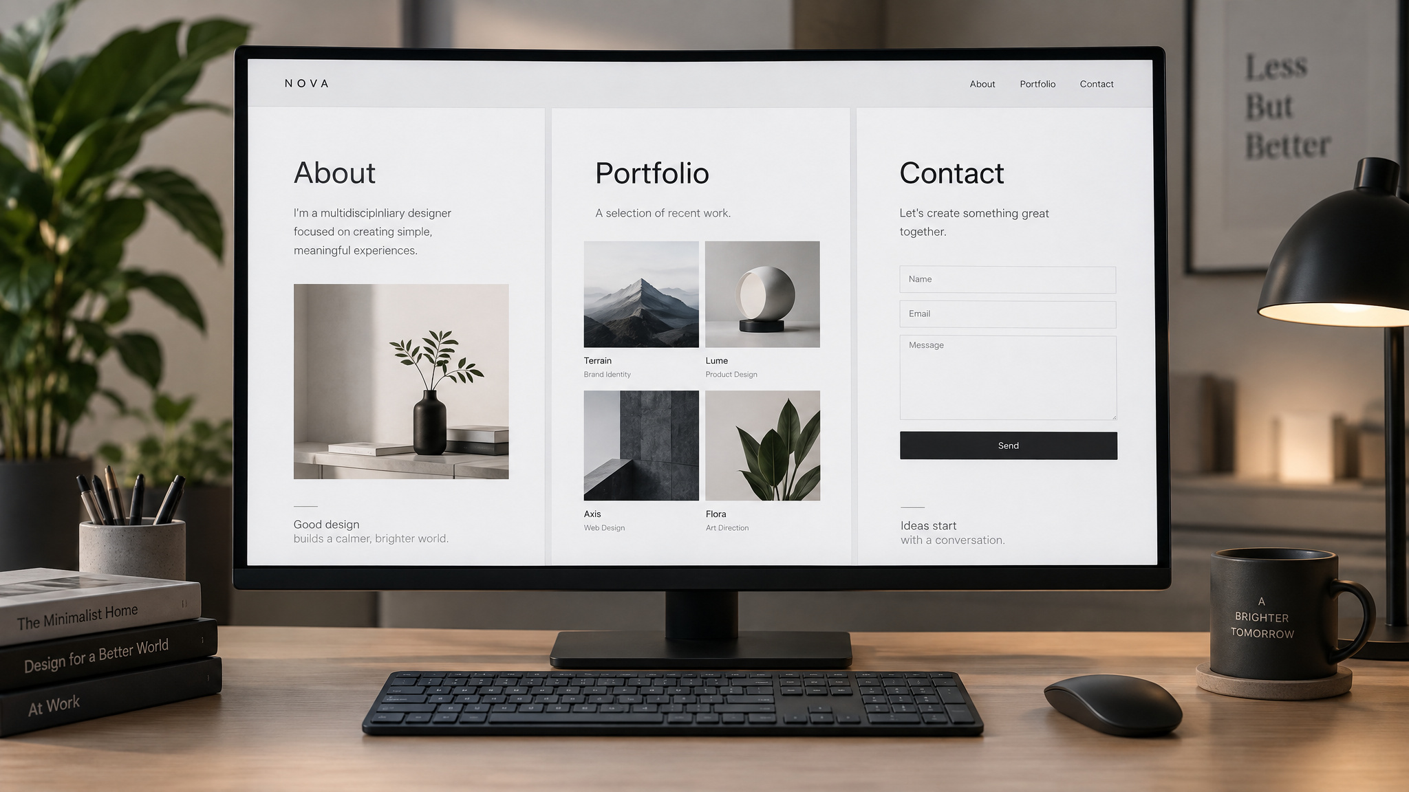
A freshly registered .com domain and an empty folder on your laptop can sit untouched for months, usually because figuring out what to put on a personal website stalls on what the site is even supposed to be. Nobody wants to sink a weekend into a messy layout that gets quietly judged or turns into an abandoned ghost town. Two rules unstick the build immediately. First, launch a Level 1 minimum viable structure of just three pages (About, Portfolio/Resume, and Contact) designed to pass a recruiter’s homepage-only skim test. Second, treat everything past that professional baseline as a personal playground where you can drop in over 100 technical and pleasantly weird features whenever motivation hits, because the ceiling on personal web pages is entirely up to you.
Key Takeaways
A Level 1 personal website only requires three core pages (About, Portfolio/Resume, and Contact), which you can build over a weekend or two for a few dollars a month as job-search insurance across the 600+ job applications the average US worker submits in a lifetime.
Your homepage and About section must pass a single-skim test by keeping your elevator pitch to 2 to 3 paragraphs, curating a gallery of resonant work rather than dumping an archive, and offering a direct email address plus an embedded downloadable resume.
Get that baseline live on Wix, Squarespace, Hostinger AI Builder, WordPress (which powers 43% of the web), or free-tier card.co. Then ship features incrementally from a catalog of 100+ ideas, including /now pages, clickable bookshelf image maps, and PerformanceObserver asset reports.
Table of Contents
What a personal website is for
A personal website is a living digital portfolio on owned ground that replaces paper business cards and physical folders, and a standalone LinkedIn profile cannot match complete control over your look, content, and presentation. Now that AI writes half of the polished CVs and LinkedIn summaries flooding applicant tracking systems, owning your own turf acts as job-search insurance. As Joel Michon points out, a site casts a wider net across platforms and companies, while Jillian Gomez notes it lets you show an authentic self in creative roles.
The Muse frames this through a museum analogy: spotting a takeout menu inside the Metropolitan Museum of Art confuses visitors, so your site should read as a clear menu of offerings rather than a mystery gallery. An essay unpacking a move from a Big Four firm to industry shows real judgment, proving you can operate without hand-holding and that a team would enjoy working with you, two things a resume bullet can’t touch. Because the average person in the US applies for over 600 jobs in a lifetime, even a small edge compounds fast. One hiring manager who reviewed thousands of applications and hired over 30 people observed that candidates with even a basic online presence are far more likely to land an interview, and that searchability helps employers and funders reach you.
Essential pages every personal website needs
The essential pages of a personal website are the About page, the Portfolio/Resume page, and the Contact page, where the About section pairs a 2- to 3-paragraph elevator pitch summarizing major companies, proudest projects, and your professional superpower with a direct email address and downloadable resume. Building this Level 1 personal website structure creates an online CV in a weekend or two for a few dollars a month, establishing a clean baseline that can later evolve into a Level 3 personal brand magnet.
- Homepage / Hero Section: A clean, fast visual element paired with a one- to two-sentence summary, an intuitive navigation menu, and immediate access to your work, past project examples, and contact details.
- About Page: A concise 2- to 3-paragraph elevator pitch expanding your homepage summary, highlighting major companies, proudest projects, core skills, and personal context without turning into an autobiography, plus a direct email address and an embedded downloadable resume.
- Portfolio / Work Samples: A curated gallery of your strongest, niche-relevant projects (or role-specific sections like Reporting or Articles) rather than an exhaustive archive of everything you’ve ever built.
- Resume / CV: A dedicated, published resume page and embedded downloadable file that makes it easy for hiring managers to review your background.
- Contact Information: Direct contact details like an email address, which beats a contact form for recruiters, alongside curated links to relevant professional profiles like GitHub, LinkedIn, Behance, Twitter, and publications where your work lives.
The homepage: work, projects, and contact at a glance
NBCUniversal recruiters emphasize that your homepage must immediately show the work you do, examples of past projects, and contact information. Pair your name with a one- to two-sentence summary, a simple, fast visual element that avoids overdesign, and intuitive navigation using a clear menu, a grid layout, or a clean one-page structure.
The elevator pitch
Following writer Alexandra Franzen’s model, cover major companies you’ve worked with, your proudest projects, your professional superpower, and a dash of personality. Skip the full life story; visitors won’t spend hours clicking around, and two sharp paragraphs always beat two skimmable pages of autobiography.
The About page
Expand your homepage summary with a one-paragraph introduction on the About page. NBCUniversal’s Scott Williams notes that skills belong first, though personal context helps round out the picture.
Portfolio and resume pages
Publish a dedicated resume page right alongside your portfolio so visitors have an immediate online CV to reference alongside your LinkedIn profile. Frame the portfolio side as a curated highlight reel rather than an unedited archive.
The navigation menu
Keep navigation labels instantly readable: About, Work, and Contact cover almost everyone, though you can swap in role-specific variants like “Reporting” or “Articles” if you’re a journalist. Your About page should expand your homepage summary into a two- to three-paragraph elevator pitch covering major companies, proudest projects, your professional superpower, and a little personality, skipping vague life stories while adding a direct email address and an embedded downloadable resume.
Contact and your around-the-web links
Pull your scattered digital footprint into one hub by linking to LinkedIn, Twitter, publications, GitHub, Behance, author pages, sites you helped build, and articles where you’re quoted. Cut anything unrelated to your work, including personal Facebook profiles, side-project blogs, most Tumblrs, and Pinterest (unless you work in a creative field).
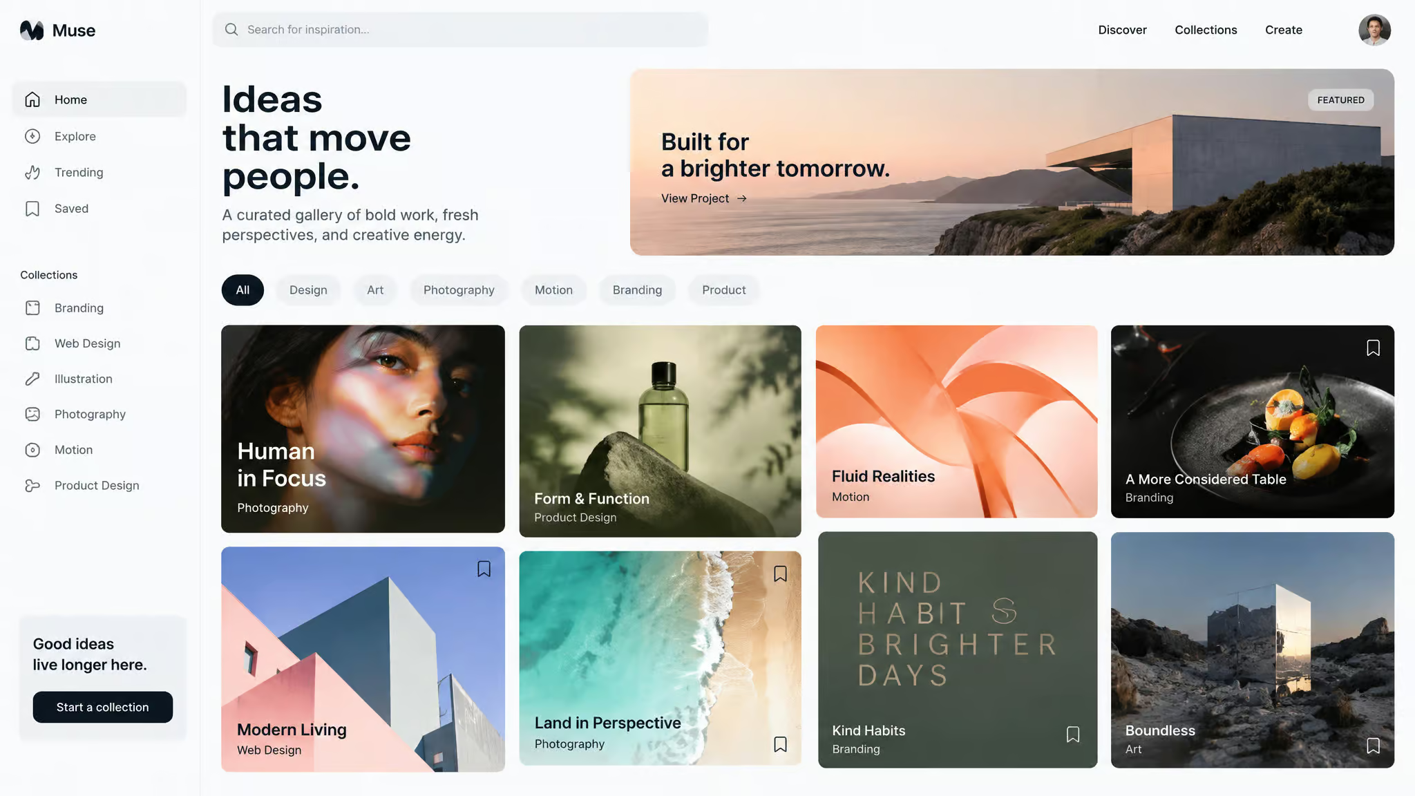
Building a curated gallery of your work
Overwhelmed hiring managers usually click the first item in a large repository and ignore the rest, so tight curation controls the sequence of what they see.
Choose pieces that resonated
To curate your best work, apply the boss test: exclude any work in progress that you wouldn’t hand directly to your current manager. NBCUniversal’s Emily Porter advises picking pieces that resonated with you and clicked most with your audience. If you’re pivoting mediums, connect the dots to show how your past work informs the new role.
What belongs in the gallery, field by field
Even if you’re not in an especially visual field, you can (and should!) build a gallery of the work you’re most proud of. Designers, artists, and photographers can lean on visual tools like Squarespace galleries, while writers can display clips, photos of print articles, and book links, marketers can highlight campaigns and events, and sales pros can describe the companies they’ve sold to.
Journalist galleries: demo reels to beat coverage
Text journalists do best with thumbnail galleries of lead art and headlines, while seasoned reporters can split coverage into breaking news, features, specials, and beats.
A list of everything you’ve made
Taking a cue from developer and blogger James G’s catalog of site ideas, you can also maintain a dedicated master list of projects you’ve made across art, poetry, blog posts, and websites.
Citations and a publications page
Students and researchers in academia should add formal citations for their academic work and maintain a dedicated page listing their publications.
Publish b-roll you’re proud of
If you work in film or video, publish standalone b-roll footage you’re proud of having shot instead of letting it sit on a scratch disk.
How to design a personal website that looks professional
A professional-looking personal website follows a design direction matched to your field, either whitespace-heavy minimalist design that keeps the eye on visual portfolios, or bold typography, playful color, and animation where the site itself demos your craft, backed by clean typography hierarchy, intuitive navigation, mobile testing, and AA color contrast verified through the WebAIM checker. Getting the visual polish right doesn’t require the budget of a web design company if you combine a clear layout with small, high-signal front-end details like custom CSS variables for your palette and relative font sizing (rem or em) so text scales cleanly across screens.
Choose a new font
Choosing a new font over the browser default changes how your site reads immediately.
Add a banner or header image
Drop a distinct banner or header image across the top of your pages to anchor the visual layout.
Archive the banners you’ve used
To design a personal website that looks professional, focus on critical design choices like typography, color composition, element placement, animation, and website layout to drive engagement, using whitespace-heavy minimalism for visual fields, or bold typography and animated elements to build a unique brand. You can also keep a dedicated archive page listing every header banner image you’ve ever retired on the site.
Add a fleuron
Tuck a fleuron, that classic typographic leaf ornament, between sections for a subtle nod to book design.
Add an emoji to a page
Drop a single well-placed emoji onto a page when a section needs a quick, human touch.
Add a hover effect to links
Wire up a CSS :hover state on your links so visitors get immediate tactile feedback as they move the cursor.
Track your colour palette with CSS variables
Define your brand colors as CSS custom properties on :root so you can tweak your entire palette from a single block of code.
Check relative font sizes
Audit your stylesheet to make sure typography uses relative units so layouts don’t break when a reader zooms in.
Personal website examples and what they show
The curated list of 100 ideas of things you can do with your personal website is 4x larger compared to the 25 Top Personal Website Examples list.
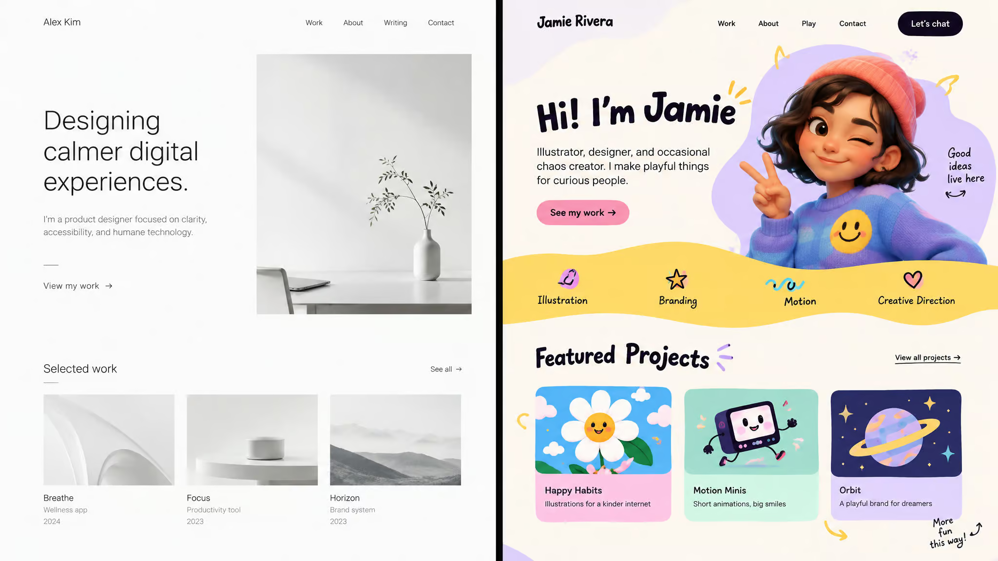
Neil Oseman: whitespace-heavy minimalism
Cinematographer Neil Oseman uses WordPress with a whitespace-heavy minimalist design, an icon-only header, and a hidden hamburger menu so nothing distracts from his reel.
Ine Agresta: playful color and animated logo
Ine Agresta’s WordPress build uses playful contrasting colors, generous whitespace, and big bold images, bookended by an animated logo in the header and footer.
Jake Sinclair: animations and digital avatars
Jake Sinclair uses a black WordPress background with loading-screen animations, digital avatars, and parallax scrolling, showing why you should study color theory before locking in brand colors.
Dr Gillian Jack: copy-centric hero
Created with Hostinger AI Builder, Dr Gillian Jack’s hero section pairs short copy and a clear typography hierarchy with a historical illustration for strong search optimization.
Anulika Nwankwo: animated hero for UX/UI
UX/UI product designer Anulika Nwankwo uses Hostinger AI Builder to run an animated hero section with interactive illustrations that prove her design chops on arrival.
Blue Sky Eating: a minimalist menu bar
This WordPress food blog uses a simple menu bar and minimalist layout where limiting navigation choices nudges visitors into action across a couple of main categories.
Nicole Windle Yoga: image-focused and information-heavy
On WordPress, Nicole Windle Yoga balances information-heavy pages with an image-focused layout and an extensive menu bar linking key pages to keep bounce rates down.
Amacie Design Studio: bold header typography
Built on Hostinger AI Builder, Amacie Design Studio lets unique, bold header typography carry the entire brand identity.
Morgan Sun: animated loading screen
Motion designer Morgan Sun greets visitors with an animated loading screen that demos her specialty before the page even finishes rendering.
Kwasek: grid layout
A clean, scannable grid keeps visual portfolio pieces easy to browse at a glance.
Rafal Bojar: parallax and cursor animations
Rafal Bojar combines parallax scrolling with custom cursor animations for a kinetic browsing feel.
Selome Welday: sticky menu bar
Selome Welday keeps a sticky menu bar pinned to the viewport so recruiters can skim between sections without scrolling back up.
More sites to study
For more layout inspiration across different niches, check out the personal web pages of Kira Olsen, Visual Poetry, Leesha Williams, Sabrina Tran, Jacob Maentz, Iordanis Passas, Greg Ross, and Harry Trotter accounting.
Accessibility and load-time basics
Accessibility and page speed are measurable technical floors that beginners routinely skip, starting with verifying AA color contrast through the WebAIM checker so visitors can read your text.
Add a skip link
Place a hidden-until-focused “Skip to main content” link at the very top of your HTML so keyboard and screen-reader users can bypass repetitive navigation menus.
Check colour contrast with WebAIM
Run your background and foreground hex codes through the WebAIM color contrast checker and adjust them until your body text and UI elements meet the AA standard.
Create an accessibility statement
Publish a plain-language accessibility statement explaining the standards your site targets and how visitors can report an issue.
Test your site on a mobile phone
Don’t just drag your desktop browser window narrower; pull the live site up on an actual mobile phone to catch tap-target and overflow bugs.
Lazy load images
Add lazy loading to off-screen images so browsers only fetch heavy assets when a visitor scrolls near them.
Limit high-resolution media
Emily Porter warns that slow load times on desktop or mobile will drive visitors away, so limit uncompressed high-resolution images, heavy videos, and animations, and embed video via YouTube or Vimeo instead of self-hosting raw files.
Add a skip-to-top link
Drop a “Back to top” anchor link at the bottom of long articles so mobile readers don’t have to thumb-scroll all the way back to the nav bar.
Cool things to embed on a personal website
Playful embeds on a personal website are low-effort, high-personality features, led by a /now page, a custom 404 page, and an interactive image map of your bookshelf, that turn a static online resume into a memorable corner of the web.
Now page
A dedicated /now route tells visitors what you’re focused on at this exact moment in your life and work.
page
Build a custom 404 page for mistyped URLs.
Random page link
Wire a nav link that drops visitors onto a random page of your site.
Linktree page
Host your own Linktree-style social directory right on your domain.
Story section
Longer narrative pieces and personal essays deserve their own dedicated space outside your standard project logs.
Glossary
Compile a glossary of words you love or use often and link to it from your blog posts.
Favourite quotes
Curate a running page of your favorite quotes.
Jokes you like
A running page of one-liners and bits that reliably make you laugh is an instant personality test for visitors.
Websites that inspired you
Link out to the indie domains whose layouts, code, or writing sparked ideas for your own build.
Time-of-day profile image
Use a tiny snippet of JavaScript to swap your profile photo based on the visitor’s time of day.
Wordle scores
Post your Wordle scores on your personal website to turn a daily puzzle into a running data log.
Cursor highlight colour
Override ::selection in CSS to change the text highlight color when a user drags their cursor.
Web quiz
Make a web quiz for visitors to fill out while they browse your pages.
Rotating message
Display a tagline or greeting that changes on page rotation or refresh.
Image map
Build a clickable HTML image map of your bookshelf linking to book reviews, houseplants linking to care advice, desk objects linking to their backstory, or a collection of thimbles or teddy bears.
Dither an image
Apply a retro pixel-art dithering filter to an image for low-byte geek cred.
Favicon
Drop a custom favicon into your root directory so your browser tab stands out.
Coffee shops you like
List your favorite coffee shops in a city with notes on what made each one great.
Landmarks you’ve visited
Log the physical landmarks you’ve visited over the years.
CDs or vinyl you enjoy
Catalog the CDs or vinyl records spinning in your collection.
Coffee cups with stories
Photograph your favorite coffee mugs alongside the story of where each one came from.
Photo gallery
Curate a standalone gallery of your favorite personal photos.
Plant care tips and illustrations
Share practical plant care tips alongside an original illustration you drew yourself.
Personal website ideas for developers
When another engineer pops open DevTools on your domain, these IndieWeb and browser-API touches prove you care about how the web works under the hood.
Subscribe to blogs you like
Hook an RSS reader like NetNewsWire up to the independent blogs you read every week.
Add an RSS link to your navigation
Put a visible RSS feed link right in your main navigation bar so readers don’t have to view-source to subscribe.
Posts-over-time visualization
Render a bar-graph visualization showing the volume of blog posts you’ve published over time.
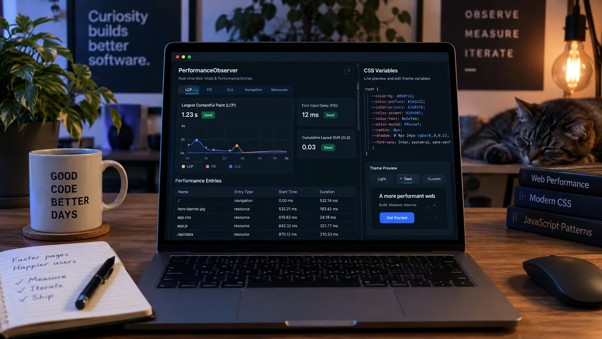
PerformanceObserver asset report
Use the browser’s PerformanceObserver API to generate a live on-page report showing the exact byte weight of every asset loaded.
Backlinks on pages
Display automatic backlinks at the bottom of a page listing every other internal page on your domain that links to it.
Related articles at the bottom of posts
Generate a related-articles block under every post to keep readers exploring your archive.
Download your Instagram photos to your site
Pull an archive of your Instagram photos and self-host them on your own server.
An HTML-only page with ten CSS rules
Build a constraint-challenge page using raw HTML and a maximum of ten CSS rules.
Make a website template for others
Clean up your site’s markup and release it as a free HTML and CSS website template others can adopt.
Thumbnail-to-fullsize images
Use the HTML image size attribute to load lightweight thumbnails that expand to full resolution when clicked.
The abbr tag
Wrap technical acronyms in the <abbr> HTML tag so hovering reveals the full term.
An icon after external links
Use a CSS selector to append a small arrow icon after external links so readers know they’re leaving your domain.
Maps with leaflet.js
Embed custom interactive maps using the open-source leaflet.js library.
Blogging on a personal website: what to write and how often
Whether you need a strict blog cadence depends entirely on your goal: if you’re running a professional blog to prove writing skill and industry expertise to recruiters, you must commit to 2 to 3 posts per month because stale content untouched for two years damages credibility, whereas a personal IndieWeb site has zero obligations under developer Dave Ratfactor’s rule that it’s your site and your RSS feed has no rules.
The professional blog, and its cadence
The Muse notes that sharing industry philosophy and career updates is great for your network, provided it’s grammar-clean and updated 2 to 3 times a month; if you’ll abandon it for two years, skip the blog, or take Ratfactor’s route and publish whatever you want to your feed, full text or snippets, ignoring anyone who tries to police your schedule.
Blog about an event you enjoyed
Recap a conference, concert, or local meetup while the details are fresh.
Blog about your favourite TV show
Unpack why a favorite series works so well.
Rank an album’s songs
Pick an album you love and rank every track in order of enjoyment.
Write about a lesson a teacher taught you
Share a lesson from a childhood teacher that stayed with you into adulthood.
Blog about your sticker collection
Catalog the stories behind the stickers on your laptop or notebook.
Write about a learning challenge
Document a technical or creative wall you hit and how you got past it.
Review a movie
Write a candid review of a film you just watched.
Publish a poem
Write a poem and give it a permanent URL.
Share a recording of music you played
Upload an audio clip of a piece of music you recorded yourself.
Write about a design pattern you like
Break down a web content presentation pattern or blog structure you admire.
Add an intended audience to a post
Place a short “Intended audience” note at the top of a post to frame the context.
Keep an unpublished draft just for you
Write a blog post and never hit publish: you don’t owe the internet everything you make.
Community features: fanlistings, interviews, and co-building
A personal website doesn’t have to be a walled monologue; some of the best old-web traditions turn a solo domain into a neighborhood hub that connects your work directly to other humans.
Join a fanlisting
Track down an active fanlisting for a hobby, game, or tool you love and add your URL to its member directory.
Start a fanlisting
Launch your own fanlisting around an underserved obsession and design a tiny pixel button that members can badge onto their own sites.
Interview a blogger
Reach out to a blogger whose writing you admire and publish a Q&A interview with them on your site.
Start an interview series
Turn that curiosity into a recurring interview series focused on a single craft or niche topic you enjoy exploring.
Invite friends to build with you
Turn site-building into a multiplayer weekend project by inviting friends over to spin up or overhaul their own personal web pages alongside you.
Write a Manual of Me
Publish a “Manual of Me” page that lays out your communication quirks, preferred feedback styles, and how collaborators can work with you most effectively.
Wix vs Squarespace vs WordPress for a personal website
For most beginners, a website builder like Wix, Squarespace, or Hostinger AI Builder is the fastest path to a personal website with minimal effort, whereas WordPress is the decisive choice for advanced users who want maximum customization on the platform that powers 43% of the internet, and card.co lets you create a personal website for free when you’re building on a zero budget. Beyond the big three, builders like Webflow, Framer, Notion, and even Tumblr can also anchor a site depending on how you like to work. What matters most at GeekExtreme is matching the tool’s architecture to your actual appetite for maintenance so you don’t spend three weeks fighting a configuration file before writing your About page. According to Avenue 25, “it’s important to select the CMS that will best fit your requirements” because “each of these systems requires a considerable amount of knowledge and experience to build on them.”
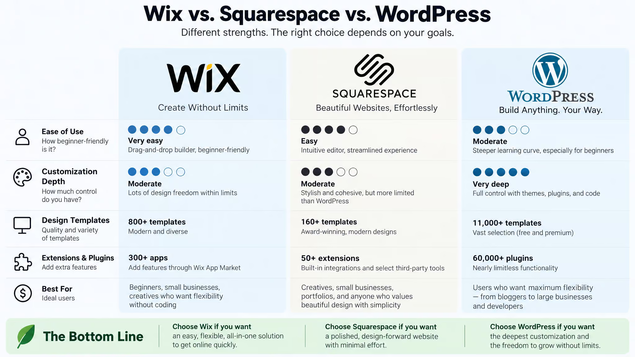
| Platform | Best For | Customization Depth | Cost Structure |
|---|---|---|---|
| Wix / Squarespace / Hostinger AI Builder | Beginners, no coding | Low | Low monthly hosting fee |
| WordPress | Advanced users, deep control | High (powers 43% of the web) | Low monthly hosting fee |
| card.co | Zero-budget one-page builds | Low | Free option available |
Choosing your domain
Register your own name ending in .com through a registrar like GoDaddy or directly via WordPress, such as victoriabarrycarolan.com, because a clean yourname.com address makes an immediate professional impression on recruiters.
Free and low-budget paths
If you want a zero-budget build, card.co offers a free website option that gets a clean landing page online fast, while developers can pair a hand-rolled HTML/CSS template with free static hosting. Even paid starter plans on beginner builders only run a few dollars a month.
Before you launch: feedback and distribution
Hyperlink your new URL across your resume and job applications, submit it to talent communities and recruiter portals like NBCUniversal’s, and make sure the link sits inside the resume file you upload to applicant tracking systems.
Start before it’s perfect
Dave Ratfactor delayed adding content to his site for years because he was obsessed with getting his directory structure right the first time; once he stopped worrying and started putting pages up in 2017-2018, the site snowballed, as he puts it, it’s hard for an empty sack to stand upright. James G’s site grew the exact same way, accumulating small incremental changes whenever motivation struck.
Maintaining and evolving your personal website
You keep a personal website alive by treating it as malleable clay that you periodically prune, audit for consistency, and edit in place rather than a monument that has to be built all at once.
Simplify: remove what you no longer want
Follow Thoreau’s “simplify, simplify, simplify” by removing unwanted scripts and sections from your site.
Click around your own site for consistency
Audit your own pages periodically and fix anything that no longer looks like you.
Browse other sites for ideas
Spend an hour clicking around sites like Maggie Appleton’s or Tracy Durnell’s for fresh layout inspiration.
Write a privacy statement for your analytics
Publish a clear privacy statement explaining what analytics you run.
Edit existing pages: the site is malleable
Go back to expand existing pages, change your mind, leave drafts for later, keep what works, and drop what doesn’t.
A personal website should be personal
A personal website is allowed to take whatever shape fits your brain, deep on a single obsession or shallow across dozens, where a professional portfolio, fan pages, and journal entries all live under one roof.
Learning in public without being an expert
Follow Dave’s Cheese Pages philosophy: share notes while learning in public and keep a timeline of learning milestones so readers learn alongside you.
Your site as a commonplace book
Store keyboard shortcuts and quotes in a personal commonplace book you can search anytime via site:ratfactor.com dwm.
Publish on your own site, syndicate elsewhere
Practice POSSE (Publish on your Own Site, Syndicate Elsewhere) by posting to your domain and RSS feed first before cross-posting to social networks.
Start a digital garden
Build a digital garden or personal wiki. Maggie Appleton’s essay on digital gardens is the classic starting point, where notes grow over time.
The quietly public middle ground
Keep at least one quietly public space on your domain where pages go live without fanfare, curing the perfectionism that comes with a formal publishing mindset.
Frequently Asked Questions
Can you provide some examples of website homepage design?
Strong homepages range from cinematographer Neil Oseman’s whitespace-heavy WordPress layout with an icon-only header to Ine Agresta’s mix of playful contrasting colors and animated logos. If you want a copy-driven approach, Dr Gillian Jack combines short hero text and clear typography with a historical illustration, while UX/UI designer Anulika Nwankwo uses an animated hero section with interactive illustrations to prove her skills immediately. Recruiters also benefit from functional touches like Selome Welday’s sticky menu bar or Kwasek’s scannable grid layout.
What are some cool things I can embed on my website?
Low-effort additions with high personality include a /now page sharing your current focus, a custom 404 page, and a clickable HTML image map of your bookshelf or desk objects. You can also drop in a tiny JavaScript snippet that swaps your profile photo based on the visitor’s time of day, post your daily Wordle scores, or wire up a navigation link that sends readers to a random page. If you want to get technical, use the browser’s PerformanceObserver API to display a live byte-weight report of every asset loaded on the page, or embed interactive maps with leaflet.js.
How do I create a personal website for free?
If you are building on a zero budget, card.co offers a free option that gets a clean one-page landing site online fast without requiring any code. Developers who want complete control for free can write a custom HTML and CSS layout—or even release it on GitHub as a free template for others to fork—and pair it with free static hosting. When you eventually decide to upgrade, starter plans on standard builders only cost a few dollars a month.
What should students put on a personal website?
Students and academic researchers should use the same selective gallery format that seasoned professionals use, swapping in their strongest coursework, student projects, and a dedicated page listing their publications with formal citations. Apply the boss test by leaving out unfinished drafts you wouldn’t hand to a manager, because overwhelmed hiring managers usually click the first item in a massive repository and ignore the rest.
How often do you need to update a personal website blog?
Your posting schedule depends entirely on whether the blog is for recruiters or for yourself. If you are writing to prove industry expertise to hiring managers, commit to two or three grammar-clean posts per month, because leaving a professional blog untouched for two years hurts your credibility. If you are running a personal IndieWeb site or digital garden, developer Dave Ratfactor’s rule applies: your RSS feed has zero obligations, and you can publish whatever and whenever motivation strikes.
